
Charts and Dashboards: How to Create a Chart
1 November 2019
Welcome back to Charts and Dashboards blog series. This week, we’ll create our very first chart.
As they say, “a picture is worth a thousand words”. Well, there are always some people who will want to see the underlying data, but even the best analysts can still appreciate the value of communicating information using an image.
It is very important though when preparing charts that you do not influence the way the information is presented. The goal is to present the data visually for viewers to analyse and draw their own conclusions, not to present the data in such a way as to alter anyone’s perception of the data. As I proceed through the type of charts, I will highlight tips about how to avoid effectively manipulating the presentation of the data.
To create a chart, the process is basically the same irrespective of the chart type you wish you use.
Step 1
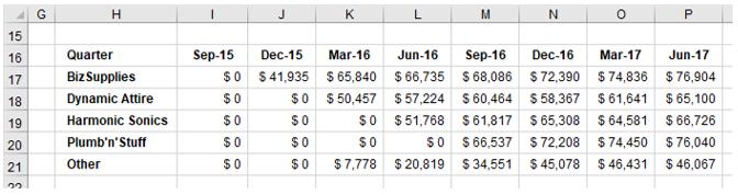
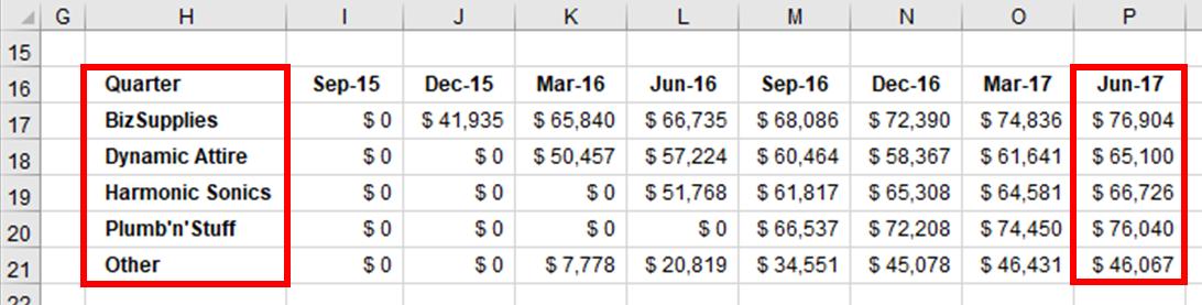
To begin with, I need a table containing just the data I want to chart. I have a data of sales by customer groups by quarters as follows:
Step 2
Once the data is ready, next I need to highlight the data to be included in the chart. I will highlight the headings above and to the left of my data, assuming I want these brought across to the chart. Most charts will allow for multiple data series to be reported in the one chart. The exception to this is the Pie Chart, where only one data series may be charted.
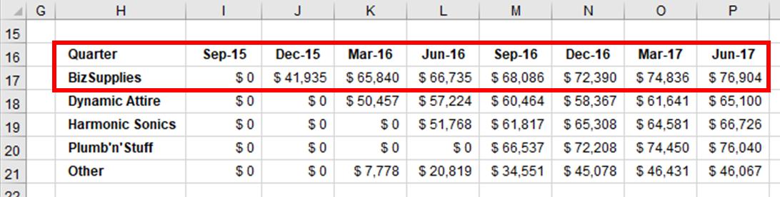
To highlight a single series, say the quarterly sales for BizSupplies as per the example above, I would highlight cells H16:P17:
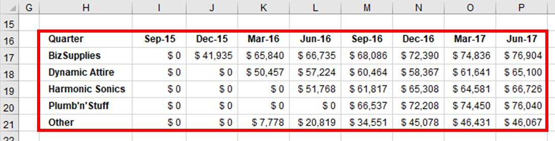
To highlight multiple series, say the quarterly sales for all clients, I would highlight cells H16:P21:
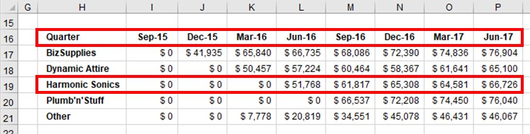
Please note that the data series do not have to be in a single area. For example, if I want to chart the quarterly sales for Harmonic Sonics, I can highlight the headings and the data series separately using the CTRL key. To achieve this, I would highlight cells H16:P16, then hold down the CTRL key and highlight H19:P19, then release the CTRL key:
It is also important to note that data series do not have to be in rows. They may be in columns as well. Let’s say I want to chart the quarterly income per customer for the June 2017 quarter. Here, I would highlight cells H16:H21, hold the CTRL key, then highlight P16:P21, then release the CTRL key:
Step 3
With the data selected, I can now create a chart. In Excel, go to the Insert tab on the Ribbon. In the Charts group, I am presented with a number of options:
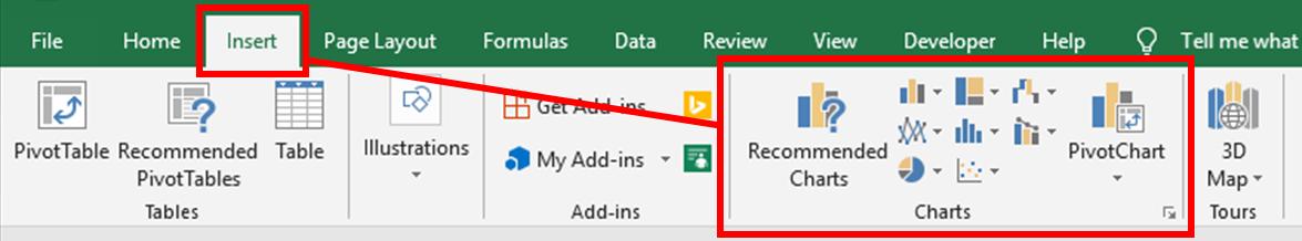
- if I click on ‘Recommended Charts’, Excel will analyse my data and provide me with a few options that it considers are appropriate. From this window, I can also click on the ‘All Charts’ tab at the top and see all the different chart types and all the variations available
- in the centre of the ‘Charts’ group, there are a series of buttons / icons representing the various chart types ready for me to select and use. Each has a drop-down arrow to show which charts have been grouped under each button and a subset of the variations available for each chart type
- the ‘PivotChart’ button links to ‘PivotTables’, which is an area of Excel covered in detail by SumProduct in another >course. For the purposes of explaining charting, I will skip PivotCharts here (for the time being anyway!)
- finally, there is a little arrow in the bottom right corner of the Charts group. Clicking on this arrow will simply take me to the ‘Recommended Charts’ area.
Let’s click on ‘Recommended Charts’. Using the available data where I have the June 2017 quarter data series in a column, Excel has provided the following ‘Recommended Charts’:
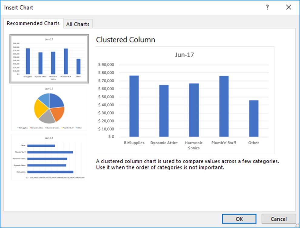
I can choose one of these charts or alternatively click on the ‘All Charts’ tab at the top of this window and use any of the other chart types available.
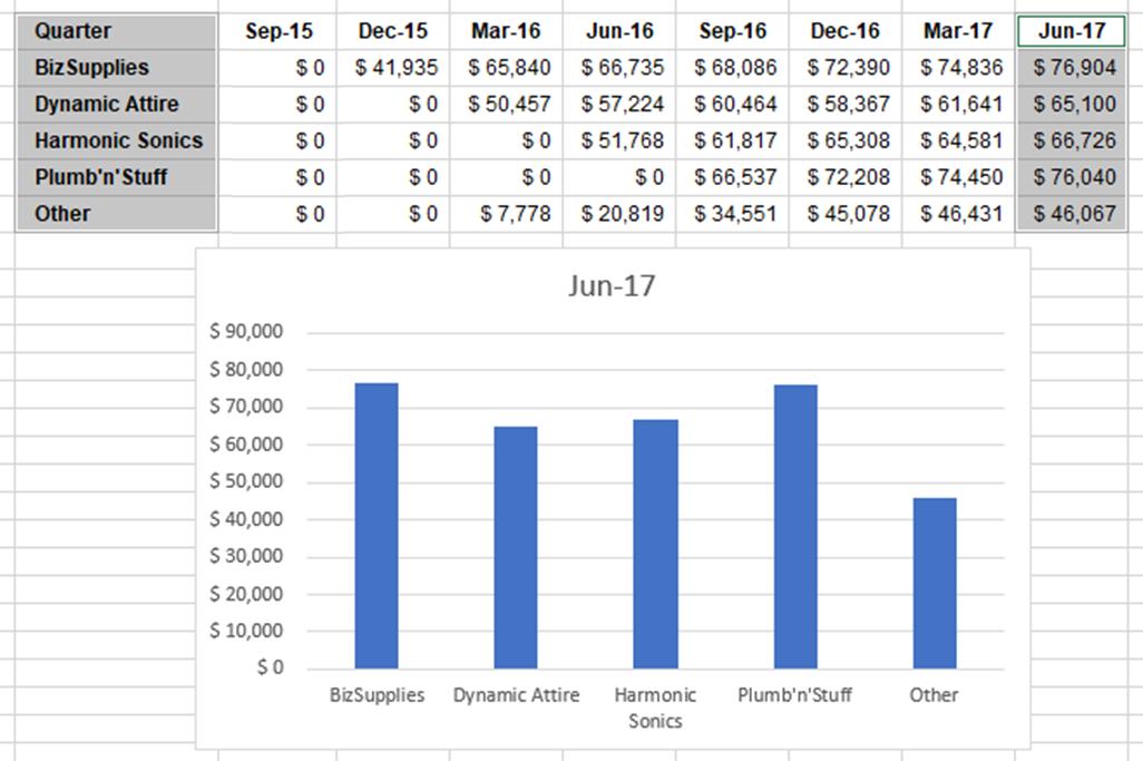
Once I have the chart I want, I simply click OK to accept my choice and Excel will embed the chart onto the spreadsheet where the data resides.
That’s it for this week; check back next week for more Charts and Dashboards tips.