
Charts and Dashboards: The Horizontal Raincloud Chart – Part 4
1 December 2023
Welcome back to our Charts and Dashboards blog series. This week, we continue to show you how to make a bespoke Horizontal Raincloud chart, by merging the charts created so far to create the final Horizontal Raincloud chart.
The Horizontal Raincloud chart
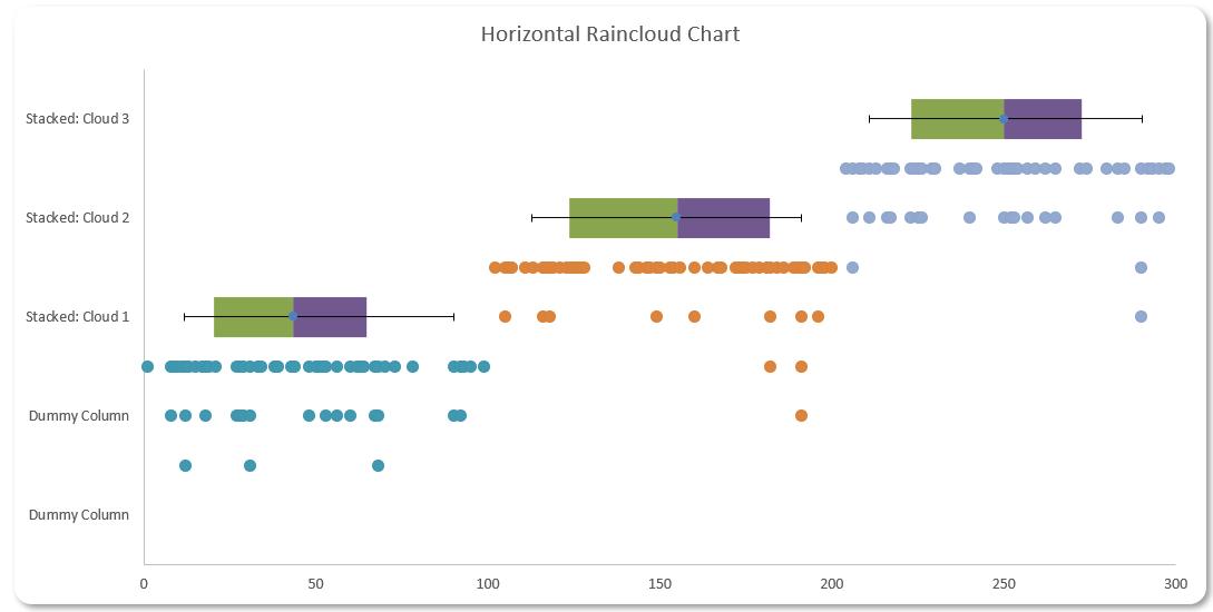
Are you looking for a new way to present your data? This week, we continue looking at the Horizontal Raincloud chart. If you are unfamiliar with this concept, the Horizontal Raincloud chart might look like the following image:
You can download the starting Excel file here to build this chart with us.
Our Excel file contains two [2] workings sheets, one named ‘Horizontal Raincloud – 1 Cloud’ and the other ‘Horizontal Raincloud – 3 Clouds’. We will illustrate our example in the ‘Horizontal Raincloud – 1 Cloud’ sheet.
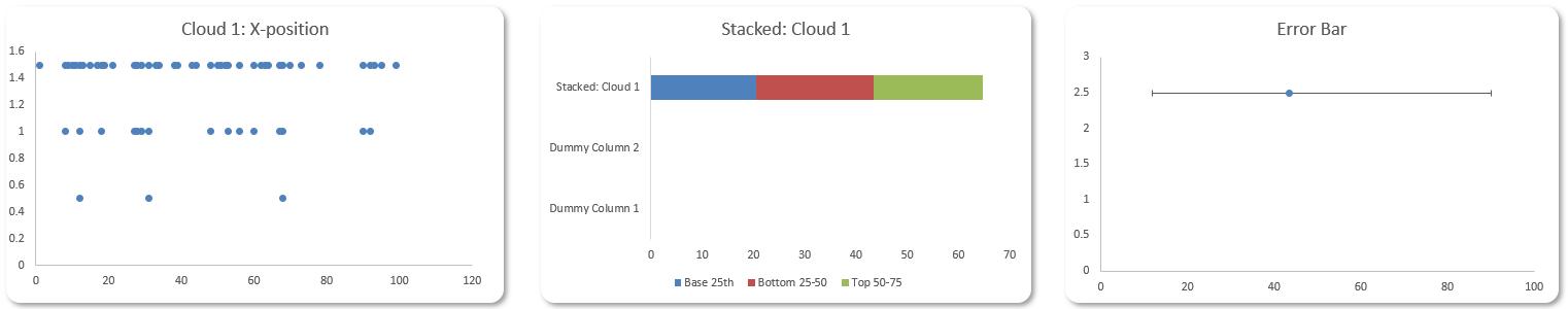
Let’s break down the charts we used here to make this design:
- a Scatter chart for our data point distribution
- a Stacked bar chart for percentile analysis
- a Scatter chart for our error bar.
We will illustrate how to construct each of these charts and later merge them together to create the Horizontal Raincloud chart.
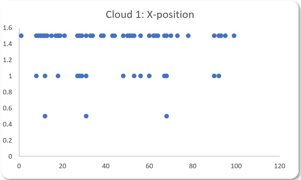
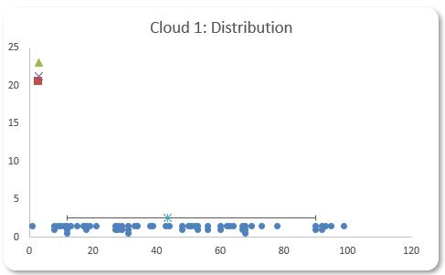
In Part 1, we created a Scatter chart for our data point distribution:
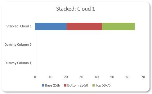
In Part 2, we created a Stacked Column chart to show the percentile analysis.
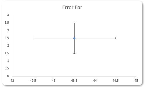
Last week, we created the last element for our Horizontal Raincloud chart: a Scatter chart for our error bar.
We have created the elements we need for the Horizontal Raincloud chart, now all we need to do is to merge all three [3] charts together.
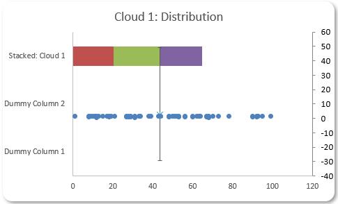
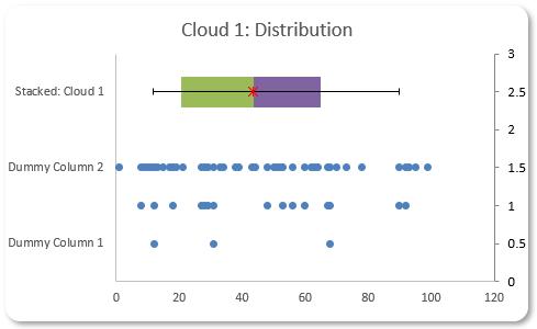
We can simply pick out any of these three [3] as a base and copy the other two [2] into it. We will use the Stacked Column chart as the base and copy and paste the other two [2] charts into it. This will render the following visual:
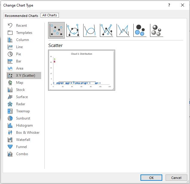
Now, don’t panic here! We just must modify this a little to make it a proper Horizontal Raincloud chart. We can do this by clicking on the chart and heading to the ‘Chart Design’ tab and selecting ‘Change Chart Type’. In the ‘Change Chart Type’ dialog box we select Combo:
After selecting the Combo tab our chart will change once again:
Lovely.
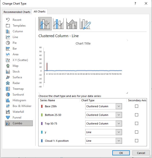
In the ‘Chart Type’ drop-down box we will select the ‘Stacked Bar’ type for each ‘Series Name’ here. You will see that the ‘Secondary Axis’ option becomes ticked after changing the ‘Chart Type’. This is not what we want, so we untick all the ‘Secondary Axis’ boxes. Then we select ‘Scatter’ as the ‘Chart Type’ for our y and ‘Cloud 1: X-position’ series. This will give us the following visual:
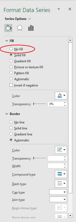
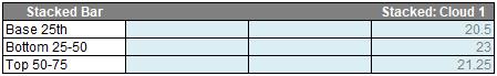
At this stage, we are almost done here. We just need to hide the ‘Base 25th’ series. To hide this series, we simply double-click on the red rectangle and select ‘No fill’ in the ‘Format Data Series’ box:
After that, we change the name of the chart to “Horizontal Raincloud Chart”, and we will have the following visual:
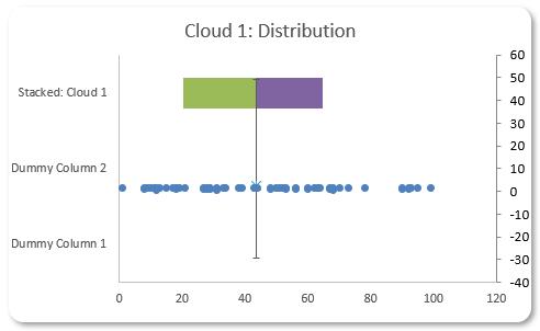
Next, we will fix the error bar. We must first remove the vertical error bar by clicking and deleting it. The error bar will return to the middle of our Stacked Bar chart:
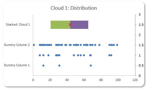
Then we repeat the step we performed for the error bar in Part 3:
If you do not like the ‘Dummy Column’ labels, you can simply remove it from the Stacked_Bar table by clearing the content there:
There we have it, a clean Horizontal Raincloud chart:
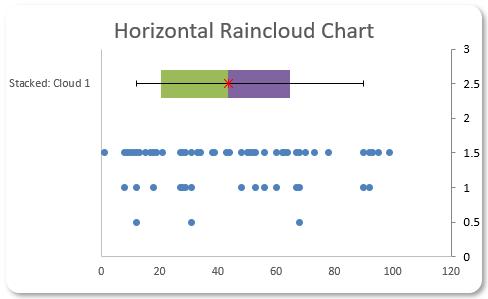
Congratulations we just make a Horizontal Raincloud chart. Yay!
If you wish to create more Horizontal clouds, you can use the ‘Horizontal Raincloud – 3 Clouds’ sheet in the initial excel file to do that. Otherwise, you can download our completed Horizontal Raincloud charts file here.
That’s it for this week, come back next week for more Charts and Dashboards tips.