
Charts and Dashboards: The Point and Figure Chart – Part 4
11 August 2023
Welcome back to our Charts and Dashboards blog series. This week, we continue to explain how to create a bespoke Point and Figure chart by looking at how we use all the data we have summary, prepare and transform to plot the chart.
Plotting Data
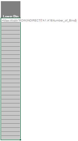
Next, we head to the ‘PnF-CSE’ sheet. In the Lower Bin column, we will implement the following formula for the column:
=Max-Width*ROW(INDIRECT("A1:A"&Number_of_Bins))
Let’s recall that we have Max as the maximum value in the Adj Close column, Width is the distance between two [2] bins of number and Number_of_Bins is the number of number bins we have. The ROW(INDIRECT("A1:A"&Number_of_Bins)) will generate an array of numbers from one [1] to the number of bins we enter in Number_of_Bins cells. (You can also use the SEQUENCE function here to achieve the same thing. What we are doing here is building this model in the Legacy Excel version for most of the users)
In Legacy Excel for the above formula to work we need to select a range that is equal to the Number_of_Bins (in our case here is 30) then enter the formula and press Ctrl + Shift + Enter.
If there is a curly bracket around the formula afterward then we are heading in the right direction:
{=Max-Width*ROW(INDIRECT("A1:A"&Number_of_Bins))}
We do a similar thing for the Upper Bin column with the following formula:
=Max-Width*(ROW(INDIRECT("A1:A"&Number_of_Bins))-1)
With that we have finished our vertical axis:
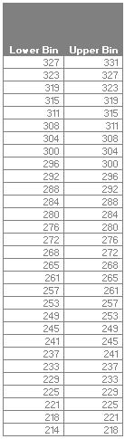
We will name the data in the Lower Bin column as Lower_Bin_Column and Upper Bin column as Upper_Bin_Column
Next, we will create the horizontal Axis. In the sheet we prepare for you, we will select E9:EF10 and enter the following formula:
=TRANSPOSE(Transform_Data[[Unique Index]:[Date]])
This formula will flip the row we have for the Unique Index column and Date column in the Transform_Data table to the right. As this is a legacy array, we need to press Ctrl + Shift + Enter to complete the formula and with that our axes are completed. We will name the numbering row as Index_Row and we will have the following visual:
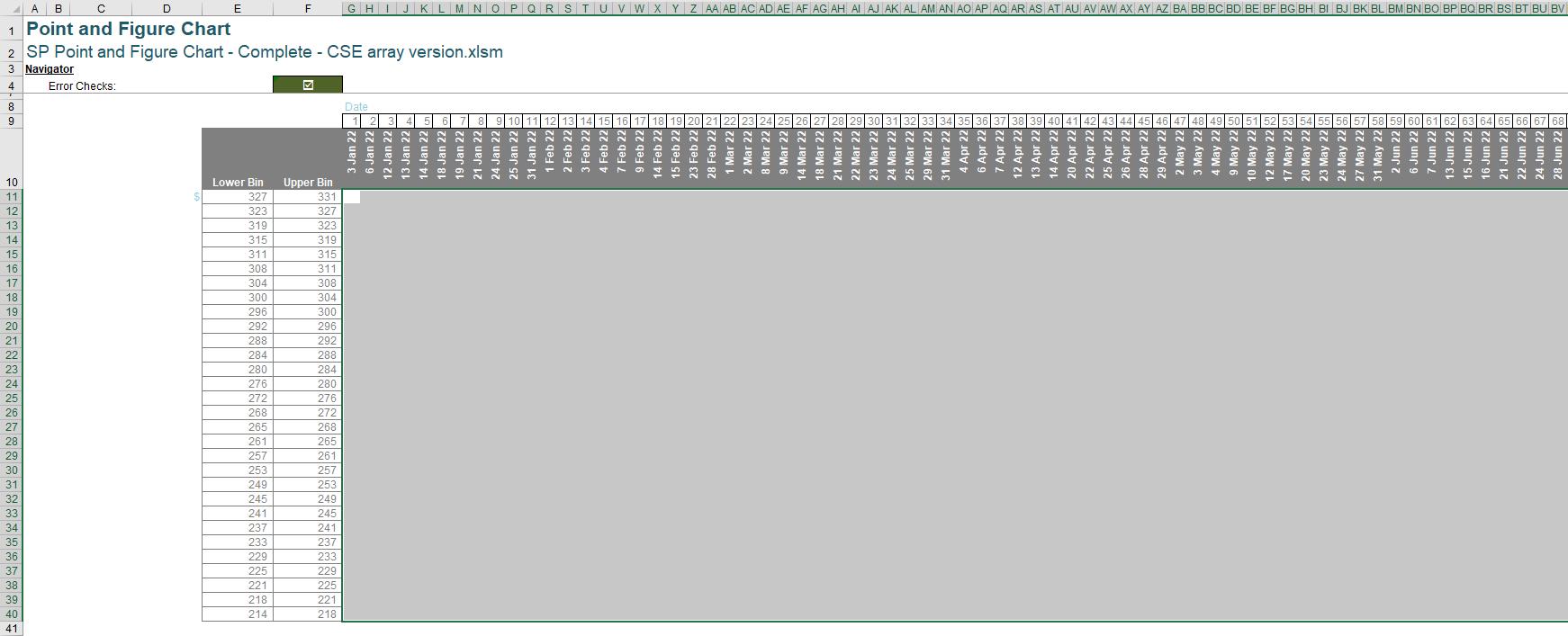
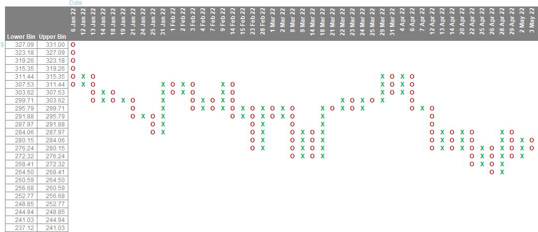
The final step is to plot the chart. We select the chart area from G11:EF40. Then we enter the following formula:
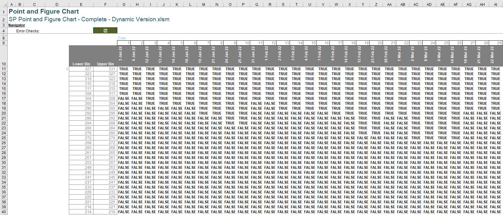
=IF((Upper_Bin_Column>=TRANSPOSE(Transform_Data[Min]))
*(Lower_Bin_Column<=TRANSPOSE(Transform_Data[Max])),
IFS(Starting_Symbol=Up_Symbol,IF(MOD(Index_Row,2)=1,Up_Symbol,Down_Symbol), Starting_Symbol=Down_Symbol,IF(MOD(Index_Row,2)=1,Down_Symbol,Up_Symbol)),"")
Let’s break down the meaning of each component in this formula:
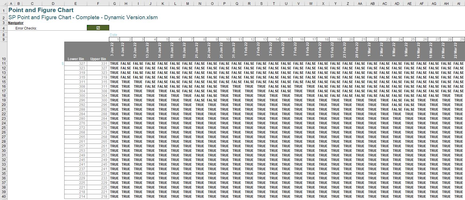
(Upper_Bin_Column>=TRANSPOSE(Transform_Data[Min])): The Upper_Bin_Column is an array that looks like a column vector and the output of this formula TRANSPOSE(Transform_Data[Min])) is an array that looks like a row vector. The logical formula between these two arrays will generate a matrix of TRUE or FALSE with the width of the matrix is the maximum number of the Unique Index column in the Transform_Data Table and the height of the matrix is the Number_of_Bins. This matrix will have TRUE on top and FALSE on the bottom like the following image:
(Lower_Bin_Column<=TRANSPOSE(Transform_Data[Max])): The Lower_Bin_Column is an array that looks like a column vector and the output of this formula TRANSPOSE(Transform_Data[Max])) is an array that looks like a row vector. The logical formula between these two arrays will generate a matrix of TRUE or FALSE with the width of the matrix is the maximum number of the Unique Index column in the Transform_Data Table and the height of the matrix is the Number_of_Bins. This matrix will have FALSE on top and TRUE on the bottom like the following image:
(Upper_Bin_Column>=TRANSPOSE(Transform_Data[Min]))*(Lower_Bin_Column<=TRANSPOSE(Transform_Data[Max]))
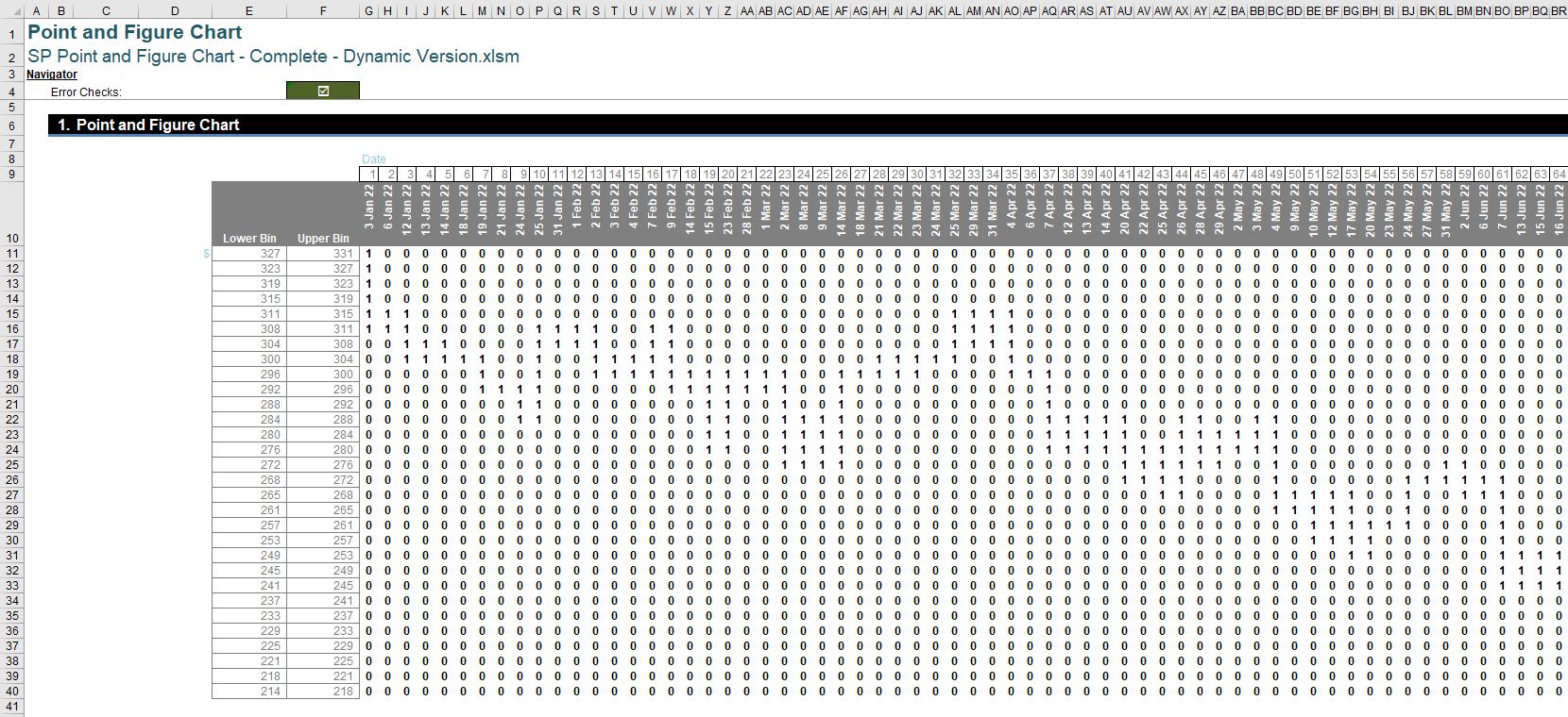
When we multiply these two matrices, we will generate a matrix of one [1] and zero [0] where the overlapping TRUE components are one [1] and the rest is zero [0] which will look like the following matrix:
We have overlapping points; we will need to determine which symbol goes into the cells. That is when the latter components come in handy:
IFS(Starting_Symbol=Up_Symbol,IF(MOD(Index_Row,2)=1,Up_Symbol,Down_Symbol),
Starting_Symbol=Down_Symbol,IF(MOD(Index_Row,2)=1,Down_Symbol,Up_Symbol))
The first thing we check is if our Starting_Symbol is Up_Symbol, then every odd index number will possess the Up_Symbol and every even index number will possess the Down_Symbol. This is why we use the MOD function like this MOD(Index_Row,2)=1 to detect the even and odd number here. We repeat the same process if our Starting_Symbol is Down_Symbol.
"": the last component of the big IF function here is the blank space which will keep the chart clean.
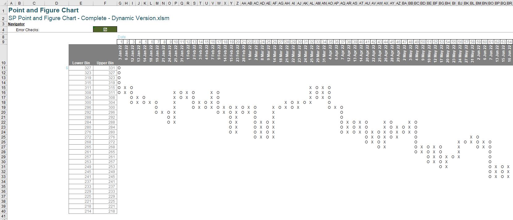
Finally, after entering the formula and pressing Ctrl + Shift + Enter we will have the chart we want:
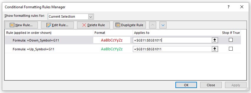
Now you might want to colour the ‘X’ symbol green and the ‘O’ symbol red. We can employ Conditional Formatting to do our bidding. We go to Home -> Styles -> Conditional Formatting -> New Rules (or Alt + O + D for short). We add these rules for the colour scheme of the graph:
Congratulations we make the Point and Figure Chart.
You can download the complete file here, where it contains the chart make from CSE array, dynamic array and a dynamic array version that have Bollinger Bands.
Word to the Wise
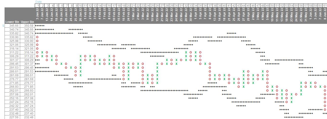
This chart would be more useful if adding Bollinger Bands for our chart here and the chart will look like this with some tweaks in the formula and data transformation:
This can be in other Charts and Dashboards for some other day.
That’s it for this week, come back next week for more Charts and Dashboards tips.