
Power BI Blog: Custom Visualizations – Funnel/Pyramid Chart
28 May 2020
Welcome back to this week’s edition of the Power BI blog series. This week, Jonathan Liau takes a look at new custom visualisation, the Funnel Chart by xViz.
Funnel charts are a great tool to illustrate the different stages involved in a sales process. The user will be able to see how much potential sales is related to each process of the sale. Users may also see how much ‘potential revenue’ falls off after customers progress to the next stage (it sounds horrible when we call customers “potential revenue”).
We will use the following dataset. Let me explain what the following table signifies. The value of one (1) signifies that a visitor has navigated to that class of page whilst browsing the website.
For example, looking at visitor 100001, this visitor has a 1 in both the Article and ‘News Page’, which means that they have viewed content on both types of page, while they were visiting the website. The ‘Course Page’ serves as a pseudo checkout page, since that is where visitors may browse our courses, add them to a cart and then subscribe to a course.
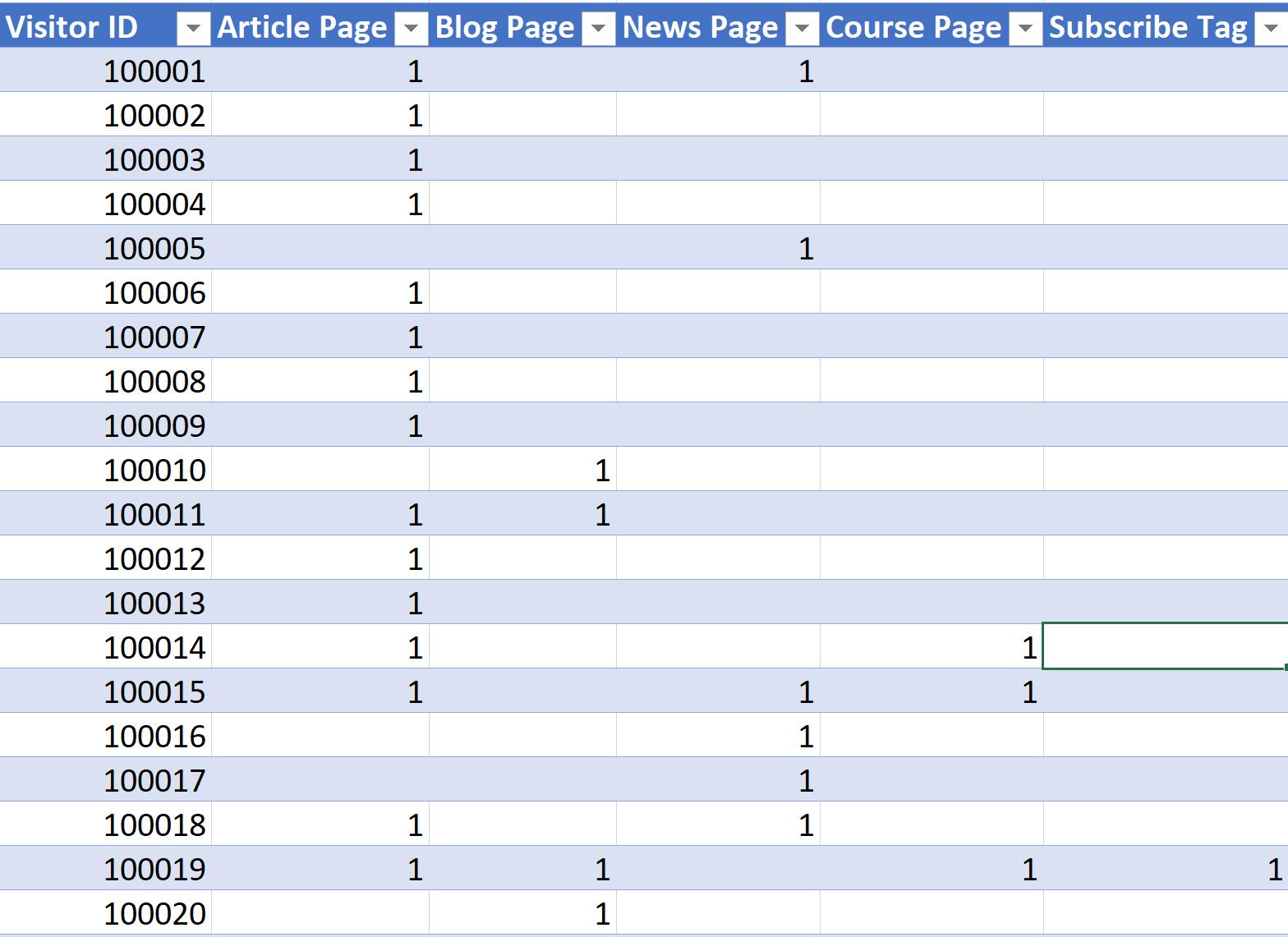
As usual, this picture above does not represent the entire dataset.
After importing this dataset into Power BI, we have to download the custom visual. If you wish to read more about how to download custom visuals, you can read about it in our first Custom Visual blog here.
As it stands, we are unable to populate the chart very well with the current state of our data:
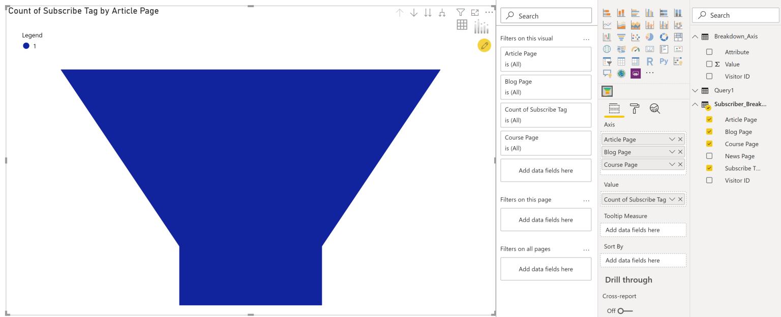
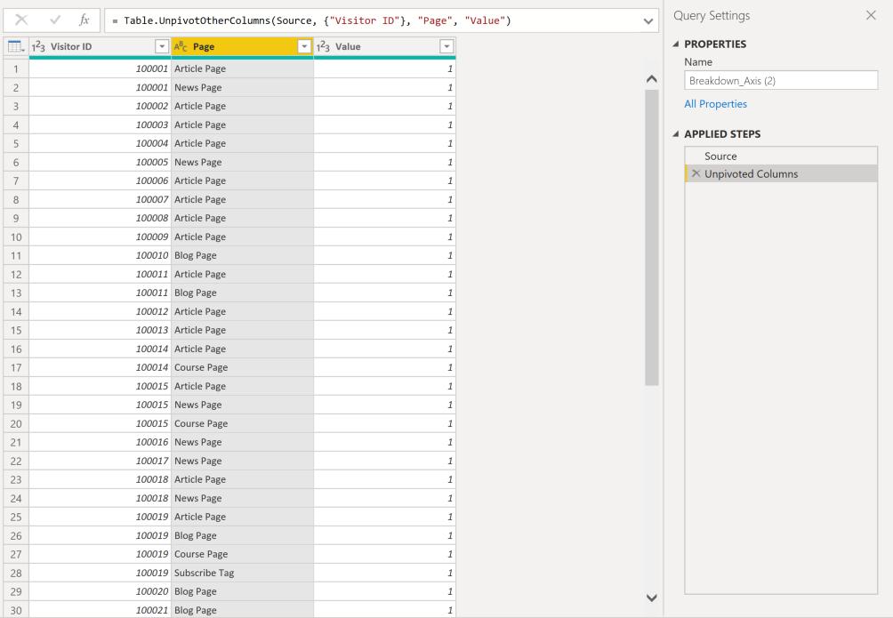
The chart is designed to present data that is organised differently. Let’s see what we can do to our data to transform it into a state that is more suitable for this visualisation. After unpivoting the columns, we have produced a table that looks like this:
We can now add the Page field into the Axis area and the Value to the Value area of the visualisation:
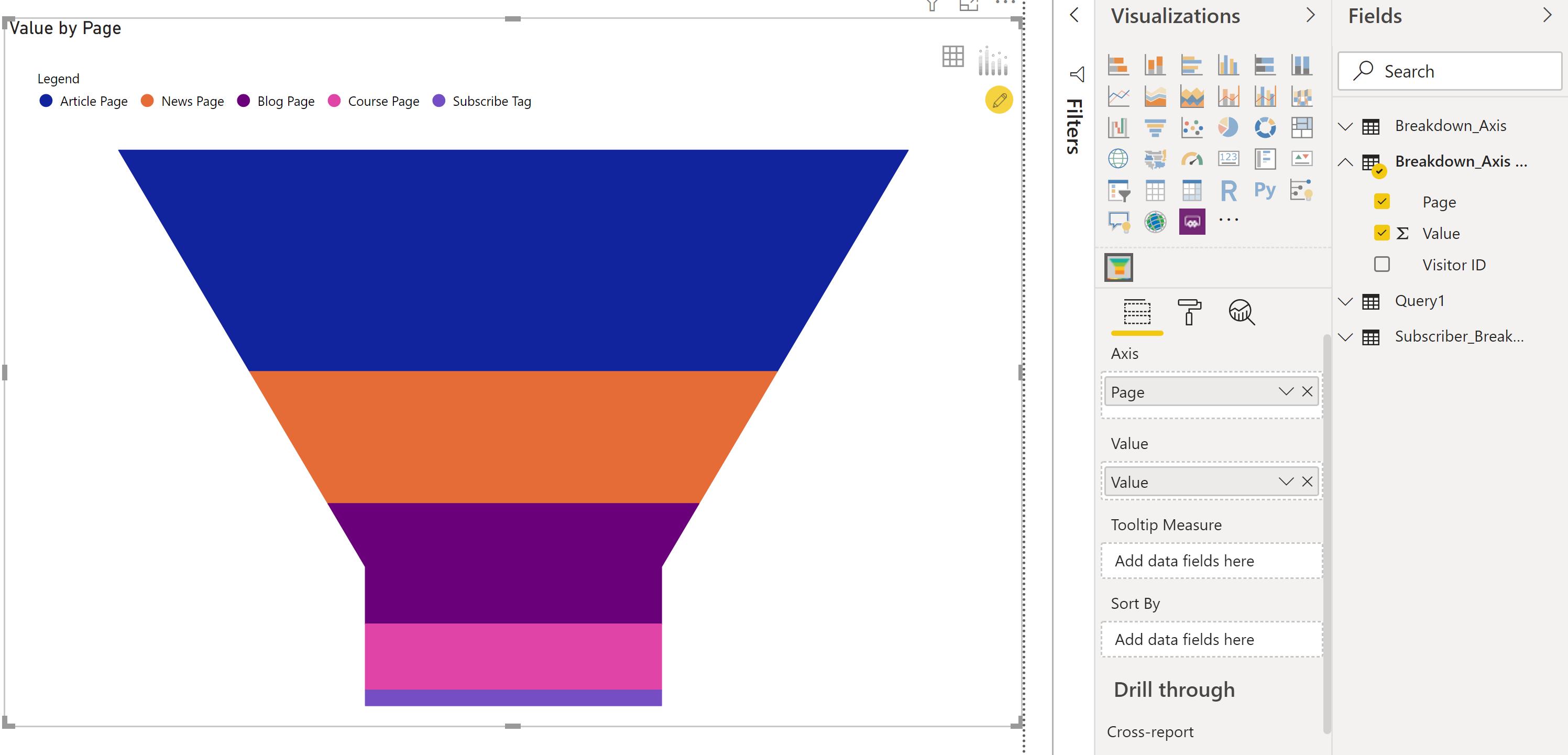
That looks slightly better. We can now see different partitions of the funnel, representing each stage visitors take before subscribing to our paid content. We can enable data labels in our visualisation to make it more reader friendly. We do this by clicking on the visualisation and then click on the Format tab, and finally, on ‘Data Labels’:
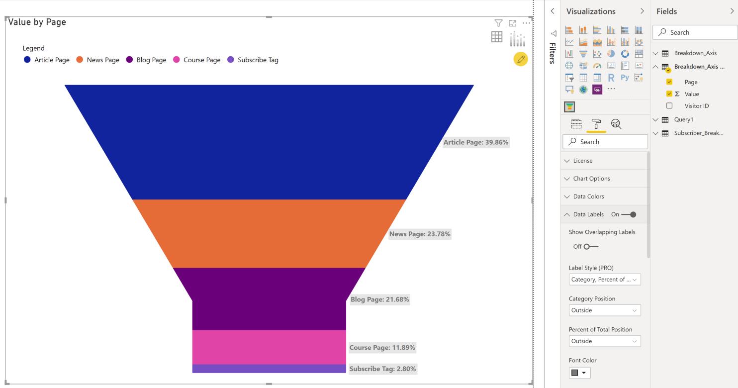
Now that we have the data labels on the side of each segment, the visualisation is easier to read.
That’s it for this week, how to create a basic Funnel chart in Power BI. Check in next week for more Power BI!
In the meantime, please remember we offer training in Power BI which you can find out more about here. If you wish to catch up on past articles, you can find all of our past Power BI blogs here.