
Challenges: Monday Morning Mulling: March 2021 Challenge
29 March 2021
On the final Friday of each month, we set an Excel / Power Pivot / Power Query / Power BI problem for you to puzzle over for the weekend. On the Monday, we publish a solution. If you think there is an alternative answer, feel free to email us. We’ll feel free to ignore you.
The challenge this month was to create a line in a Matrix visualisation in Power BI. This should be performed only using the tools within Power BI, but not by drawing a Shape in the report.
The Challenge
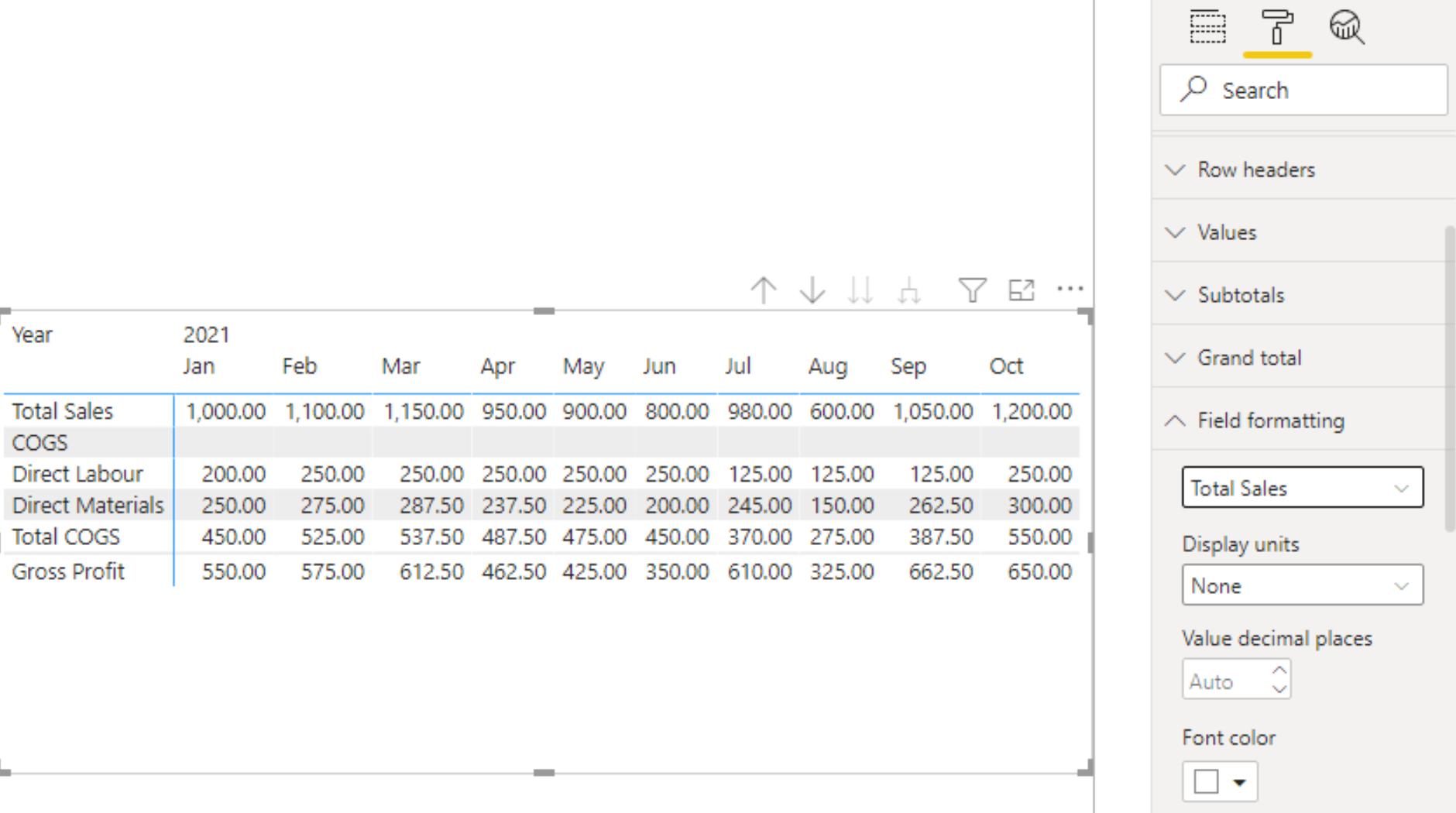
In Power BI there is a visualisation called the Matrix visualisation. We can use it to display numerical values over several time periods:
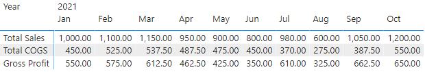
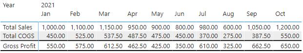
Each line item is a measure. The challenge here was to make the Gross Profit measure stand out more by inserting lines into the Matrix visualisation like so:
We did not simply draw a line on top of the visualisation. We can expand the visualisation by breaking the Total COGS measure down to Direct Labour and Direct Materials:
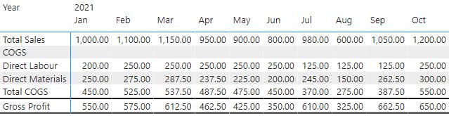
The lines move automatically.
Suggested Solution
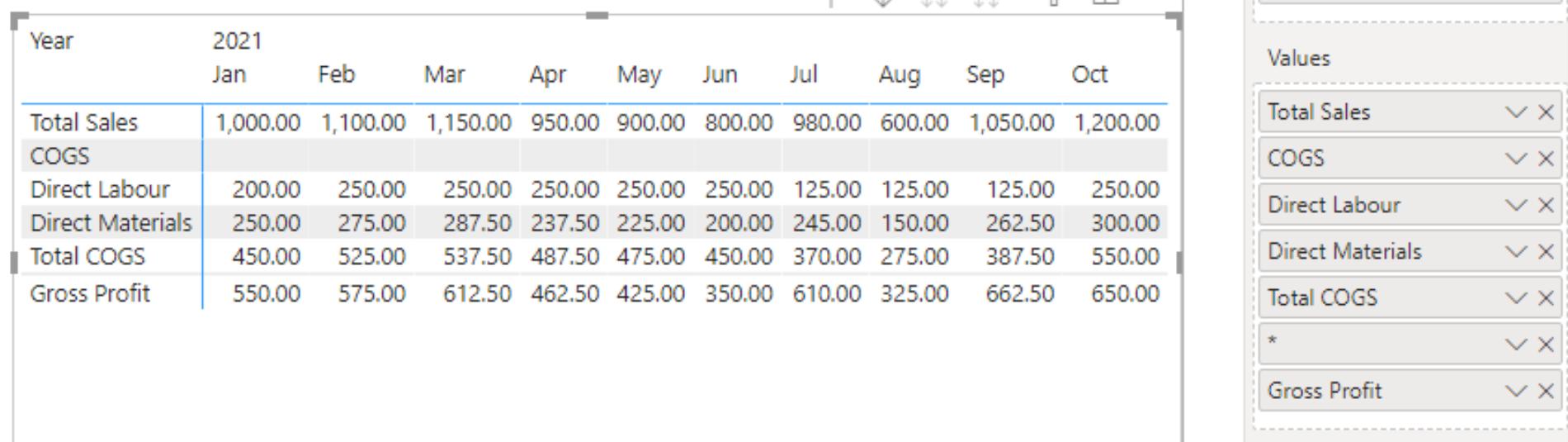
The first step here is to create a new measure, in this case we are going to enter the following DAX code into the measure formula bar:
* = " "
We use the asterisk in this example, because when shown on a visualisation, the Asterisk defaults to a blank space. That’s a nice trick to know. For example, if we place the newly created Asterisk measure in between the Total COGS and the Gross Profit measure we get the following result:
Looking at the visualisation it is currently a grey line. We can change that by navigating to the Format tab, and expanding the ‘Field formatting’ section:
From here, we change the formatting of the asterisk (*) measure, with the trick being to change the ‘Background color’ to black:
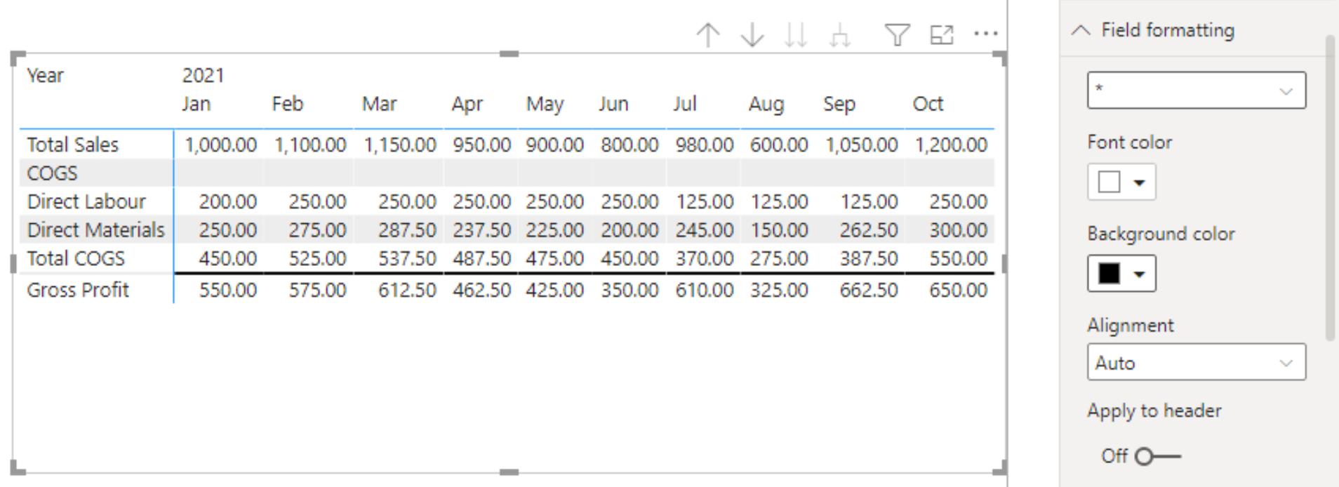
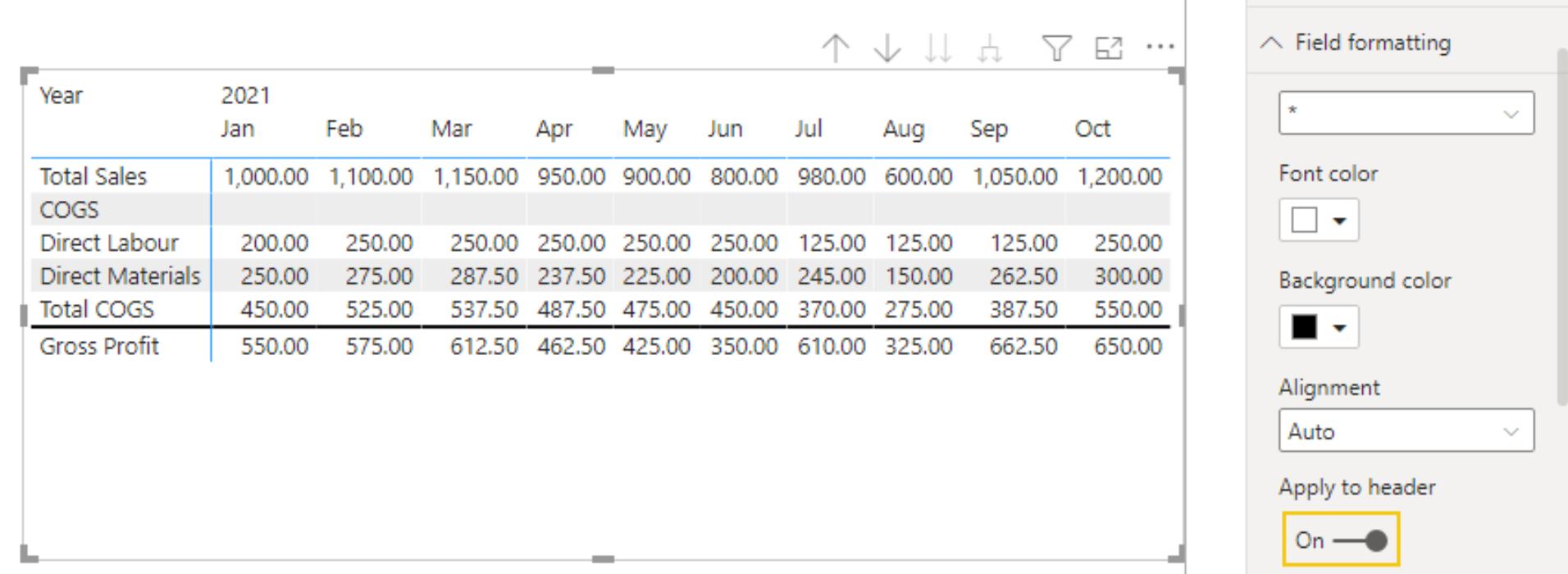
The next step is to toggle the ‘Apply to header’ option to On.
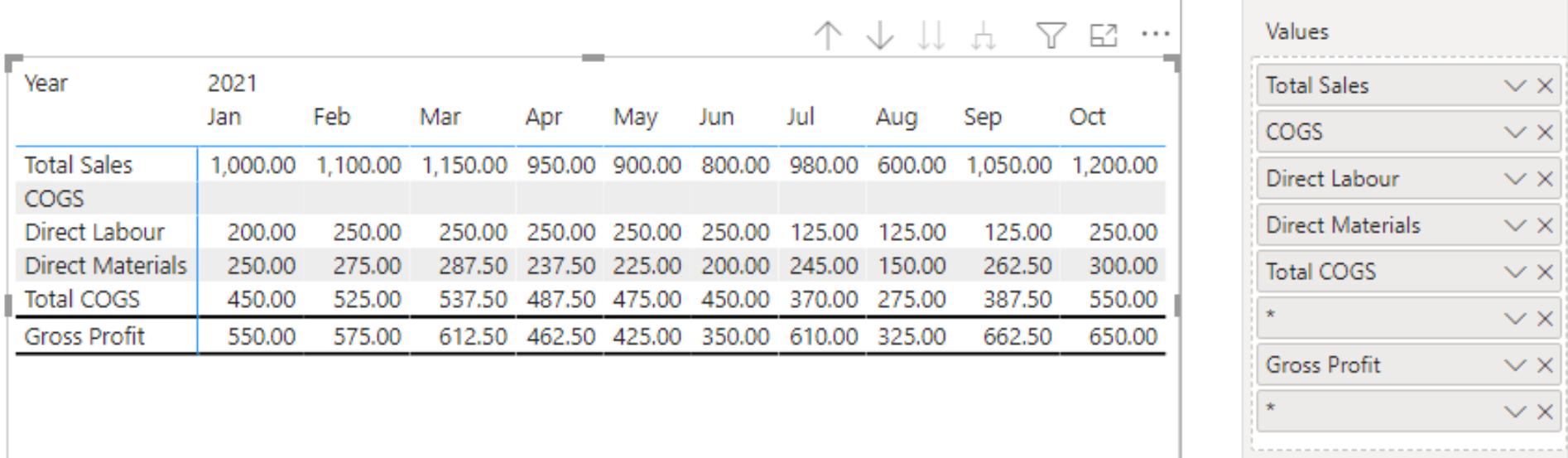
To add the line below the Gross Profit measure, we simply add another Asterisk measure below the Gross Profit measure in the Values area:
That is how we did it. How did you fare?
The Final Friday Fix will return on Friday 30th April 2021 with a new Challenge. In the meantime, have a great April fools and please look out for the Daily Excel Tip on our home page and watch out for a new blog every business workday.