Charts and Dashboards: Asking the Right Questions with Analyze Data
19 August 2022
Welcome back to our Charts and Dashboards blog series. This week, I look at the Analyze Data tool.
I have some data for my imaginary tent business:
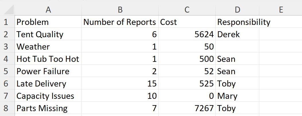
I’d like to create a dashboard from this data, but let’s assume I don’t know where to start. Last time, I looked at how the ‘Quick Analysis’ tool could help me:
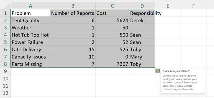
This time, I’m heading back to the Ribbon to look at how I can use ‘Analyze Data’ on the Home tab.

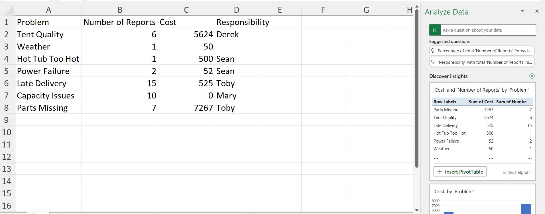
Unlike ‘Quick Analysis’ if I don’t have data selected, or if I select whole columns, then ‘Analyze Data’ will try and work out what data to use:
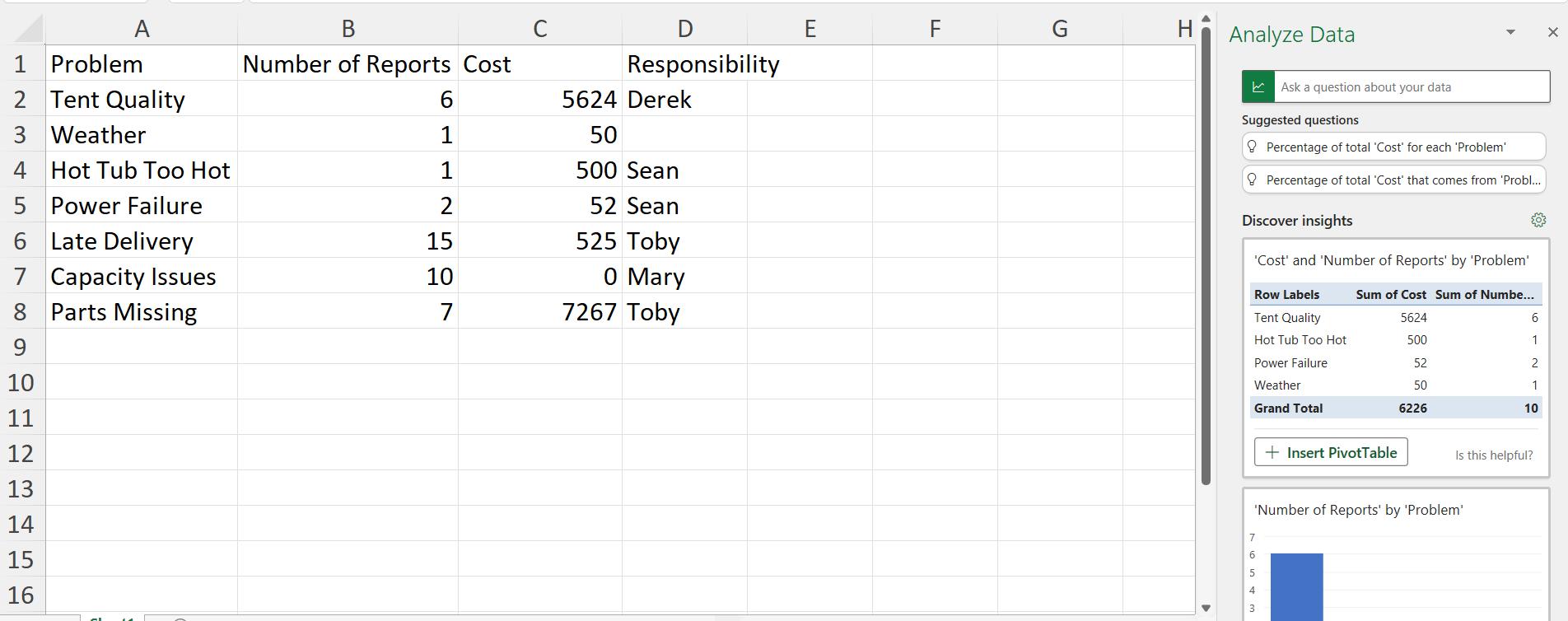
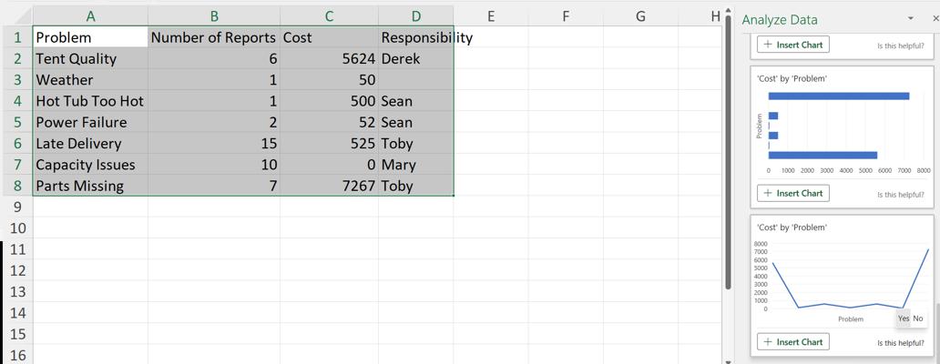
I can also choose a subset of my data, in this case the first five [5] rows excluding the Responsibility column:
Going back to the full data set, I can scroll down in the ‘Analyze Data’ pane and see the suggested charts:
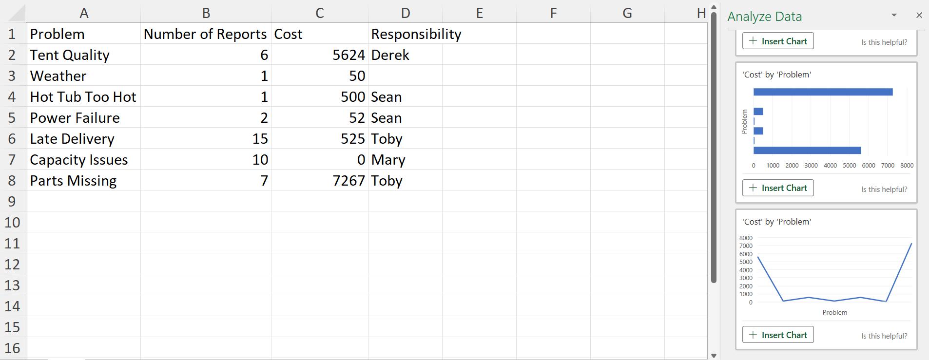
I can choose to ‘Insert Chart’ for any charts that I like, and I can also click the ‘Is this helpful?’ button to provide feedback on the tool:
Going back to the top of the ‘Analyze Data’ pane, a number of questions have been suggested. I can click on the question to see how the algorithms answer the question:
In the box for my own questions, there are more suggested questions in a dropdown:

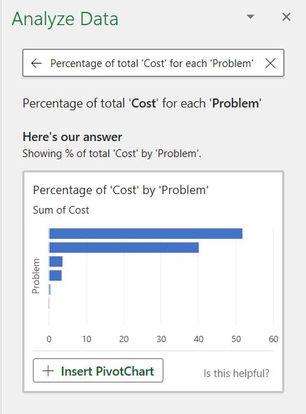
If I choose one of these, the algorithm provides a chart to answer the question:

I can also ask a question of my own:

I am not only answered, but also provided with related questions in case this wasn’t quite what I wanted, which I may click on:

‘Analyze Data’ can provide answers and suggestions to help users work with their data. By providing feedback, this tool will continue to develop and become even more useful!
That’s it for this week. Come back next week for more Charts and Dashboards tips.

