Charts and Dashboards: A Bar Chart with Dynamic Ordering – Part 1
21 May 2021
Welcome back to this week’s Charts and Dashboards blog series. Over the next two weeks, we will discuss creating a bar chart with dynamic ordering.
Bar Charts are not only useful to illustrate the magnitude of values in one or more data series, but also a good alternative to the Pie Chart, which compares the proportion of a series in a group of data.
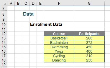
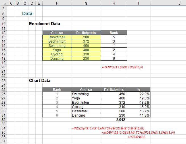
For example, here is enrolment data for six sport courses from a youth centre.
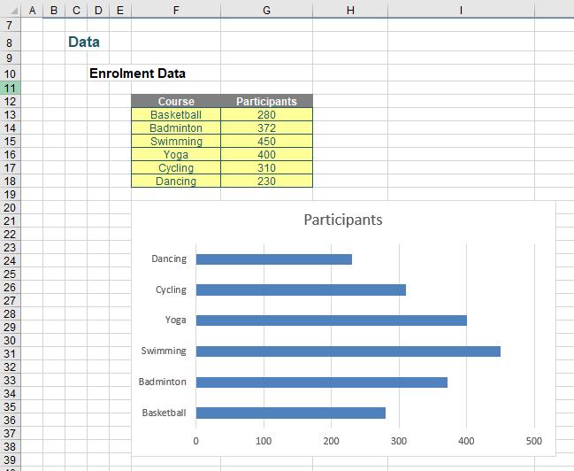
From the above data, if we create a bar chart, it may appear as below:
We want the bar chart to illustrate the percentage of each course’s participants relative to the total and also sort the bars in order from largest to smallest.
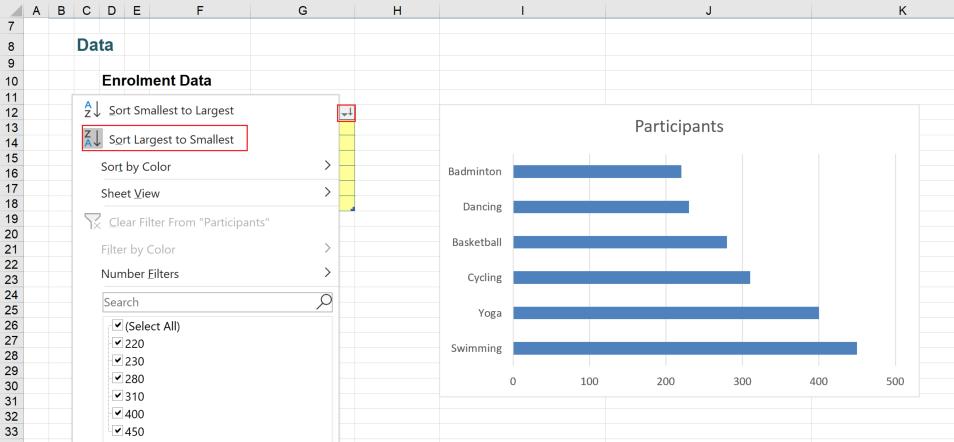
One way to sort the bars is to turn the data in cells F12:G18 to a table by highlighting the range and press CTRL + T, then sort the Participants column in the descending order. However, when we update the data in the table, we need to sort the data again so that the chart works in the way we want.
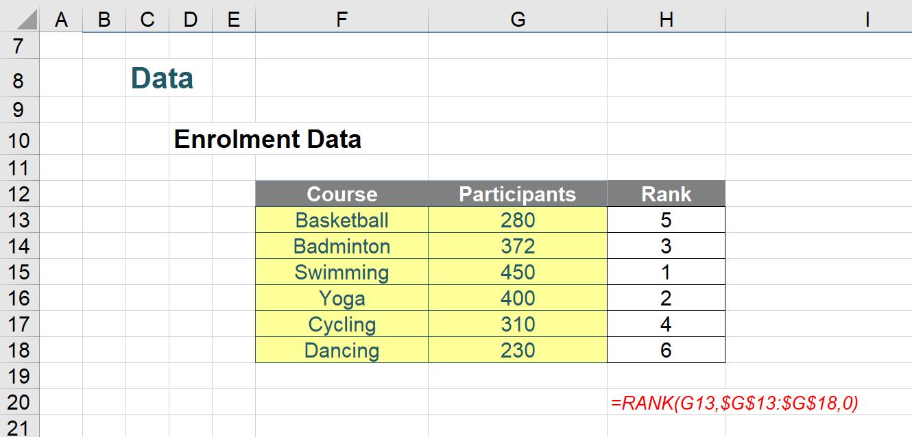
Let’s consider another way to get this working without using tables. In column H, we will get the order of the bar using the RANK function. The formula in cell H13 is:
=RANK(G13,$G$13:$G$18,0)
Next, we will create a Chart Data section to get the related data in order. We will >INDEX MATCH against the Rank to get the Course and Participants. The formulae in cells G26, H26 and I26 are respectively:
=INDEX(F$13:F$18,MATCH($F26,$H$13:$H$18,0))
=INDEX(G$13:G$18,MATCH($F26,$H$13:$H$18,0))
=H26/$H$32
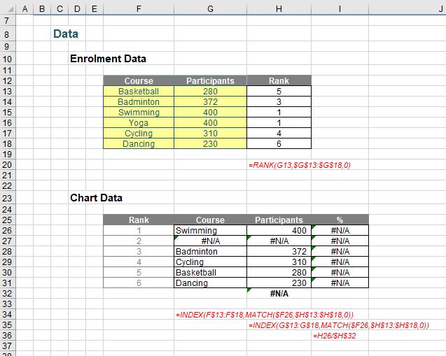
There is one thing that is not quite right here. Suppose the data changes and the number of participants in the Swimming course and Yoga course are equal e.g. they are both 400. Their ranks will be equal first and the Chart Data will no longer be correct.
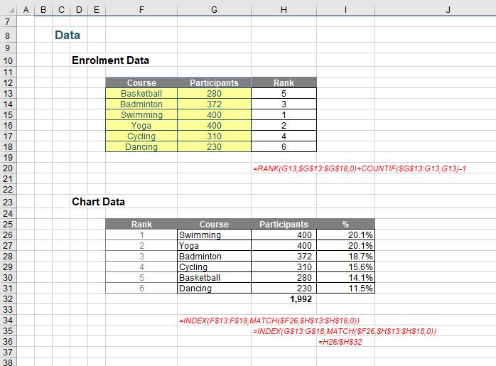
Hence, we will fix the formula in cell H13 to get the unique rank:
=RANK(G13,$G$13:$G$18,0)+COUNTIF($G$13:G13,G13)-1
If we revert to the original data and now that we have the Chart Data ready, we will select the Course and % columns to create an initial bar chart that looks like the one below.
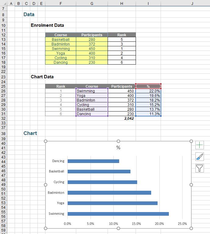
We can do more to get the chart a nicer look, but that’s for next time…
That’s it for this week. Come back in a fortnight for more Charts and Dashboards tips.

