Charts and Dashboards: Bullet Charts – Part 1
12 February 2021
Welcome back to this week’s Charts and Dashboards blog series. This week, we begin a review of Bullet Charts.
A few weeks ago, we talked about how to create Multiple Bullet Charts, and how to format them. Over the next few weeks, we will consider how to create and format a single bullet chart.
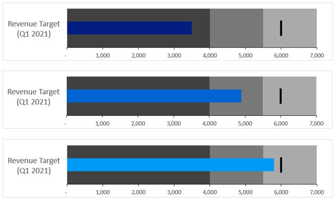
Bullet charts (sometime known as Thermometer Charts) are very useful visualisations to show how a variable is on track with a target and accepted lower / upper bounds, viz.

We can break down the bullet chart into four digestible elements:
- We need the bar that indicates the actual performance measure (indicated by the blue bar)
- We need two other bars that will indicate unsatisfactory, satisfactory and good performance(s) (indicated by the shaded areas)
- We need a target (indicated by the black bar at the 6,000 mark in this illustration)
- As an added bonus, we will be including conditional formatting into the bullet chart.

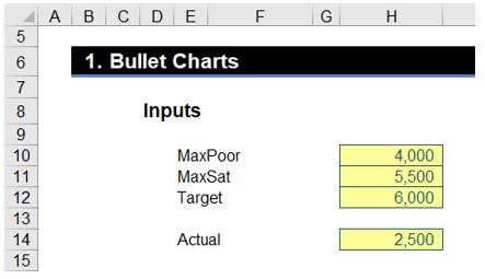
To aid in with the conditional formatting aspect, we need the following inputs for this build:
- MaxPoor: the maximum ‘poor’ value
- MaxSat: the maximum ‘satisfactory’ value
- Actual: the actual amount
- Target: the target value.

We will assign the following range names to the cells:
- H10 = MaxPoor (Maximum poor performance threshold)
- H11 = MaxSat (Maximum satisfactory performance threshold)
- H12 = Target
- H14 = Actual
The next two inputs we need are the target value again and the target category:

The ‘Target Value’ (cell H18) should refer to the ‘Target’ range name we set up earlier. Therefore, the formula in this cell should be:
=Target
The Target Category should be an input, in this case 2, whereas the Target Value indicates the ‘X’ value of the target and the Target Category centres the bar.
There will be three rows to that will serve as the chart data, the repeated Graduations row is intentional:
- Graduations
- Actual
- Graduations

The formulae in the table are as follows:
H24:J24 = 0
H25 = IF(Actual < MaxPoor, Actual, NA() )
H26:J26 = 0
I25 = IF(AND(Actual >= MaxPoor, Actual < MaxSat), Actual , NA() )
J25 = IF(Actual >= MaxSat, Actual, NA() )
K24 and K26 = MaxPoor
K25 = MAX(MaxPoor – MAX (0, Actual), 0)
L25 = MAX(MIN(MaxSat - MaxPoor, MaxSat - Actual), 0)
L24 & L26 = MAX(MaxSat - MaxPoor, 0)
We will select our chart data from H24:L26 (this will be one of the few times we allow for #N/A errors, as they are needed for conditional bar colours):

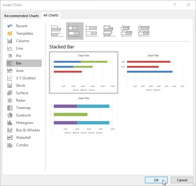
Go to Insert -> Charts -> Recommended Charts -> Stacked Bar Chart:

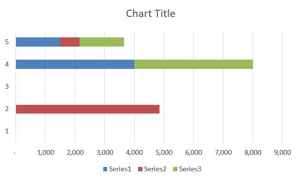
If your initial chart looks like this:

This needs modifying, but more on that next time.
Check back next week for more Charts and Dashboards tips.

