Charts and Dashboards: Creating Comparable Charts - Part 1
8 April 2022
Welcome back to our Charts and Dashboards blog series. This week, we look at how to easily create a set of comparable charts with similarly-scaled axes.
Picture a scenario where you wish to create some charts to compare the below data:
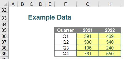
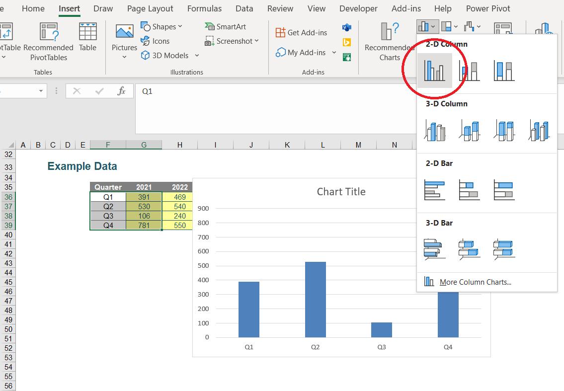
In this scenario, I wish to have two charts side-by-side depicting the data. To start with, I will create a chart for the first data set. To do this, I will select cells F35:G38 and then insert a 2D Clustered Column chart (keyboard shortcut ALT + N + C), viz.
Some formatting of the chart is advisable, to tidy it up and make the data more presentable. With a few small tweaks, I can get something similar to the following:
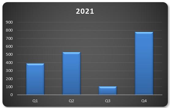
Notice that the scale on the y-axis here goes from zero [0] to 900. This may seem like an odd point to emphasise, but it will shortly become apparent why.
Instead of also graphing the second dataset in this chart, for dashboard reporting reasons, I have decided I want to display a similar chart adjacent to this one. This can be easily achieved by first right-clicking the chart and selecting ‘Copy’ (CTRL + C), I can then right click and paste a duplicate wherever I please (CTRL + V).
After creating this duplicate graph, if I right-click on the data
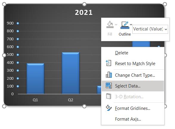
I can choose ‘Select Data…’, which will bring up the following dialog box:
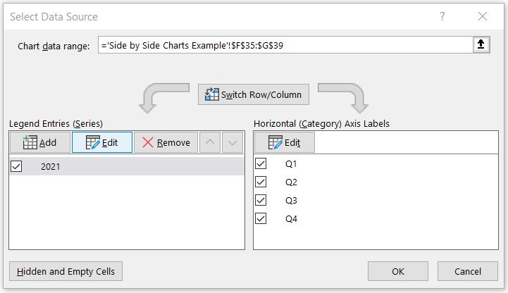
I can then choose to ‘Edit’ the ‘Legend Entries (Series)’, as above. This will present me with the following, where I can change the references to the second data set:
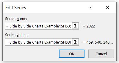
This will provide me with a graph with the same formatting as the first, but with the second dataset:

We have now created two similarly formatted charts.
However, we’re not done! Do you see why comparing these charts could be misleading? The right-hand chart’s y-axis scale goes from zero [0] to 600, rather than 900. We are not comparing like with like. This is a common mistake made in dashboard reporting that can be easily rectified.
We will cover ways of rectifying this mistake next week, in part 2.
That’s it for this week. Come back next week for more Charts and Dashboards tips.

