Charts and Dashboards: Dynamic Chart Labels for Stacked Column Charts
5 February 2021
Welcome back to this week’s Charts and Dashboards blog series. This week, we continue to talk about customising chart shapes.
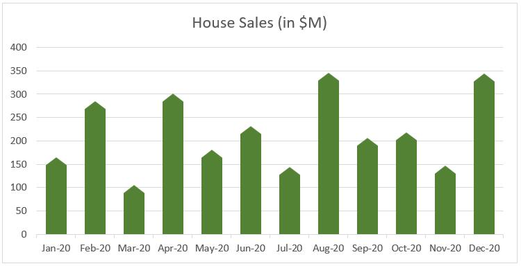
In the past few weeks, we have talked about customising chart shapes and formatting tips, where we created a chart for house sales with the house-shaped columns like the one below:

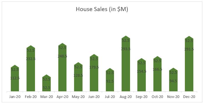
The chart is actually a stacked column chart and we left the vertical axis in place. Now, we want the data labels representing sales to be displayed on top of each column. However, when we remove the vertical axis and gridlines and add data labels to the chart, since it is a stacked column chart with two data series, we get two series of data labels.

Unlike the column chart options where we can add data labels at the outside end of the column, in the stacked column chart, we need a few tweaks to get this done:
- we will need a helper data series to top the stack chart, say ‘Label series’, whose values are equal to the Roof series
- right-click on the chart and choose ‘Select data’ and add this series to the chart
- right-click on the top series and choose ‘Format Data Series’ in the ‘Series Options’
- let the Fill be ‘No fill’ and Border be ‘No line’ to make this series invisible
- to delete unnecessary series of data labels, just click on a label of the series and hit Delete.
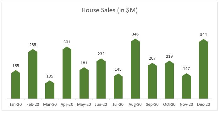
Now we have brought the data labels to the top of the columns.

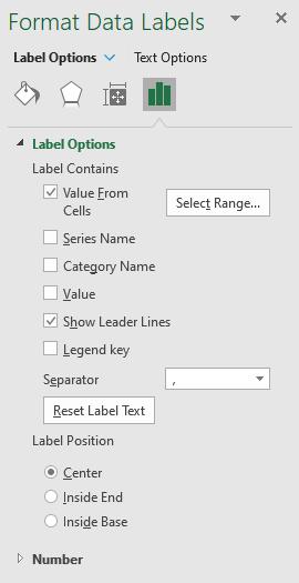
To get the data labels to point to the house sales instead of the helper stack data, we will use dynamic chart labels. By clicking on one of the labels, on the ‘Format Data Labels’ panel, under the ‘Label Options’, uncheck ‘Value’ and check ‘Value From Cells’ instead.

In the ‘Data Label Range’ dialog that occurs, point the range to the house sales, which is the range B2:B13. The chart is now complete.

That’s it for this week. Check back next week for more Charts and Dashboards tips.

