Charts and Dashboards: Funnel Charts
10 April 2020
Welcome back to this week’s Charts and Dashboards blog series. This week, let’s look at Funnel Charts.
The Funnel Chart is effectively a form of Bar Chart. The difference between the two is that the bars in a Funnel Chart are centred across the width of the Plot Area instead of starting from the vertical axis.
A Funnel Chart can be used to show values across stages or categories. Typically, the values are sorted from highest to lowest so that when they are graphed, the chart resembles a funnel. An example of when a Funnel Chart could be used is to show the volumes at each stage in a sales process, commencing with the number of general enquiries, then those that become genuine prospects, those who respond to quotes provided, those that make contact to discuss / negotiate, and finally those who place orders. Such a scenario would naturally result in the numbers being in descending order, but not all data that is used to create Funnel Charts follows this rule.
The data table required for a Funnel Chart is very straight forward. The stages or categories are entered into one column and the values are entered in a second column. For example, I have the following information about the six methods by which customers of a company place work orders / requests. Management is trying to ascertain which are the most popular methods that customers use to place work orders and, given recent issues with their online system and their web pages, whether they should consider investing more in upgrading their internet-based offerings.
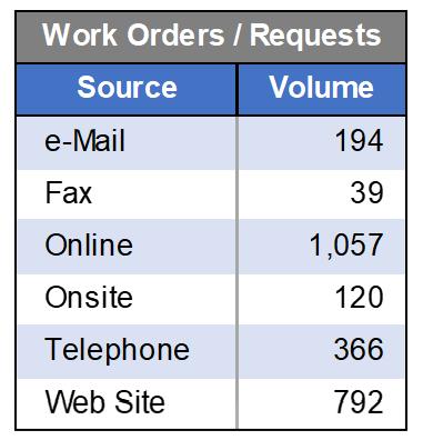
I highlight the data table and create a Funnel Chart. The Funnel Chart can be found under the Insert tab of the Ribbon, under the last small icon along the top of the Charts section. There is only one configuration option for the Funnel Chart in Excel:

My initial chart looks like the one below:
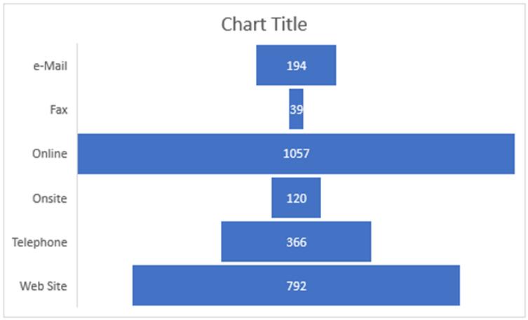
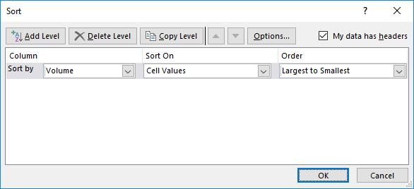
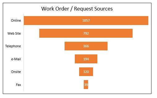
The first obvious thing I notice is that this Funnel Chart does not resemble a funnel. Clearly, this is due to the figures not being in descending order. The scenario used is one where the data is not reflecting stages in a process, but merely counts of occurrences, so my figures do not naturally reduce as I move from one category to the next. It would be more meaningful though if the figures were in descending order given management’s specific concerns. Therefore, I highlight the data table including the column headings but excluding the table header, then go to the Home tab on the Ribbon, select ‘Sort & Filter’, and finally, ‘Custom Sort’. Within the Sort screen that appears, tick the ‘My data has headers’ option, then sort by the Volume column, from largest to smallest, and click OK.
The data and chart will reflect the change in the order of the information:
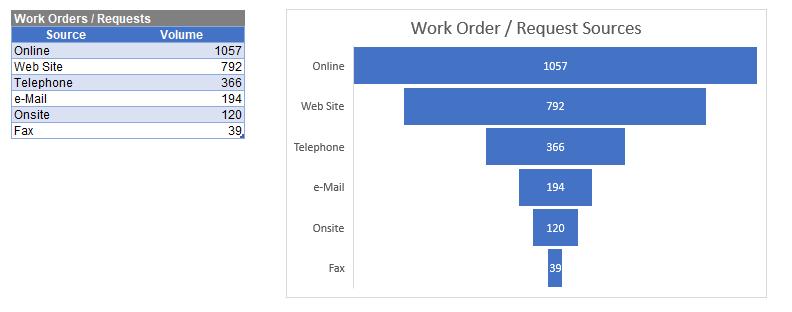
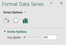
To further format this chart, I right-click on the bar and choose ‘Format Data Series’. In here, I change the ‘Gap Width’ to 40% and then I change the colour of the bar to orange.
The final product is shown below:
That’s it for this week, check back next week for more Charts and Dashboards tips.

