Charts and Dashboards: Interactive Charts – Part 3: Data Validation
14 August 2020
Welcome back to this week’s Charts and Dashboards blog series. This week, we will talk about using Data Validation in creating chart interactions.
Last week, we discussed using Form Controls to create a drop-down list. This drop-down list may also be set up using the Data Validation.
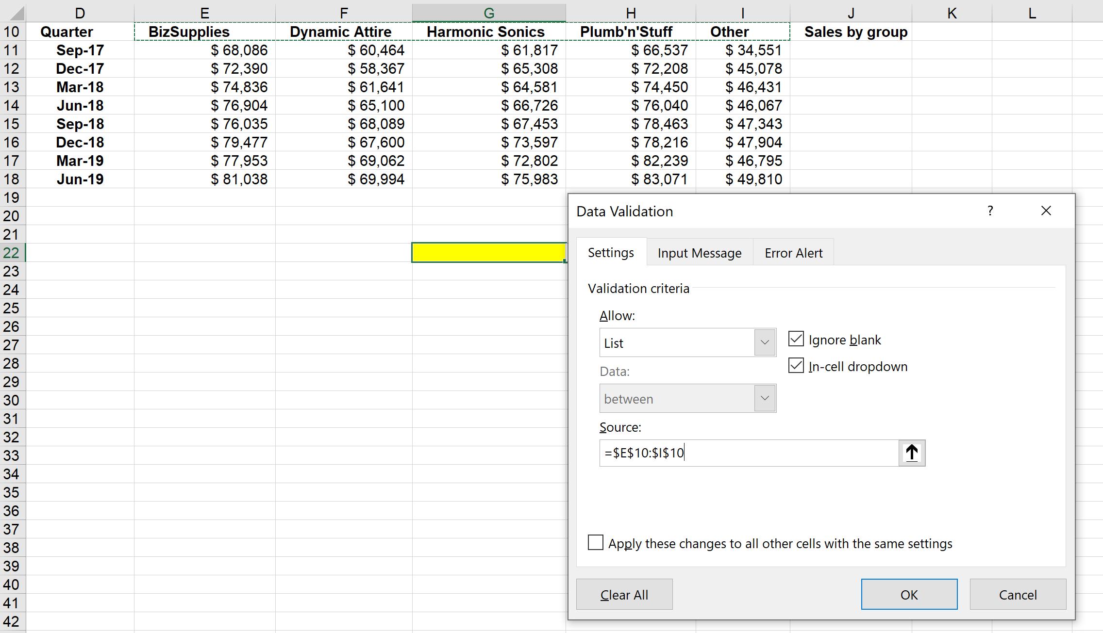
We will reuse the example from last week’s blog. Similar to last time, we will add a ‘Sales by group’ column, which we will use to build a chart. Then, we will choose an empty cell in the worksheet, here the cell G22 (highlighted in yellow), and navigate to Data -> Data Validation. In the pop-up ‘Data Validation’ dialog, when choosing the Source, just choose the area on which you wish to make a list; in this case, we’ll select the area from BizSupplies to Other, i.e. cells E10:I10.

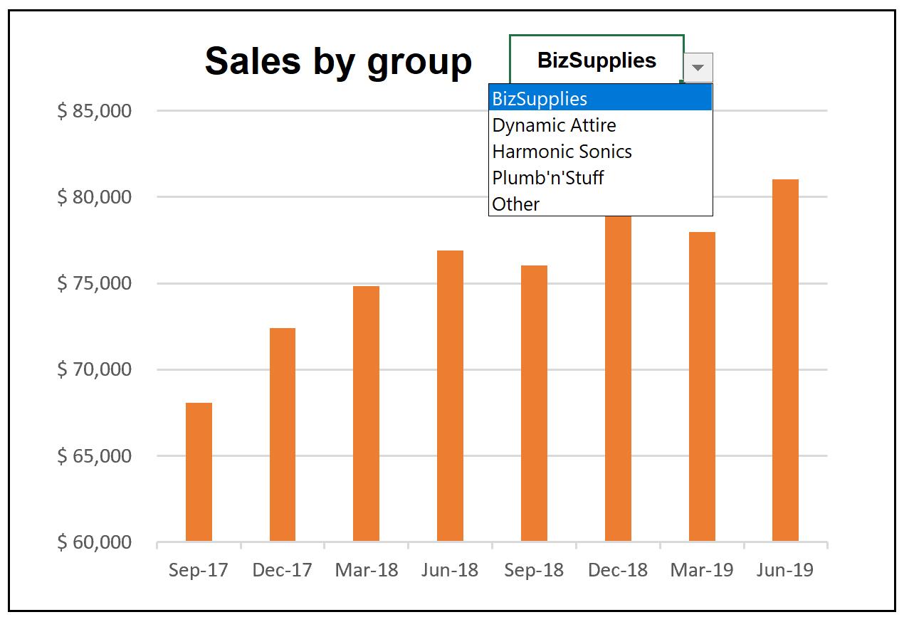
The validation cell is now active; if we click on the down arrow adjacent to the cell, it will show the list:

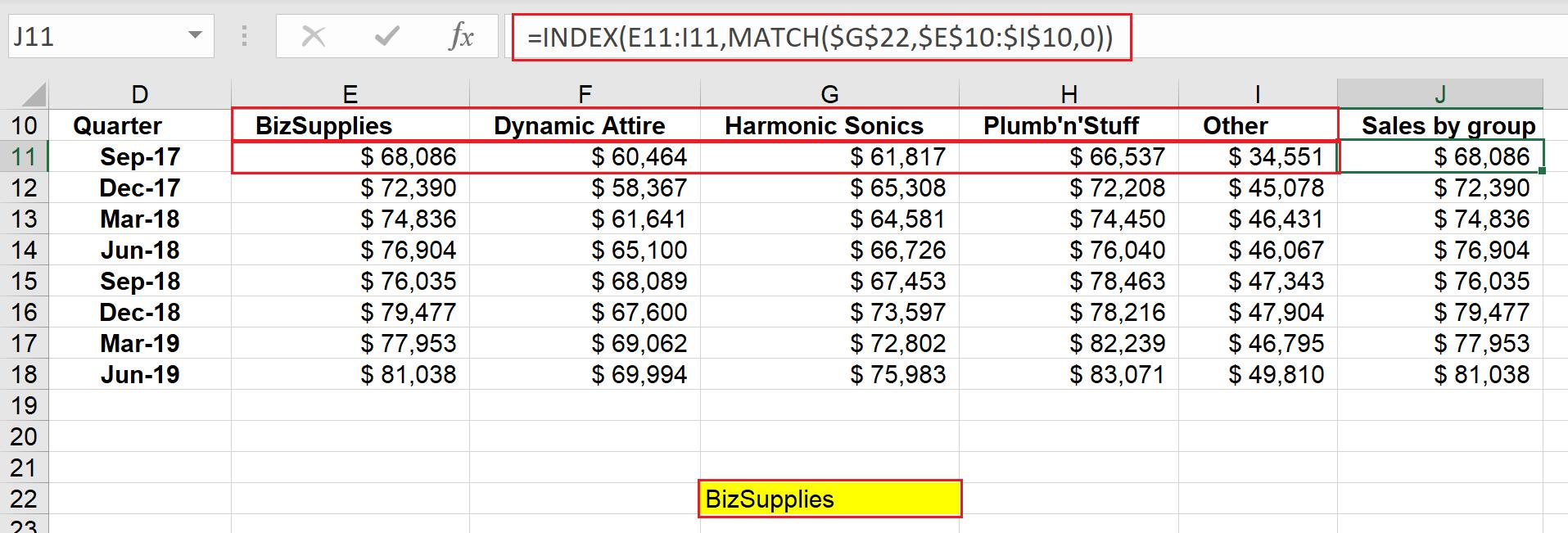
In the ‘Sales by group’ column, we now can use the INDEX and MATCH functions to get the sales figure, based upon the group we choose from the validation list. Similarly, the ‘Sales by group’ cell will pick one sales number from the sales array, if the validation cell matches with the product groups using an exact matching rule.
The formula in cell J11 is:
=INDEX($E11:$I11,MATCH($G$22,$E$10:$I$10,0))

Building interactive charts from data validation requires a few steps:
- Insert a chart using ‘Sales by group’ and Quarter
- Right-click on the horizontal axis, and choose Format Axis Option -> Text Axis to remove quarters with no data from the chart
- Right-click on the Chart Area, select Format Chart Area -> Fill -> No Fill and Border -> No Line
- Remove the Chart Title and type the alternative chart title on the cell next to the validation cell, then add some formatting to this title
- Drag the chart to the required position, then insert a shape with no fill to finish the chart formatting.
The chart should look like this once completed:

That’s it for this week, check back next week for more Charts and Dashboards tips.

