Charts and Dashboards: Line Charts
3 January 2020
Welcome back to Charts and Dashboards blog series. This week, we are going to look at Line Charts.
The Line Chart is one of the most frequently used charts. This is often necessary where many data points need to be visualised and it is arguably the simplest visualisation tool given that situation. The purpose of this type of graph is to demonstrate trends, typically over multiple time periods. Quite simply, the numbers within each data series are linked together by lines to show movements from one point to the next.
Excel provides a number of variations for Line Charts, including the use of markers, stacked and 3-D.

For example, I have sample sales data in two financial years by customer group:

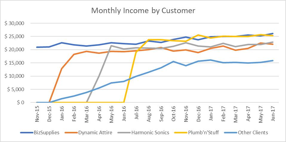
A simple line chart using the data above would look like this:

Now, let’s apply a few changes to improve this chart. Firstly, let’s add some character to the chart frame:
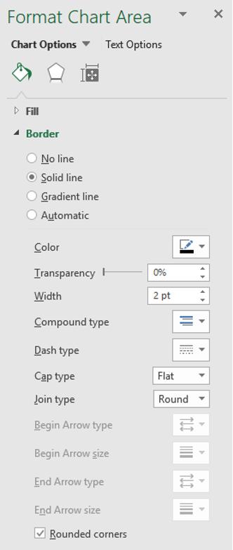
- Click on the ‘Chart Area’, then right-click and choose ‘Format Chart Area’
- Under Border, choose ‘Solid Line’, change the colour to black, set the width to two (2) point and at the bottom tick for ‘Rounded Corners’.

Next, my chart axes do not have titles (though admittedly they are pretty self-explanatory).
- Click on any element of the chart and there will be two new menus on the Ribbon under the heading of ‘Chart Tools’, being Design and Format
- Go to the Design tab and then click on the first button ‘Add Chart Element’ and pick ‘Axis Titles’, then ‘Primary Vertical’. The words ‘Axis Title’ will appear along the vertical axis
- Click on the words and change it to read ‘Income’. Increase the font from point 10 to 12 and make the title bold
- Also embolden the ‘Chart Title’ and change the font colour to black
- Repeat this process to add an ‘Axis Title’ on the ‘Primary Horizontal’ axis, label this ‘Month’ and also format it to point 12, black and bold.

Some final touches and the chart will be complete:
- Click on the ‘Chart Title’ and change it to black and bold
- Click on the vertical axis and change it to point 10, black and bold, then do the same for the horizontal axis
- Click on the Legend and change it to black and bold.
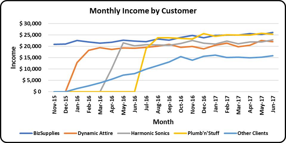
Finally, now I have a line chart with more impact!

It’s arguable whether we should embolden all (most psychologists would argue you should not), but remember, this is all for illustration purposes only!
That’s it for this week; check back next week for more Charts and Dashboards tips.

