Charts and Dashboards: Scatter Charts
14 February 2020
Welcome back to this week’s Charts and Dashboards blog series. This week, let’s look at Scatter Charts.
A Scatter Chart, or X Y Chart as it is otherwise known, simply maps one set of numbers against another set, typically with the purpose of trying to establish whether there is any correlation amongst the data that may be difficult to see by reviewing the raw numbers alone. These charts are used frequently by statisticians and scientists to visualise large volumes of data to see if any patterns exist.
Assume that I have a set of data from TransProduct on customers’ satisfaction and their transaction values as follows:

Looking at the table, it is already difficult – or almost impossible – for me to see any correlation between the two rows of data with 576 columns! (With regards to organising the data table, most people would not prepare the figures across a spreadsheet as illustrated above. Typically, this data should be arranged into two columns rather than two rows.) With a Scatter Chart, Excel is simply expecting two series so it can map one on the horizontal axis and the other on the vertical axis of the chart, so, it doesn’t mater how the data is prepared – Excel can work it out anyway!
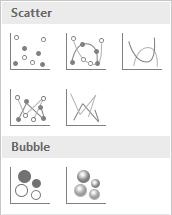
On highlighting the data, choosing ‘Insert’ then select the Scatter Chart icon, so I may get a few recommendations:

There are seven variations of the Scatter Graph. The first one is simply mapping each data point on the horizontal axis against the corresponding value on the vertical axis using a marker for each point. The next four are basically the same with the addition of smooth or straight lines, with or without markers. The last two under ‘Bubble’ section allows for a third data set, which is applied to determine the relative size of each bubble.
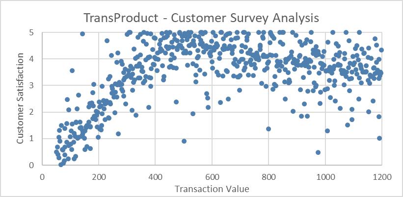
I choose the first variation and here is the corresponding chart:

It can be clearly seen from the chart that there is clustering occurring, starting very low in the bottom left corner, rising quite steeply as it moves along the horizontal axis, and then there is a spread of data points on the right side of the graph.
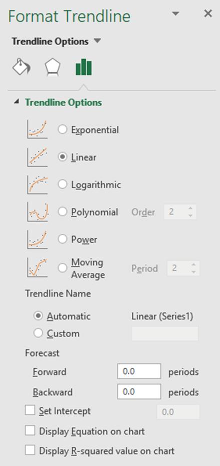
One of the strengths which I like in Excel is the ability to add trendlines to charts. A Scatter Chart is one of the best charts to apply trendlines to for analysis purposes. To add a trendline, I right-click on the data series and choose ‘Add Trendline’. This will add a linear trendline to the chart and the ‘Format Trendline’ panel will appear simultaneously.

‘Trendline Options’ offers me six different types of trendlines to pick, depending upon my purpose. Here I choose Linear, which is one of the most common trendlines used to create a single straight ‘line of best fit’ through the data. Another popular trendline is ‘Moving Average’ which calculates the average of a specified number of previous figures and creates a line plotting these averages.
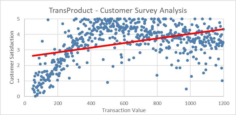
After I add a linear trendline to my chart and format it as solid red line, the chart now appears as follows:

I see the linear trendline does not align with my data: it only touches a few data points. But more on that anon…
That’s it for this week, check back next week for more Charts and Dashboards tips.

