Charts and Dashboards: Sparklines
9 October 2020
Welcome back to this week’s Charts and Dashboards blog series. This week, we will consider using sparklines when designing dashboards.
A sparkline is a tiny chart in a worksheet cell that provides a visual representation of data. Sparklines are used to show trends in a series of values, such as seasonal increases or decreases, economic cycles or to highlight maximum and minimum values.
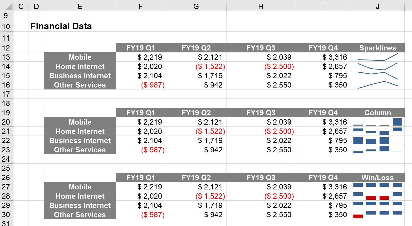
There are three types of sparklines:
1. Line: the Line sparkline summarises the data in small Line chart in a single cell
2. Column: the Column sparkline creates a miniaturised column chart of the data in a single cell
3. Win / Loss: the Win / Loss sparkline creates a miniaturised column chart that highlights positive and negative values in a single cell.
To illustrate sparklines, consider we have financial data for a store for the financial year 2019:

To insert a sparkline in cell J13, we select cell J13, navigate to the Insert tab on the Ribbon, and select the Line option from the Sparklines group:

The ‘Location Range’ is where we want the Sparkline to appear. This has already been filled out for us, as cell J13. We just have to select the ‘Data Range’, which will be cells F13:I13, and then click OK.

We can then drag the cell down as if we’re copying a formula:

The process for creating Column and Win / Loss Sparklines is similar; it is just a matter of selecting a different option from the Sparklines group in the Ribbon.

Sparklines provide a brief overview of your data, however as they are not as precise as charts, we only recommend they be used for users to “glance” at.
That’s it for this week. Check back next week for more Charts and Dashboards tips.

