Charts and Dashboards: Sparkling Sparklines Part 2
19 November 2021
Welcome back to our Charts and Dashboards blog series. This week, I continue my revisit of Sparklines.
The basics of Sparklines were covered in Charts and Dashboards Blog: Sparklines. I am revisiting the topic, let’s continue from where I left off last time:

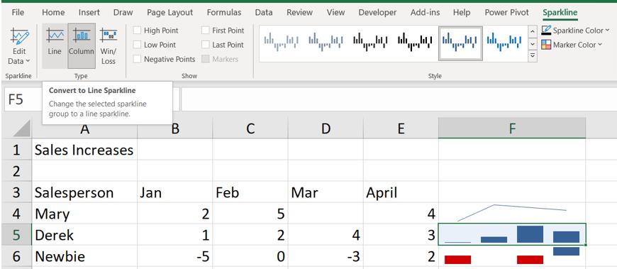
As before, I have some simple sales figures, and I have used an example of each type of Sparkline:
- F4 is a Line
- F5 is a Column
- F6 is a Win/Loss.
Last time, I looked at the dynamic nature of Sparklines and how they may be inserted and edited.
Once a Sparkline has been inserted, the Sparkline tab may also be used to change the type of Sparkline. I can change the type of Sparkline for Derek from Column to Line, for example:

The same dataset is used:

I add some more columns to the data and edit the Sparklines to include the new columns.

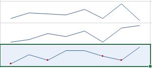
When I change Newbie’s Sparkline type to Line, something interesting is added:

The negative points on the Win/Loss type are now red dots on the Line. The reason for this may be found in another section on the Sparkline tab.

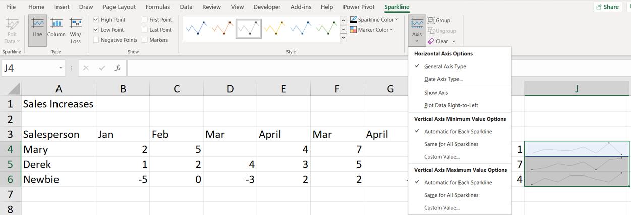
There is a section called Show and one called Style. These are linked, and I can see that since ‘Negative Points’ is ticked, I see dots on the Line in Style. I can change the values in Show to see the ‘High Point’ and ‘Low Point’ instead. I do this for all the Lines at once by selecting all the Sparklines:

I can also change the Style for all the Lines:

Making the Line lighter makes the points stand out more.
The Sparkline for Newbie looks quite similar to those for the other salespeople. I can make them easier to compare by showing the Horizontal Axis. This is available from the Axis dropdown.

This makes it more obvious that Newbie is not achieving the same results as the others:

I can also have issues comparing data if each of the Sparklines have their own Axis maximum and minimum values. Consider the following data:

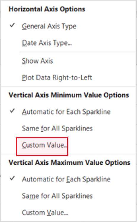
The charts for Mary and Derek look very similar, but that’s not fair on Mary. Going back to the Axis dropdown, I can customise the Vertical Axis to change the minimum value:

I want to set the minimum value to zero [0]:

I am only doing this for Derek and Mary. I also set the maximum value to 10:

When I click OK, the columns on Mary’s Sparkline look noticeable taller:

The monotonic effect is because I still have the ‘High Point’ and ‘Low Point’ highlighted and the style I picked for the Line Sparklines. I can turn the Show options off and pick another Style from the Sparklines tab, and change the ‘Sparkline Color’ to red:

Now Mary’s achievements stand out from the rest:

That’s it for this week. Come back next week for more Charts and Dashboards tips.

