Charts and Dashboards: Symbol Charts – Part 2
23 October 2020
Welcome back to this week’s Charts and Dashboards blog series. This week, we will continue to talk about Symbol Charts in dashboards.
Last week, we introduced symbols and how to add such icons to a dashboard table:

Now, we will see how to create a chart from this data with the symbols attached.
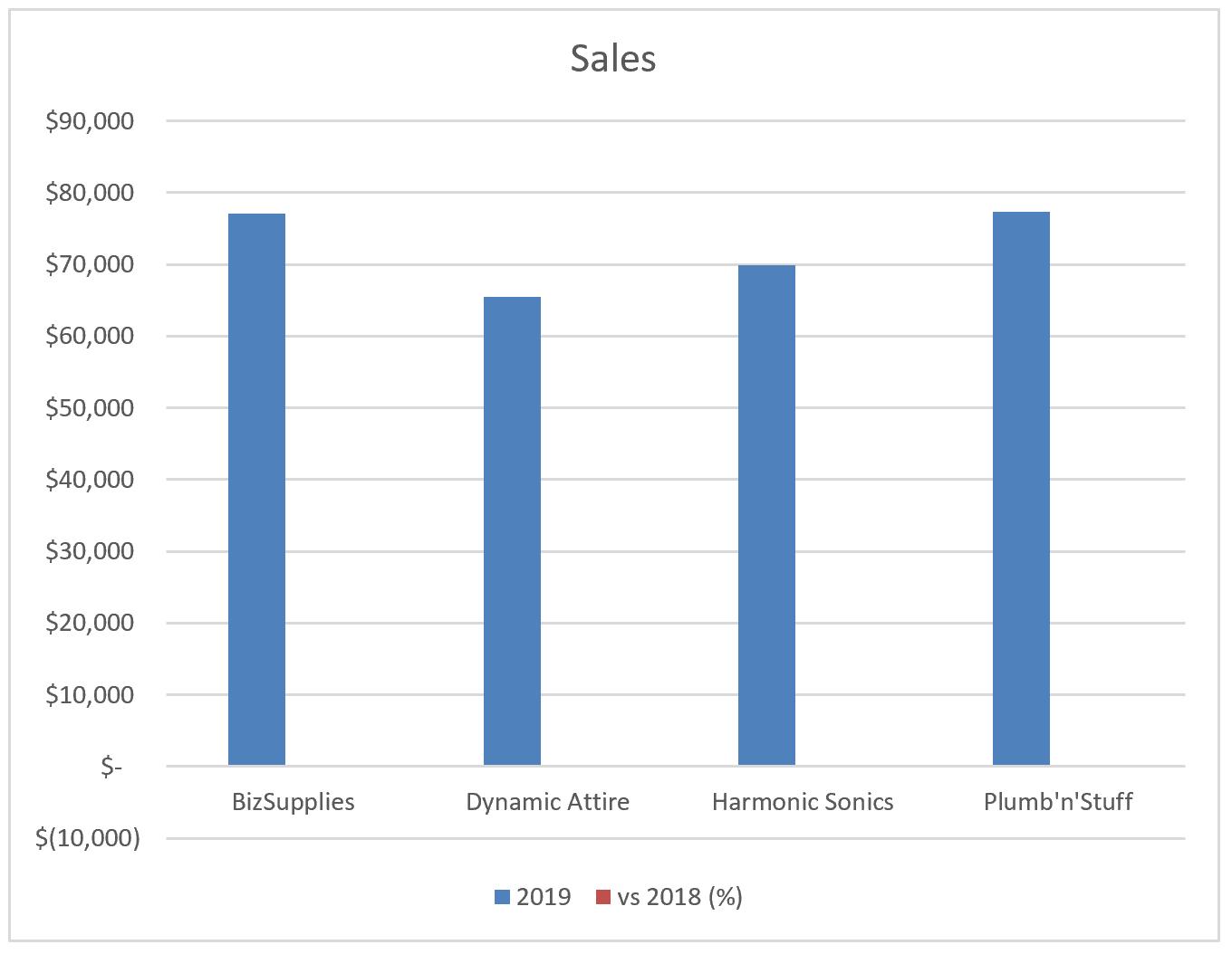
First, we choose the data area and select the Column chart. The chart initially appears like the one below. There are no icons shown here, while the ‘vs 2018 (%)’ series appears to be unnecessary in the chart (because they are too small to see!).
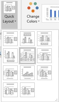
We can add the data table via Chart Tools - > Design - > Quick Layout to include the table with icons:
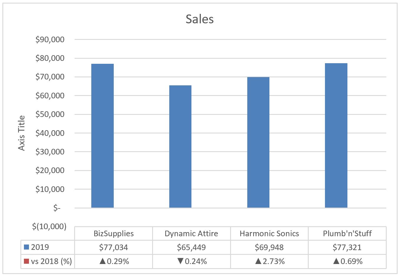
The chart now appears as below. The series ‘vs 2018 (%)’ is still there, but it is still just too small to see, viz.
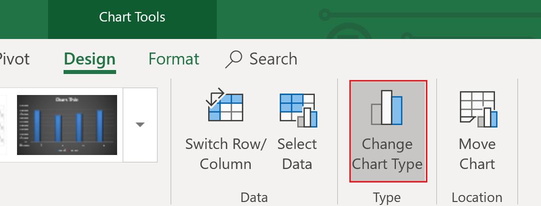
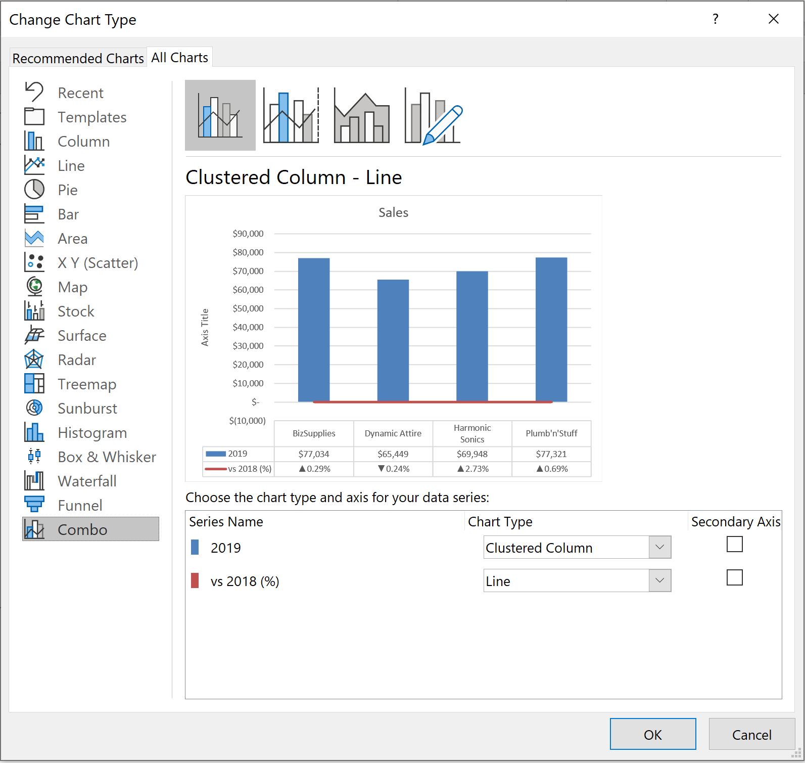
To exclude the ‘vs 2018 (%)’ series from the chart while still keeping the data in the below-chart table, we can go to Chart Tools - > Design - > Change Chart Type:
In the pop-up window’s ‘All Charts’ tab, choose the last item, Combo. We set the chart type of ‘vs 2018 (%)’ to be a Line, and finally, we can now see a line on the chart. Click OK.
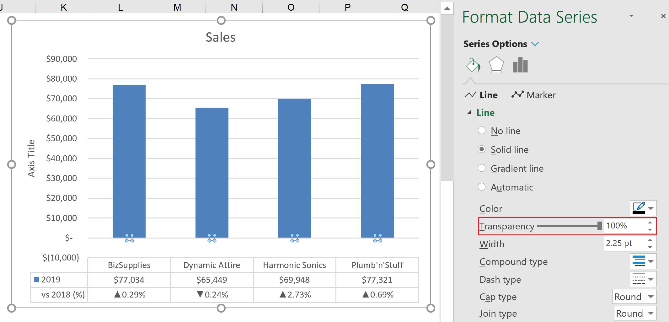
To make it invisible on a chart, click on the line and go to ‘Format Data Series’. In the Line section, set the Color (sic) to White and Transparency to 100%. The line should now be invisible:
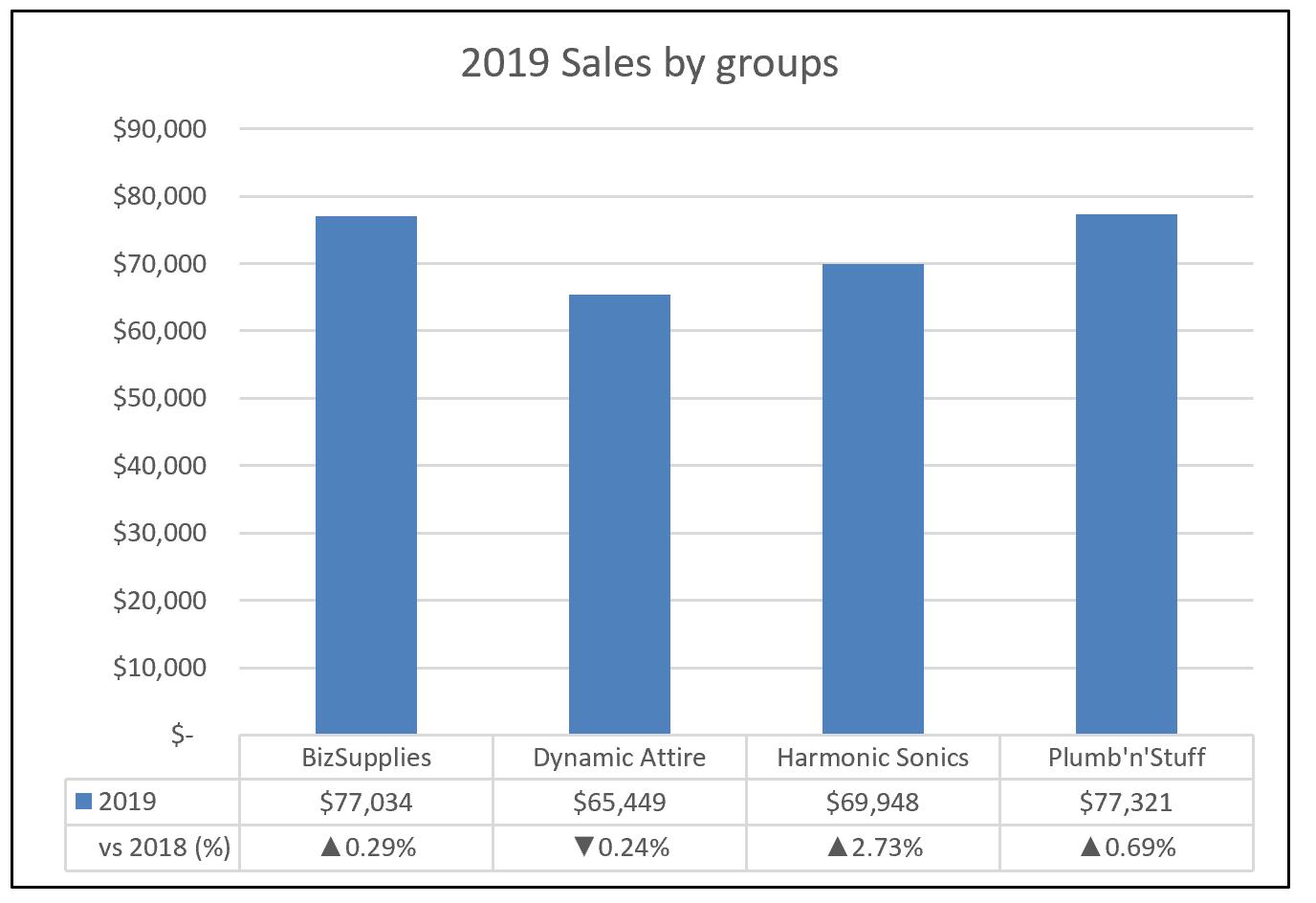
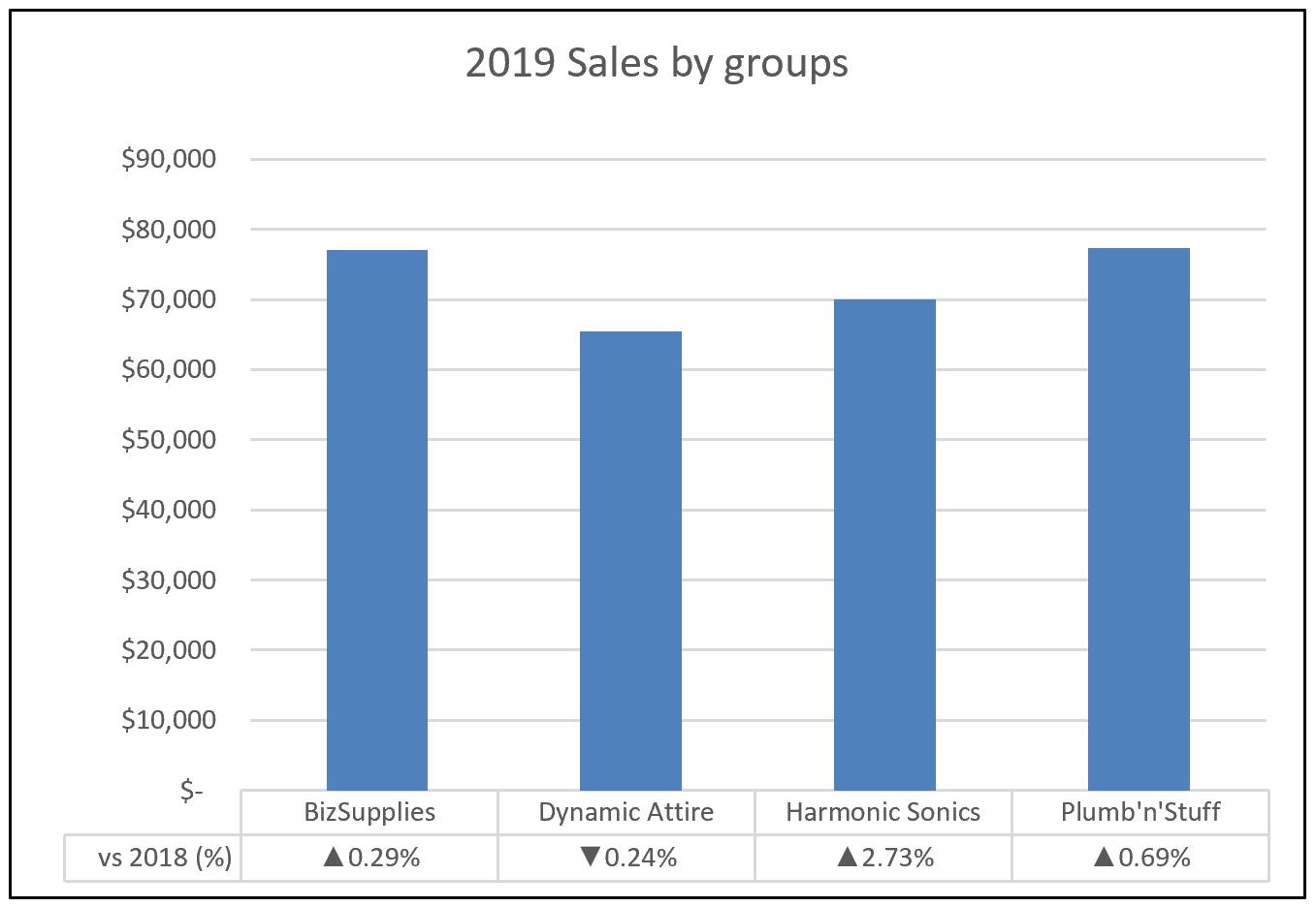
We may now modify the chart title, remove the axis title and set the vertical axis to minimum of zero (0) (since the ‘vs 2018 (%)’ series includes a negative number, the initial chart is shown to $(10,000)). Then we can change the chart design as we wish. The chart is now showing both values and icons, making it easier to understand the data.
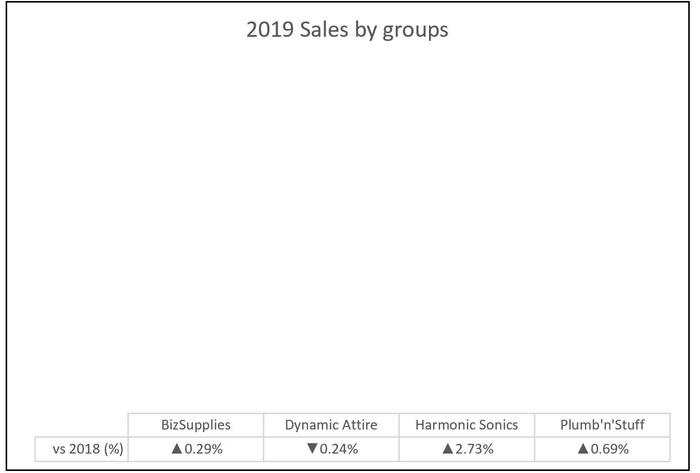
There is a trick that we can employ to remove the ‘2019’ row from the associated data table. That is, we want to see the sales columns only and how sales increase / decrease compared to the year 2018.
To do this, we duplicate the chart. In one of them, we remove the ‘2019’ series and its axis. The chart is now empty, as illustrated below:
In the other chart, we remove the ‘vs 2018 (%)’ series, as well as the horizontal axis, chart title and data tables. We also need to format the Fill and Border to be ‘No fill’ and ‘No line’ respectively. The chart should now look like this:

We now drag the column chart to fit on the empty chart with the data table, so that the columns and legend match. We now have our desired chart:
That’s it for this week. Check back next week for more Charts and Dashboards tips.

