Charts and Dashboards: Thermometer Chart Part 2
5 November 2021
Welcome back to our Charts and Dashboards blog series. This week, I finish creating a Thermometer chart.
The results have come in for last year's sales for three of my imaginary salespeople.
![](http://sumproduct-4634.kxcdn.com/img/containers/main/blog-pictures/2021/cd/079/image1.png/e774d10cbbb9450fc45efbe51abdf434.jpg)
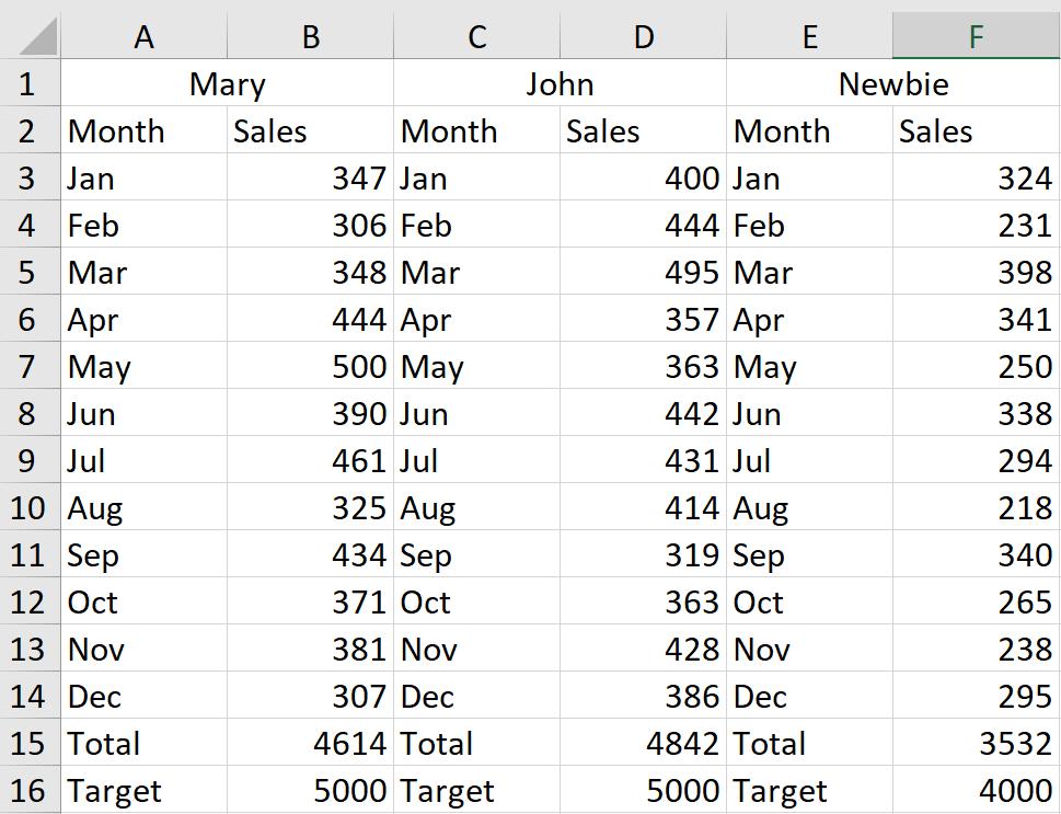
I would like to be able to see at a glance how well they are doing against their targets. There are several ways I could do this, but I have chosen to create a Thermometer chart for each salesperson.
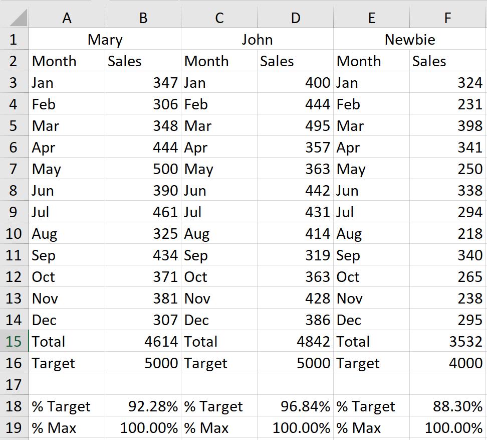
Last time, I added two new rows.
![](http://sumproduct-4634.kxcdn.com/img/containers/main/blog-pictures/2021/cd/079/image2.png/f32e5a15e2cf9c3e4d2d058458ce054d.jpg)
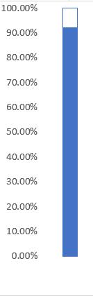
I then started creating a chart for Mary.
![](http://sumproduct-4634.kxcdn.com/img/containers/main/blog-pictures/2021/cd/079/image3.png/f1140ff857fc3b6f5f97a6a24f4a6fc7.jpg)
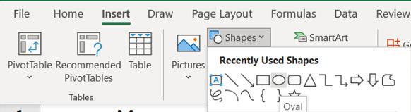
To make it look more authentic, I can add an oval from the ‘Insert Shape’ area on the Insert tab:
![](http://sumproduct-4634.kxcdn.com/img/containers/main/blog-pictures/2021/cd/079/image4.png/72aa864d2854c6fefb1083fba0ab5792.jpg)
I add this to the bottom of my chart:
![](http://sumproduct-4634.kxcdn.com/img/containers/main/blog-pictures/2021/cd/079/image5.png/36776d1da4d05b45bb5a5d09375f407c.jpg)
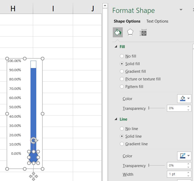
I can use the ‘Format Shape’ pane to set Line to ‘No line’.
![](http://sumproduct-4634.kxcdn.com/img/containers/main/blog-pictures/2021/cd/079/image6.png/23912d3b1671861e02bebcd5183f1607.jpg)
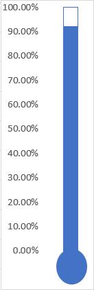
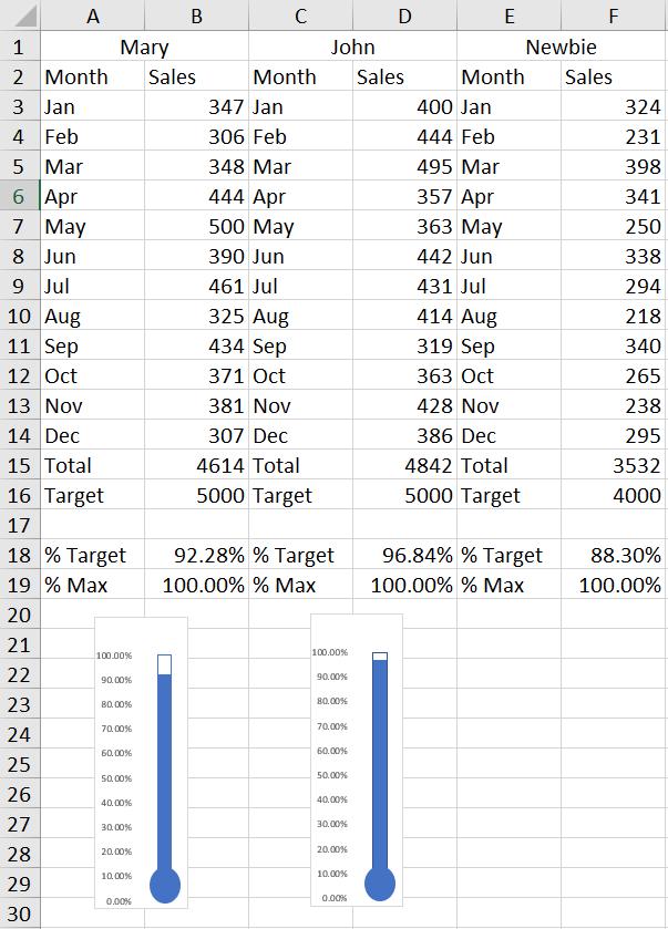
Mary’s chart is done! I move it underneath Mary’s data, and copy the chart for John. I need to change John’s chart to point at his data, so I choose ‘Select Data’.
![](http://sumproduct-4634.kxcdn.com/img/containers/main/blog-pictures/2021/cd/079/image7.png/6f49c288a0d88a66b427eaf4ece923d6.jpg)
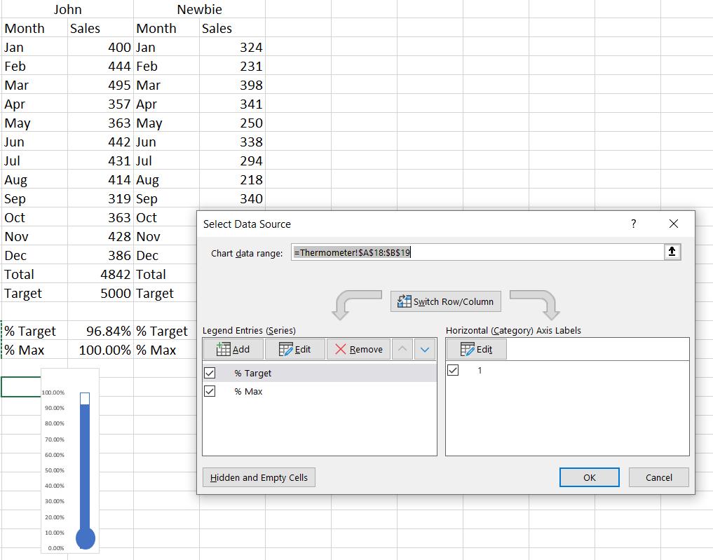
I can then choose the data for John:
![](http://sumproduct-4634.kxcdn.com/img/containers/main/blog-pictures/2021/cd/079/image8.png/b9ee28d90e6b5bc92ea4aeafdad51628.jpg)
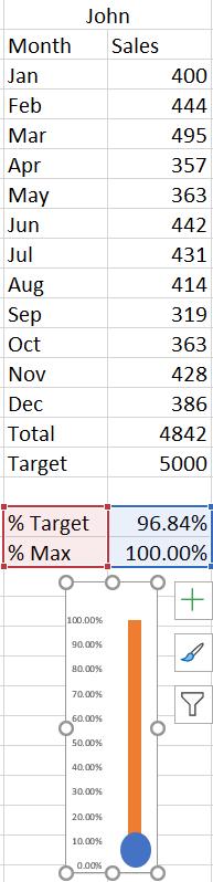
Unfortunately, Excel has tried to help by making sure I can see the % Max series! To undo this, I right-click on the bar and go back to the ‘Format Data Series’ pane:
![](http://sumproduct-4634.kxcdn.com/img/containers/main/blog-pictures/2021/cd/079/image9.png/0485ccbc83bdeec1d741bad442a1ea5f.jpg)
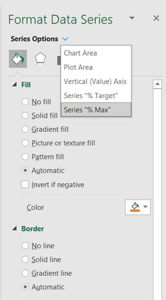
I check I am in the right Data Series, and then reset the Fill and Border to ‘No fill’ and ‘Solid line’.
![](http://sumproduct-4634.kxcdn.com/img/containers/main/blog-pictures/2021/cd/079/image10.png/daf8c4f0259ce428269c0d3d4badd32b.jpg)
That’s much better! Now I repeat the process for Newbie:
![](http://sumproduct-4634.kxcdn.com/img/containers/main/blog-pictures/2021/cd/079/image11.png/22c6daeb82d7d69ac88f878227e04b28.jpg)
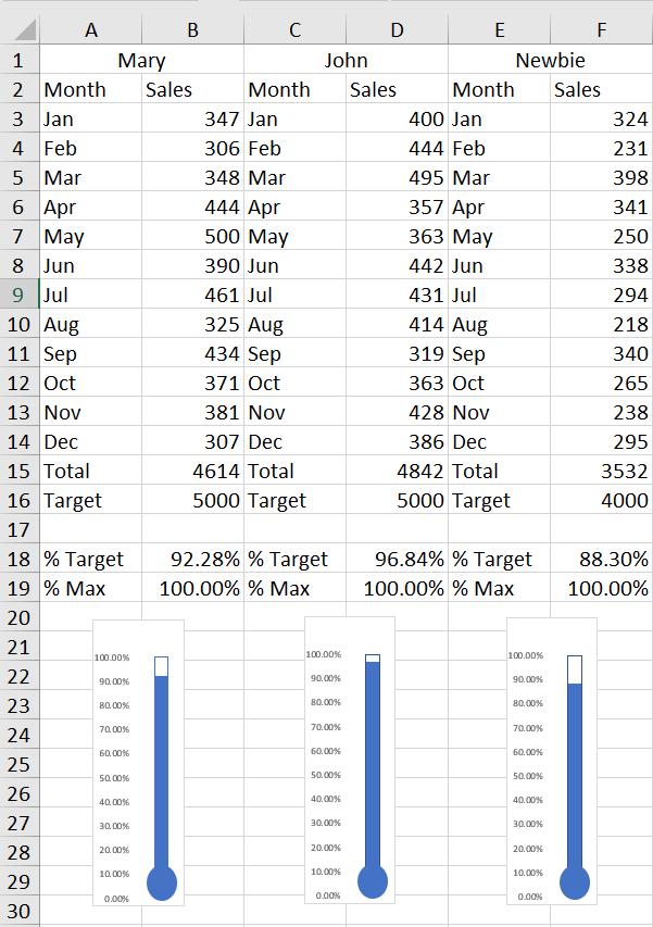
Now it’s easy to see how everyone is doing: Newbie needs to catch up!
That’s it for this week. Come back next week for more Charts and Dashboards tips.