Charts and Dashboards: Waterfall Charts – Part 2
1 May 2020
Welcome back to this week’s Charts and Dashboards blog series. This week, let’s continue to look at Waterfall Charts.
Last week, I was discussing Waterfall Charts (available in Office 2016 onwards, otherwise please consider referring to this Thought article on Waterfall Charts), in order to show the positive and negative movements that lead from a starting value to an ending value.
I had the budget and actual profit broken down into cost items of a company:
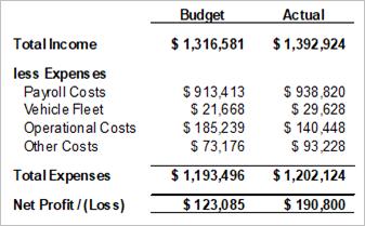
Then, I created an initial Waterfall Chart, like the one below:
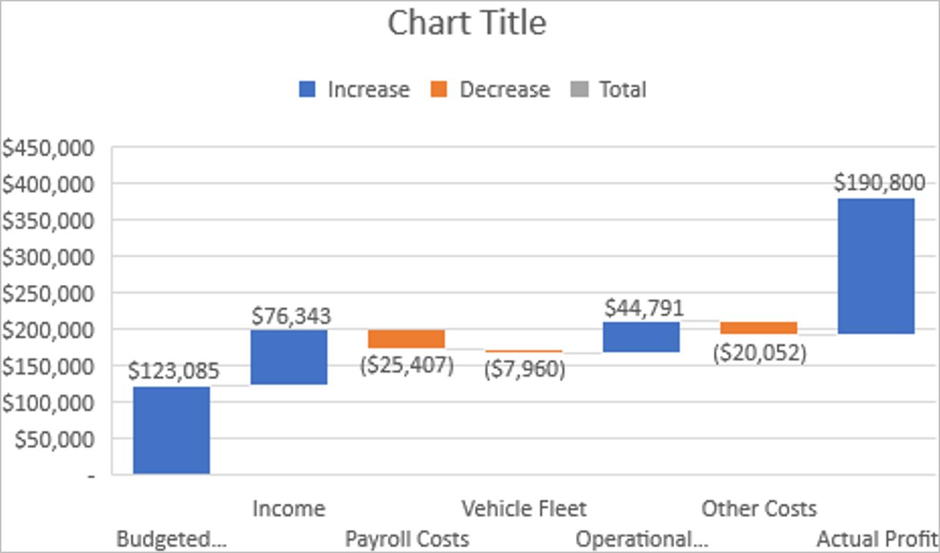
This chart doesn’t look that nice at the moment; you could argue there are a few more steps to finalise this Waterfall Chart.
The legend indicates that blue columns reflect increases, orange columns reflect decreases and grey columns indicate totals – but there are no grey columns. I need to tell Excel that the budgeted profit and the actual profit figures are the starting and ending values respectively and therefore set them as totals. To do this, I click on the data series in the chart and then specifically click on the blue column relating to budgeted profit. I notice that all the other columns fade in colour and the budgeted profit remains in full colour. I right-click on the budgeted profit column and choose ‘Format Data Point’, under ‘Series Options’, tick the box ‘Set as total’.
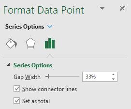
The budgeted profit column should now turn grey indicating it is a total. With the ‘Format Data Point’ panel still open, I now click on the actual profit column. This column should now be the only one in full colour. Again, I tick the ‘Set as total’ option and this column should also turn grey. I will also notice that this column has now dropped on the chart so that it touches the horizontal axis.
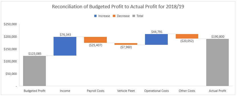
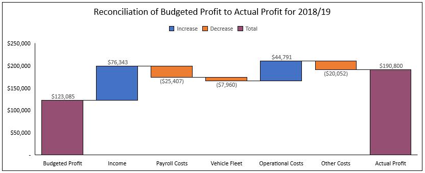
This chart portrays visually the same information as the summary Profit & Loss Statement prepared by accounting but enables the viewer to understand the information quicker and more simply. Basically, from the budgeted profit figure I started with, the company made more income than expected and saved on Operational Costs, however it did spend more on the other expense categories, though this unplanned additional expenditure could be the result of earning so much more income... but that analysis is for management to work their way through!
In case you were wondering, Excel has deliberately used blue and orange instead of the “more traditional” colours of green and red, purely because blue and orange overcome issues for people who may have colour vision deficiencies.
Finally, let’s add some formatting to complete the chart.
The grey columns are a little boring, so let’s change them to purple (hoping everyone may still distinguish the colours!). Sounds simple but this is actually more complex than it appears. If I specifically change the two profit figure columns to purple, this will not change the colour for the series, so the legend will not reflect the change made. As far as Excel is concerned, the colour for the totals is still grey – When I change the colour of two particular columns, it is not changing the setting for the series. In the Series Options setting, it is only showing one fill that can be applied to the series, so how does Excel know to colour increases in blue, decreases in orange and totals in grey?
The answer lies in the colour settings for Excel. I go to the ‘Page Layout’ tab on the Ribbon, click on the arrow next to Colors and choose ‘Customize Colors…’. Here, Accent 1, Accent 2 and Accent 3 contain the settings for the three colours in the Waterfall Chart. If I want to change the colours for the chart, I will modify them here. I am happy with blue and orange, but I want the totals in purple, so I change Accent 3 to purple, give this modified colour scheme a name at the bottom of the window like “Waterfall Colour” and click OK. The new colour scheme will be reflected on the chart (If it doesn’t, just click once on the chart for the change to take effect).
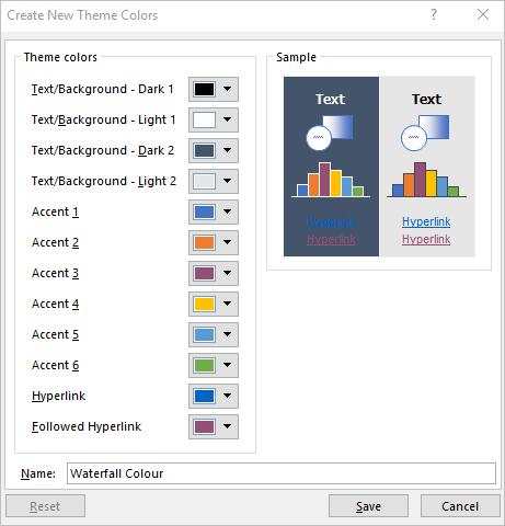
I changed the font colour of all chart element to black and get them bordered. The finished product looks as follows:
That’s it for this week, check back next week for more Charts and Dashboards tips.

