
Charts and Dashboards: Working Capital Adjustment Chart
8 January 2021
Welcome back to this week’s Charts and Dashboards blog series. This week, we will illustrate how to create a Working Capital Adjustment chart.
When modelling working capital adjustments, a chart is useful to facilitate the presentation of cash flow figures against existing profit and loss projections. For reference, you can download the Excel file used for this blog.
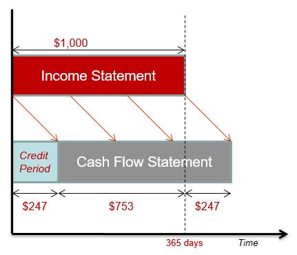
This time, we will see how we can create a Working Capital Adjustment chart, by using the example data (below).
To create the scroll bar, go to the Developer tab on the Ribbon (which you may need to install using Tools -> Options -> Customize Ribbon and then check the Developer tab in the ‘Main Tabs’ section). From Insert, choose ‘Scroll Bar (Form Control)’ and draw a scroll bar box next to the ‘Days Receivable’ cell (holding the ALT button down makes the graphic “snap to grid”):
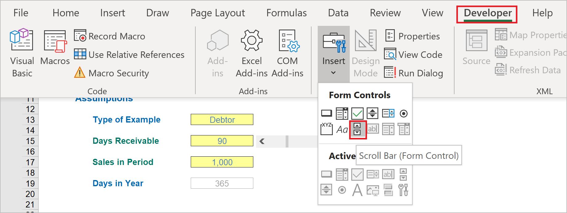
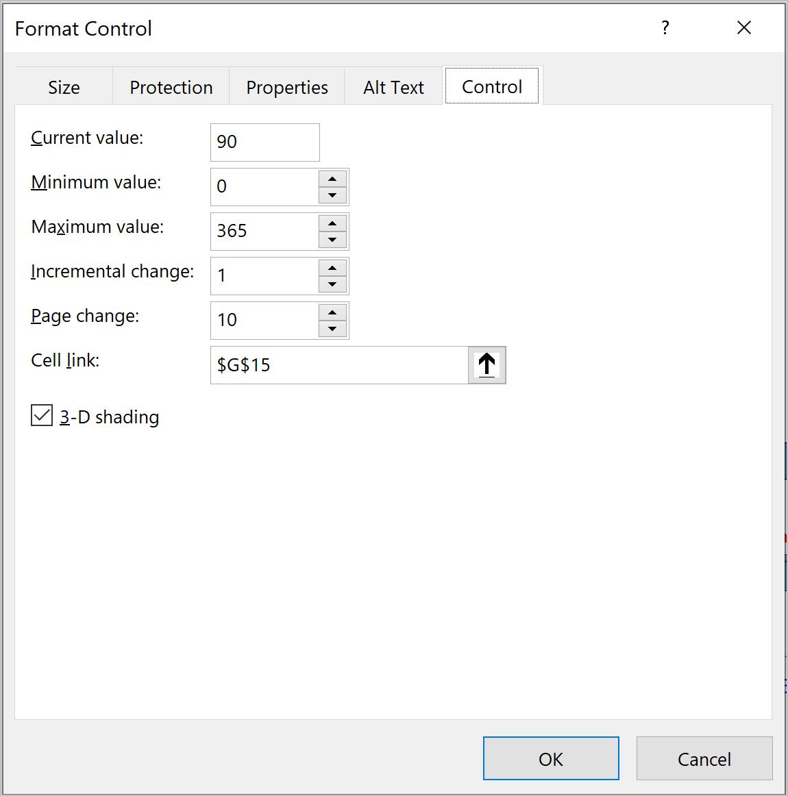
Then, right-click on the scroll bar box, choose ‘Format Control’ and link the ‘Days Receivable’ cell, cell G15, whose value will adjust as we adjust the scroll bar.
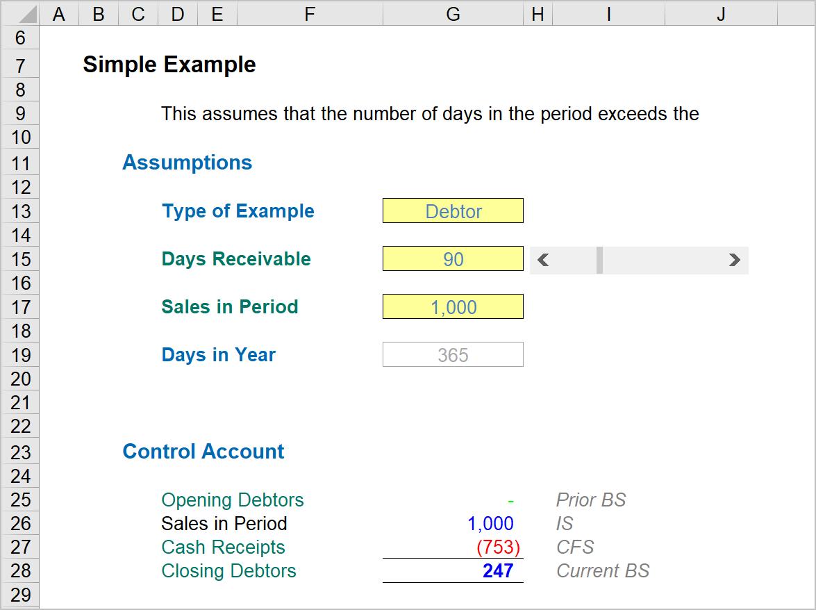
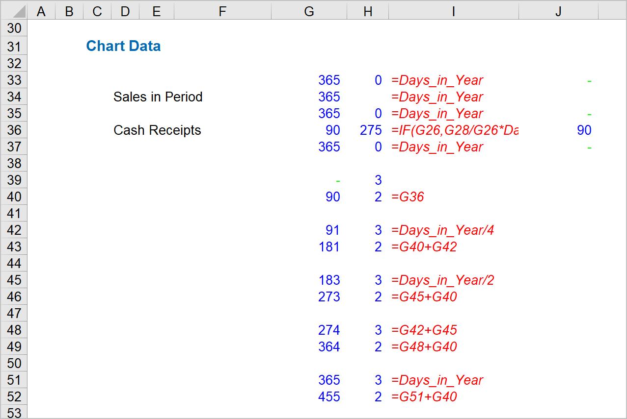
We need to prepare the data that can be used in the chart similar to below. The formulae for the calculated cells in columns G are noted down in column I.
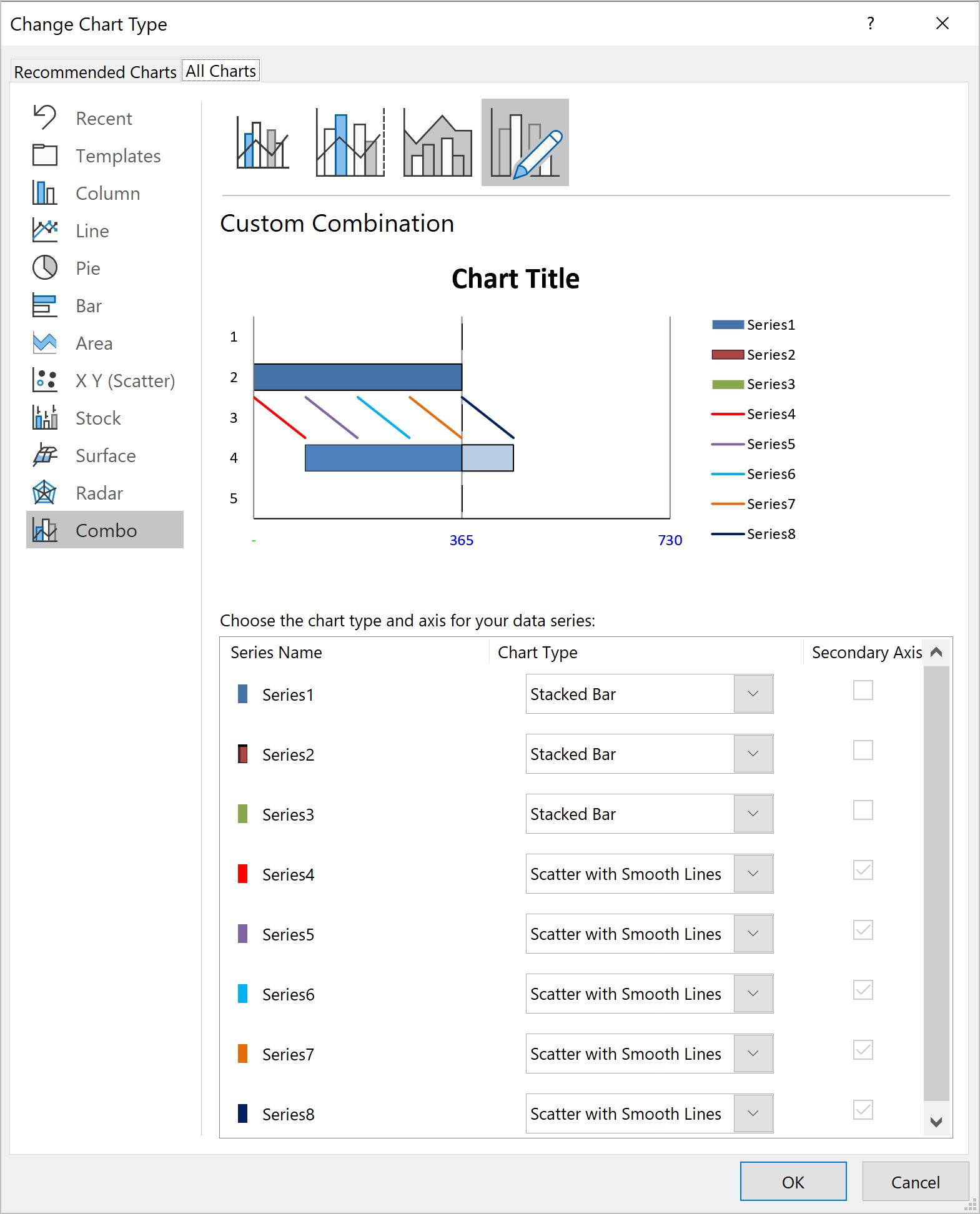
Next, highlight all the group of chart data cells in column G, H and J to create a Bar Chart. Then from the ‘Chart Design’ tab on the Ribbon, choose ‘Change Chart Type’. Here, keep the Series 1, 2 and 3 as ‘Stacked Bar’ and change Series 4 to 8 to ‘Scatter with Smooth Line’.
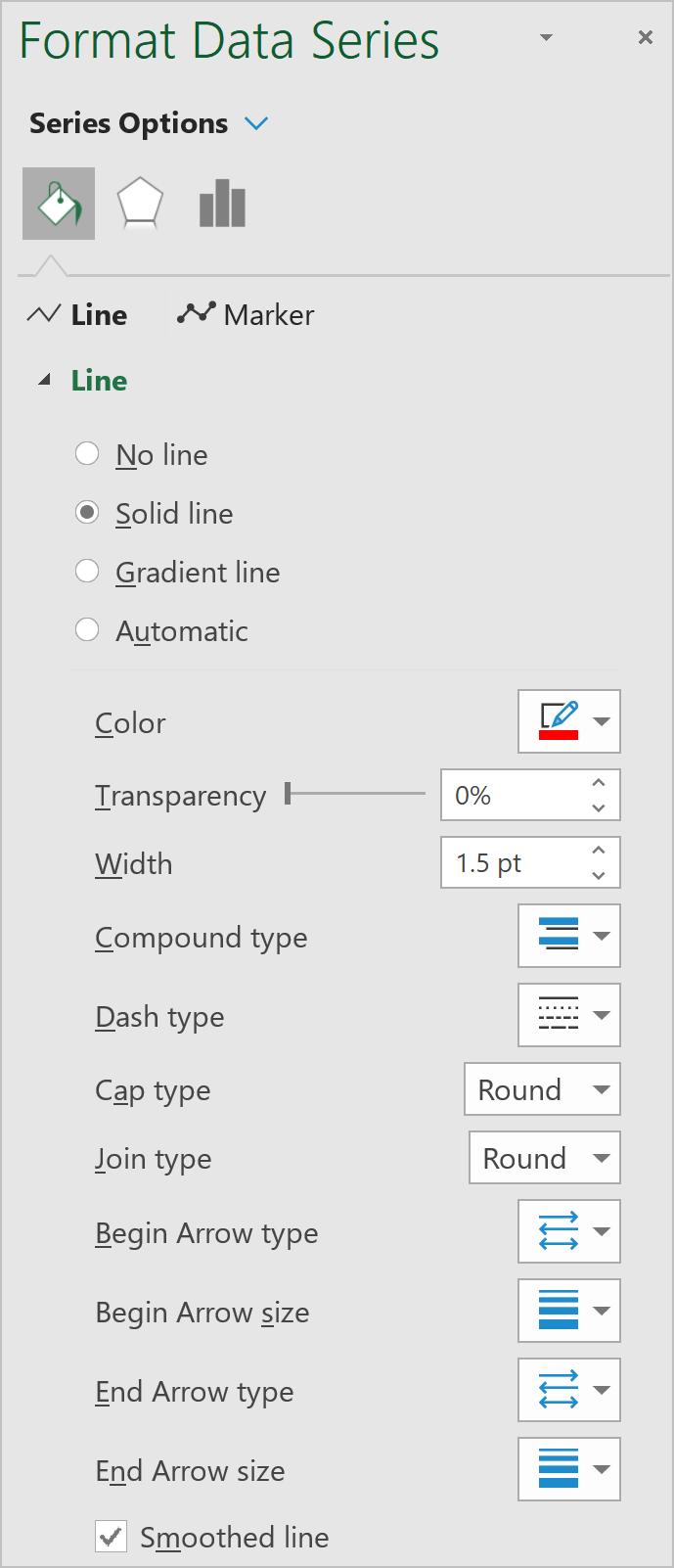
Right-click on Series 4, choose ‘Format Data Series’, here change the Color, Dash type, Begin / End Arrow type, and repeat the same format settings for Series 5 to 7.
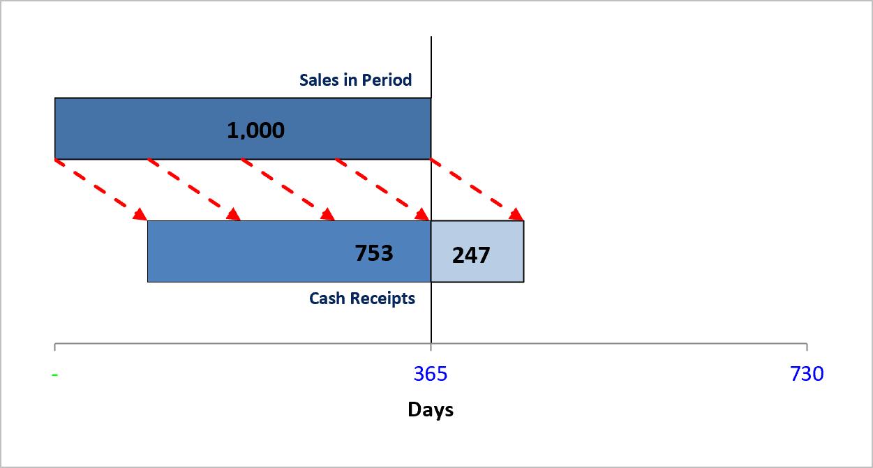
Finally, remove the chart title, add dynamic labels to enhance the chart information and the chart is done!
That’s it for this week. Check back next week for more Charts and Dashboards tips.