Charts and Dashboards: Vertical Raincloud Chart Part 2
16 December 2022
Welcome back to our Charts and Dashboards blog series. This week, we’re continuing to look at how to make a bespoke Vertical Raincloud chart by creating the second of three charts that we will need.
The Vertical Raincloud chart
Are you looking for a new way to present your data? Meet the Vertical Raincloud chart.
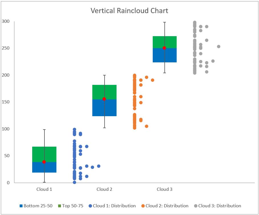
This chart shows three [3] clouds, we will start by showing how to create a chart for just one cloud.
We will need to combine three [3] charts:
- a Scatter chart for our data point distribution
- a Stacked Column chart for percentile analysis
- a Scatter chart for our error bar.
We will illustrate how to construct each of these charts and later merge them together to create the Vertical Raincloud chart. Last week, we constructed the Scatter chart for our data point distribution.
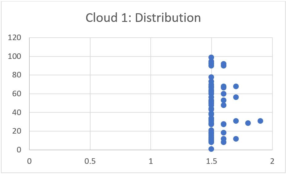
This week, we’ll create the Stacked Column chart for percentile analysis.
Stacked Column chart for percentile analysis
To create this chart, we will use the Percentile_Tableand the Stacked_Column Tables:
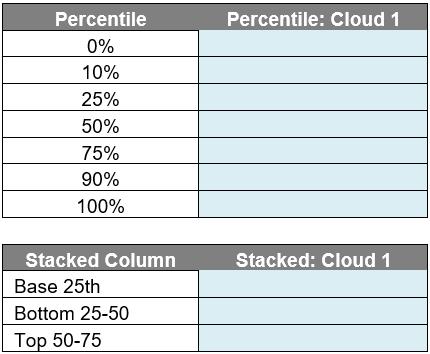
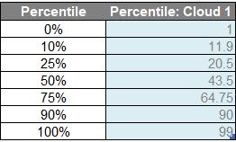
In the Percentile_Table, we will enter the following formula in the ‘Percentile: Cloud 1’ column to get the percentile of the data:
=PERCENTILE(Cloud[Cloud 1], [@Percentile])
This will give us a table where 0%, 10%, 25%, 50%, 75%, 90% and 100% percentile for Cloud 1.
Next, we will be using this table to calculate the Stacked_Column. Note that automatic calculated columns needs to be turned off to allow difference formulae in this table:
- the ‘Base 25th’ row will be equal to the 25% percentile of Percentile_Table (K15)
- the ‘Bottom 25 -50’ row will be equal to the 50% percentile (K16) minus the 25% percentile (K15) from the Percentile_Table
- for the ‘Top 50-75’ row, it will be equal to the 75% percentile (K17) minus the 50% percentile (K16) from the Percentile_Table
We will have the following table after we finished our calculations:

We select whole Stacked_Column table and we go to the Insert -> Charts -> 2-D Column -> Stacked Column.
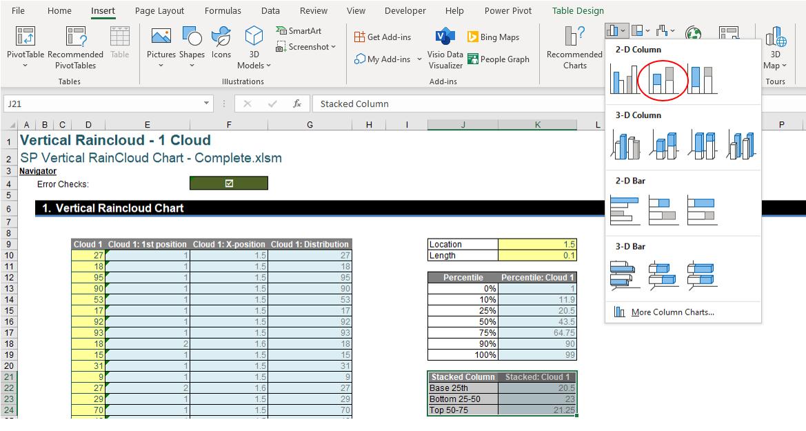
After selecting the chart, we will have the following visual:
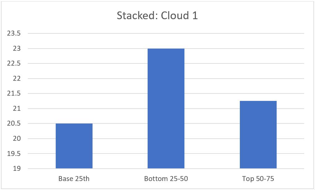
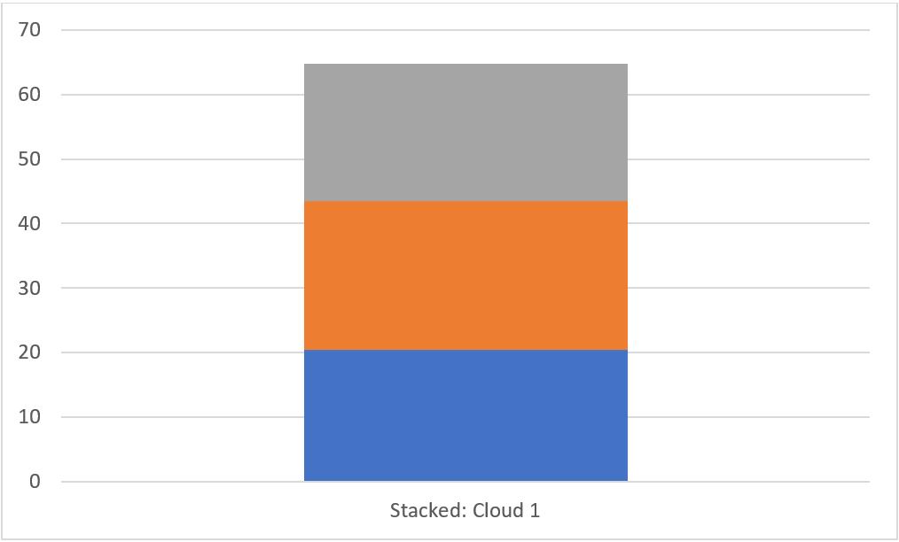
This isn’t the right stacked column chart that we want! We need to select the chart and go to Chart Design -> Data -> ‘Switch Row/Column’. This will turn our Column chart into a Stacked Column chart like this:
We then click on the plus sign on the right side of the chart to select the legend for this chart.
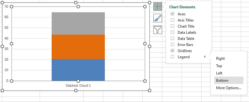
This will create the legend for our stacked column chart:
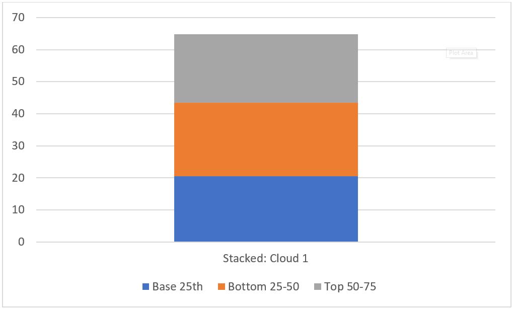
That completes the Stacked Column chart, next time we’ll look at the final chart we need, the Scatter chart for the error bar.
That’s it for this week, come back next week for more Charts and Dashboards tips.

