
Excel for Mac: PivotCharts
19 July 2024
This week in our series about Microsoft Excel for Mac, we discuss PivotCharts, which have a few differences when compared to Excel for Windows.
PivotCharts weren't always available on Mac
If we wrote this article several years ago, we could have simply said that PivotCharts aren't available in Excel for Mac. The good news is that PivotCharts were added to Mac back in 2018. That's around the time Microsoft started working hard to unify the experiences of Excel on Mac and Windows. Even though there still are quite a few differences across the platforms, most of them are less impactful and important than before 2018.
Better than on Window?
Even better news is that what's missing from Mac with regard to PivotCharts is something that many people take extra steps to hide when using PivotCharts on Windows. These are known as "field buttons", which you can see highlighted in the screen shot below.
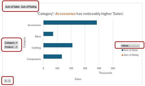
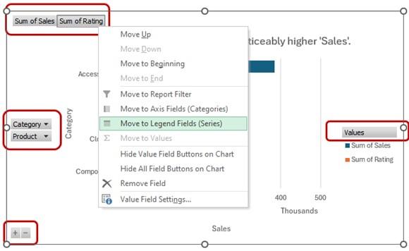
The field buttons allow you to modify the PivotTable that your chart is based on. You can move fields between the Axis (Categories), Legend (Series), Filter or Values fields. You can also use the buttons to sort and filter the data, or expand/collapse data that's grouped. The screen shot below shows the menu that appears if you right-click one of the buttons.
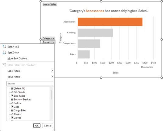
Below is another screen shot, showing the Sort and Filter dialog that appears if you click on one of the buttons for a field that’s in the Category fields of your PivotChart.
These buttons are simply not available in Excel for Mac, but that doesn't mean you can't control the layout and data on your PivotChart as well on Mac as you can on Windows. Many people, including me, choose to hide these buttons on Windows, because they take up space on your chart and they often don't look nice, since you have no control over the style of the buttons.
Even Microsoft chooses to hide the buttons in some cases. If you use the Analyze Data feature, and pick a suggested PivotChart to insert, it will be inserted with the buttons hidden.
"How to" for Mac
Again, the good news is that even without these buttons, you still have full control of which fields appear in which area of your PivotChart. There are several ways to accomplish what you need to do:
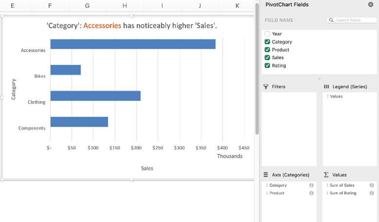
- Use the PivotChart Fields pane. To control which fields appear in each section, you can drag/drop the fields just as you do with a PivotTable.
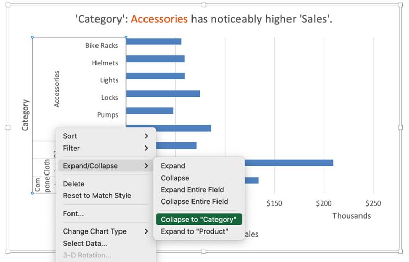
- Use the context menu (right-click) for an element in the chart. As shown below, you can right-click on part of the chart, and you’ll see options such as Sort, Filter, and Expand/Collapse. These actions are the same as what you could do if you had the buttons on the chart. The screen shot below shows how you could collapse the selected field, Category.
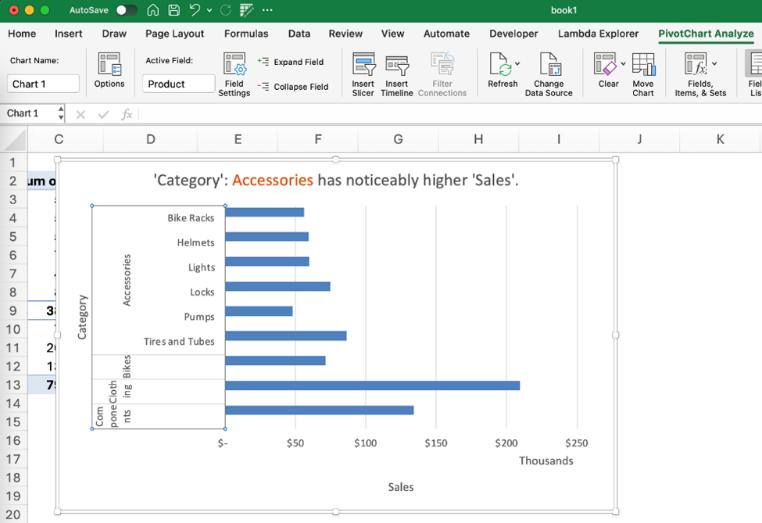
- Use the ribbon buttons. As you can see in the screen shot below, if you select a field in the chart, you can do actions like “expand field” or “collapse field” by using the buttons on the PivotChart Analyze tab of the ribbon.
- Modify the PivotTable that the chart is connected to. On Mac, there's no way to insert a PivotChart without also having a PivotTable that it's based on, so there's always a PivotTable that you can modify to adjust which fields are in which are of the table and chart. On Windows, it's possible to insert a PivotChart without a PivotTable, but only if your data has been added to the Power Pivot data model. Without using the data model, you must have a PivotTable that the chart is connected to.
TIP
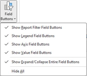
Tell your friends and colleagues who use Excel on Windows how to remove the buttons from their PivotCharts. Use the Field Buttons menu on the PivotChart Analyze tab of the ribbon. They'll thank you later.
We hope you found this topic helpful. Check back for more details about Excel for Mac and how it’s different from Excel for Windows.