
Power BI Blog: Considering Custom Shape Map
15 August 2024
Welcome back to this week’s edition of the Power BI blog series. This week, we look at the Custom Shape Map.
Why Use Custom Shape Maps?
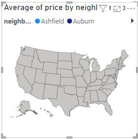
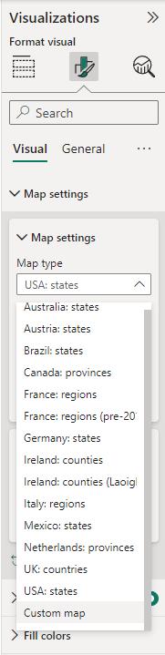
When using Shape Maps in Power BI, the available map types may not always suit specific needs. For example, there might be a requirement to illustrate housing data for each neighbourhood in Sydney, but Power BI’s default options only allow mapping Australia by states:
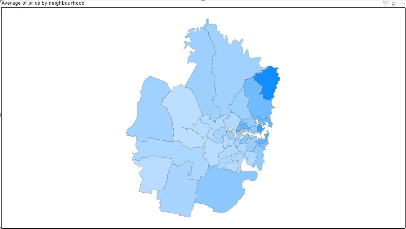
Hence, to circumvent this limitation, the Power BI give us an option to have our own Custom map. Using this option, we can have a simple map of neighbourhood in Sydney that look like this:
Let’s dive in our step-by-step guide to make this map:
Step-by-Step Guide to Creating a Custom Shape Map
Step 1: Prepare Files
To create a Custom Shape Map, we will need a shape file (.shp) or a TopoJSON file that defines the boundaries of the custom regions. If we don’t have a pre-made shape file, we can create one using tools like Mapshaper, which allows us to draw and edit shapes. In this example, we will use 2 files from “Sydney Airbnb Open Data” dataset from Kaggle which we have transformed and converted into suitable format. You can download the example files by clicking here.
A small note we have here for you that Power BI prefer TopoJSON format for better compatibility and performance. Thus, if you have .shp you can use Mapshaper to convert it in TopoJSON.
If you are creating your own custom shape map, please be consistent in naming of the area in both JSON and Excel file. Since Power BI will match the area base on the name you assign to the shape area.
Step 2: Load CSV file into Power BI
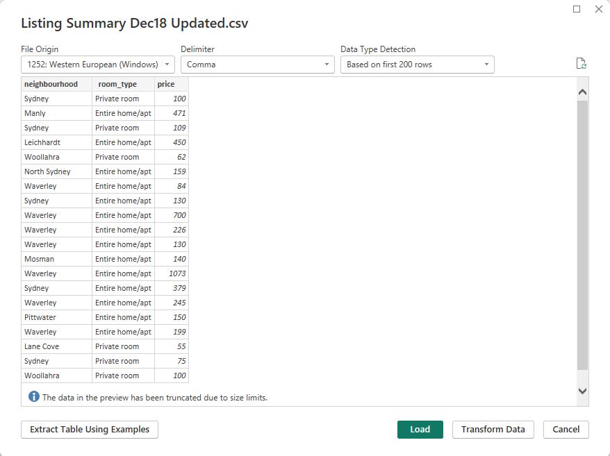
Then, we open the Power BI Desktop then we load the CSV file named “Listing Summary Dec18 Updated”:
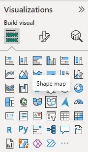
Step 3: Create Shape Map Visual
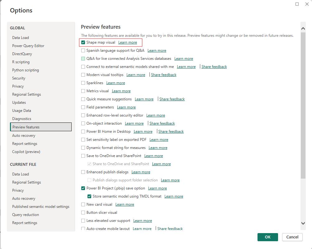
Then, we will need to enable to Shape map visual features from the File -> Options -> Global -> Preview features.
Now, we can drag and drop this visual from into our page.
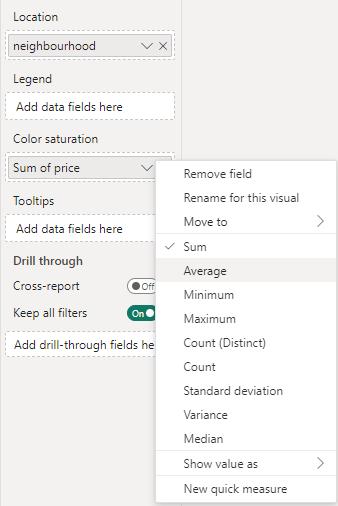
We will drag the neighbourhood into the Location field and price into the Color Saturation field:
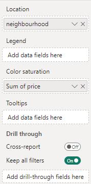
Instead of using Sum of price, we will adjust the summarization here as Average of price
Step 4: Customise the Shape Map
At this point, we will have a map of United States:
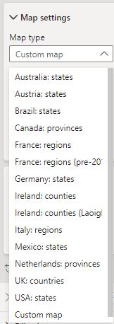
Then we will change the map by go to Format your Visual -> Visual -> Map Settings -> Map type -> Custom Map:
At the ‘Add a map type’ option we will select the TopoJSON we have which is “neighbourhoods.json” and voila:
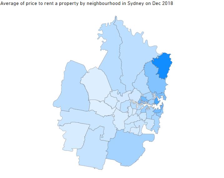
We have created a custom Shape Map visual to illustrate the average price to rent a property in each neighbourhood in Sydney in December 2018.
In the meantime, please remember we offer training in Power BI which you can find out more about here. If you wish to catch up on past articles, you can find all of our past Power BI blogs here.