Power BI Blog: Dark Mode in Power BI
10 October 2024
Welcome back to this week’s edition of the Power BI blog series. This week, we review dark mode, but beware what lurks in those shadows...
Some big news for those that like to “go dark”.

Perhaps more eagerly awaited than a Taylor Swift show or an investigation into Oasis ticket pricing, Microsoft has finally announced a new feature in Power BI Desktop that allows you to choose from a variety of themes, including the most requested dark mode, which replaces all the chrome around the design surface with white-on-black text instead of black-on-white. Thus, you may now customise your data visualisation experience to match your preferences and working environment.
Whether you’re working late into the night or simply prefer a darker interface (all you Jack Bauer wannabes out there), dark mode provides an alternative, modern look that reduces eye strain and enhances focus. You can enable any theme by going to Options and settings -> Global -> Report settings -> Personalization.
In the aforementioned Personalization section, you may select the theme you want:
- Default mode: the standard white theme of the desktop application
- Dark mode: a dark theme that transforms the desktop application into a darker interface
- Light mode: a white theme with a more stylish look than the default theme
- User system mode: adapts the theme based on your Windows system settings.
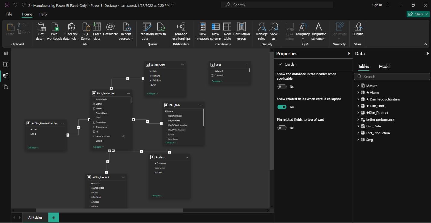
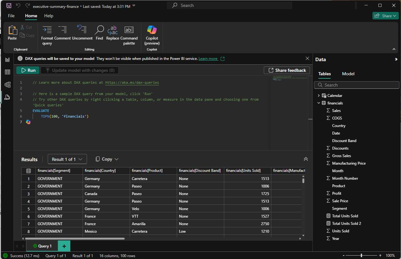
There's a mode for every window in Power BI Desktop. Using dark mode as an example:
- Report view
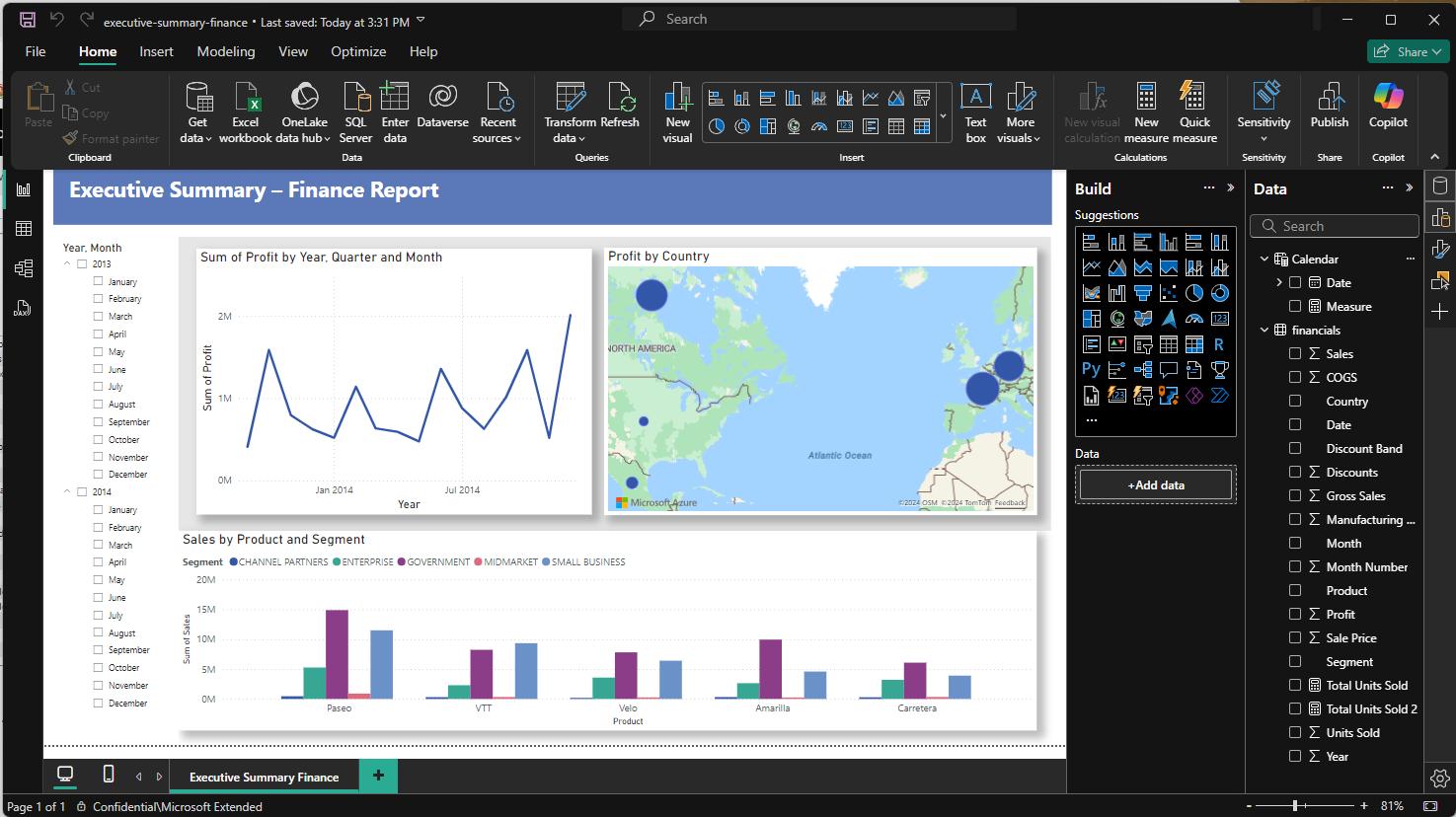
- Model view
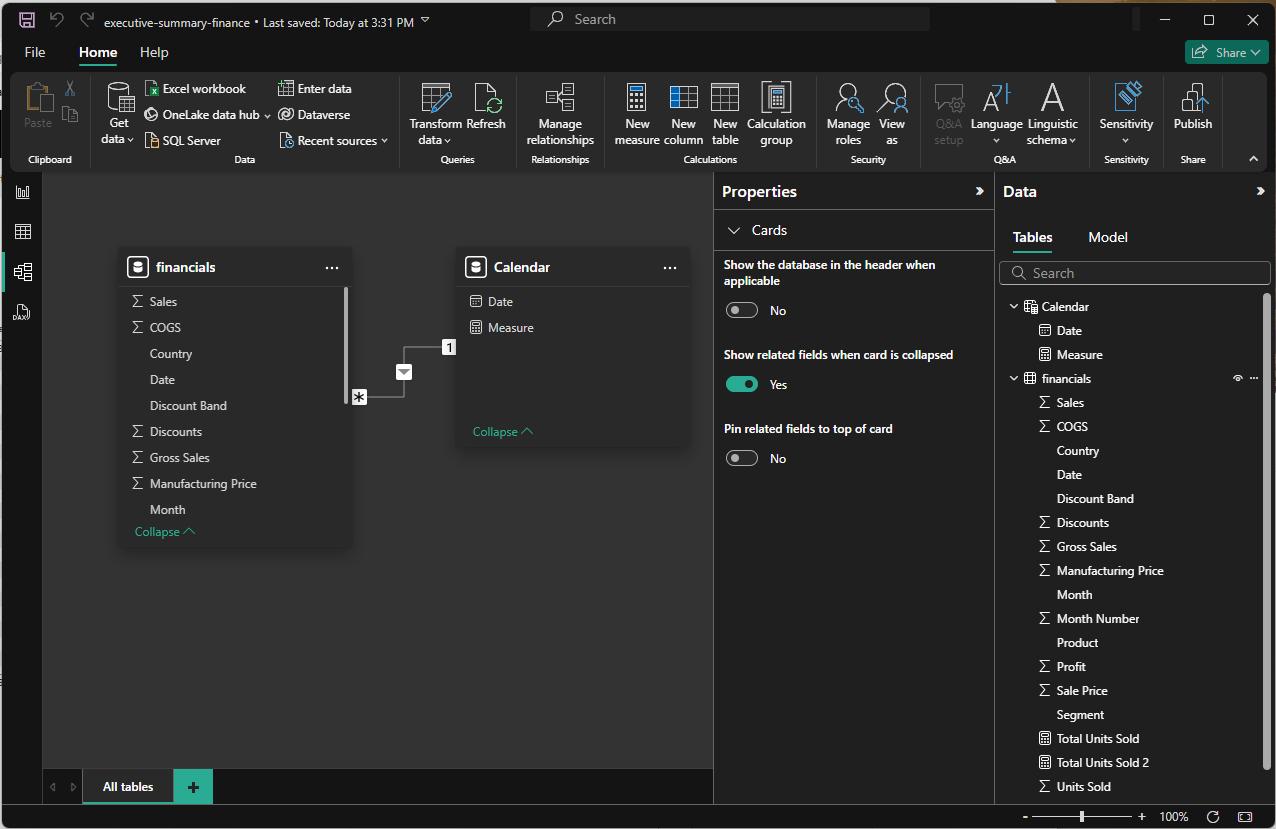
- Table view
- DAX query view.
That’s it for this week. In the meantime, please remember we offer training in Power BI which you can find out more about here. If you wish to catch up on past articles, you can find all of our past Power BI blogs here.

