
Power BI Blog: Funnel Chart – Part 1
1 August 2024
Welcome back to this week’s edition of the Power BI blog series. This week, we look at the Funnel chart.
Funnel charts are an excellent tool for visualising data as it moves through different stages in a process. Whether we are tracking sales pipelines, user conversion rates or any other process that narrows down data, a Funnel chart can provide clear insights into each stage. In this article, we will walk through the steps to create a Funnel chart in Power BI.
Simple Funnel Chart
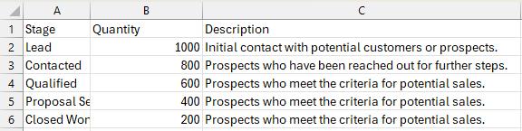
Let’s consider the following sales data examples from a file called ‘Simple Example’ which you can download from here:
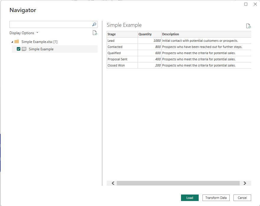
Let’s load this data into Power BI via Power Query:
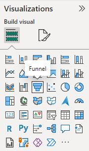
On the Visualizations Pane, we can drag and drop the Funnel visual onto the page:
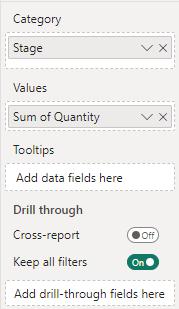
On the field section we will specific the Category we will drag the Stage in and the Values we will drag the Quantity in:
Thus, we have our simple and easy Funnel chart:
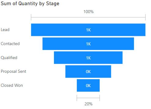
This is the native Funnel chart in Power BI, but it could be more powerful. For example, instead of displaying the quantity number here, perhaps we wish to change it to the description we have from our dataset. The chart will not allow us to do this. The options we may choose to label our data with this Funnel chart are as follows:
- Data value
- Percent of first
- Percent of previous
- Data value, percent of first
- Data value, percent of previous.
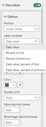
These options don’t have custom data label. Hence, to add this complexity to the Funnel chart we might need to employ a work around on this visual. Tune in next week to see what we’ve come up with.
In the meantime, please remember we offer training in Power BI, which you can find more about here. If you wish to catch up on past articles, you can find all of our past Power BI blogs here.