
Power BI Blog: Funnel Chart – Part 2
8 August 2024
Welcome back to this week’s edition of the Power BI blog series. Last week, we looked at creating a basic Funnel chart. This week, we will show you some workarounds to customise it a little more.
Adding Custom Labels
Let’s say we wanted a little more detail on our Funnel chart. We’re now going to be taking data from a file called ‘Sales_Funnel’ that can be found here. Once this data is loaded, we want to use it to create a sales funnel with both the number and percentage of leads showcased on the chart. We need to start by creating individual summaries for each segment type: Cold Calling, Digital and Roadshows.
Cold Calling = SUM(Segments[Cold Calling])
Create a measure for all three [3] structured like the one above. Once these are created, we will create a measure called Opportunities which will sum these measures together to produce the total number of opportunities.
Opportunities = [Roadshows] + [Cold Calling] + [Digital]
Next, we want to create another measure called Bar Offset. This measure will be a bit more complicated and will involve using variables.
Bar Offset =
VAR vOpportunities = [Opportunities]
VAR vTable = ALL( Stage)
VAR vMaxValue = MAXX(vTable, [Opportunities])
RETURN vMaxValue - vOpportunities * 0.5
This is a complex measure so I’ll come back to explain it once we can see how it’s being used. The next step is to create a normal stacked bar chart. Set the y-axis as Stage and have Bar Offset and Opportunities set as the x-axis.
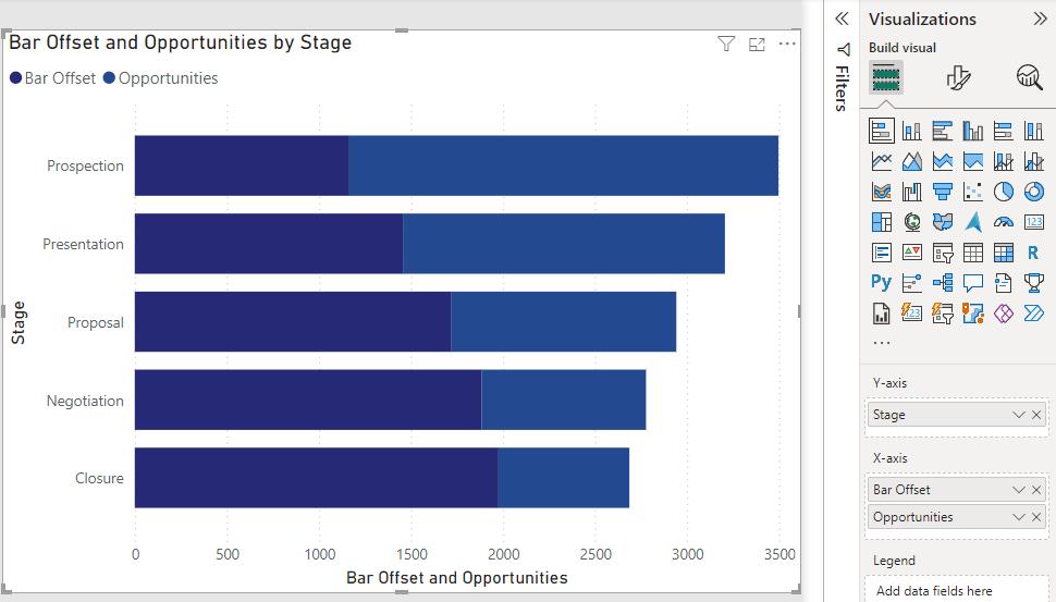
Now we can see visually how the Bar Offset measure is working. The vMaxValue variable finds the maximum number of opportunities available across all stages (which is also equal to the size of Opportunities in the first stage). The final calculation takes this maximum value and subtracts the number of opportunities divided by two [2]. This means that at each stage as the value for opportunities decreases, the output of the measure increases proportionally.
Now there are a few things we may do to make it look slightly nicer under Format visual. We can start by switching Ribbons and Data labels to On. Under Ribbons -> Apply settings to -> Series -> Bar Offset set the transparency to 100%. Meanwhile for Opportunities set the transparency to 30% or whatever you think looks good.
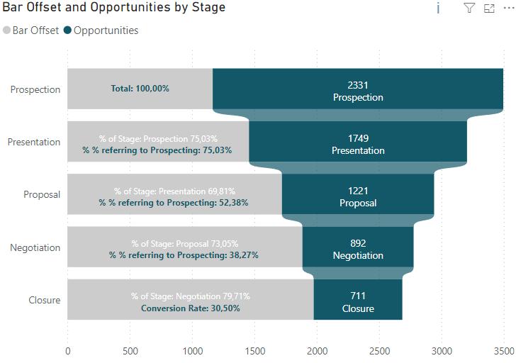
Now we’re going to create our custom labels. We first need to make two more measures. The first will calculate the percentage conversion to the selected stage from the original prospection stage.
percentage of First Value =
VAR vOpportunities = [Opportunities]
VAR vTable = ALL( Stage)
VAR vMaxValue = MAXX(vTable, [Opportunities])
VAR vConversionRate = DIVIDE(vOpportunities,vMaxValue)
VAR vText = SWITCH(SELECTEDVALUE(Stage[ID Stage]) ,1, "Total: ",5, "Conversion Rate: ","% % referring to Prospecting: ")
RETURN vText & FORMAT(vConversionRate,"0.00%")
The second will instead calculate the percentage conversion to the selected stage from the stage before it.
percentage of Previous Stage =
VAR vOpportunities = [Opportunities]
VAR vOffset = CALCULATE([Opportunities]
,OFFSET(-1,ALL(Stage[Stage], Stage[ID Stage]) ,ORDERBY(Stage[ID Stage],ASC)))
VAR vConversionRate = DIVIDE(vOpportunities,vOffset)
VAR vText = "% of Stage: "
VAR vPhase = CALCULATE(MAX(Stage[Stage]), OFFSET(-1,ALL(Stage[Stage],Stage[ID Stage] ),ORDERBY(Stage[ID Stage] )))
RETURN
IF( NOT SELECTEDVALUE(Stage[ID Stage]) = 1,
vText & vPhase & FORMAT(vConversionRate, " 0.00%"))
Now that these are set up, we can click back onto our visual and go to Format visual -> Data labels -> Apply settings to -> Bar Offset. Under Value -> Field select percentage of First Value and below under Detail -> Data select percentage of Previous Stage. Under Layoutselect Multi-line to put the different labels on two separate lines. Now we need to do the same thing for Apply settings to -> Opportunities, except filling Value -> Field with Opportunities and Detail -> Data with Stage. From here you can format the colours however you’d like but should be left with a Funnel chart that looks something like this.
Breaking it into Segments
What if we wanted to split our funnel into the different sources to look at how effective each is at generating opportunities? We can actually use the same measures that we’ve already created. The only thing to do is to select the visual and change the measures in the x-axis. While we will leave the Bar Offset measure in there, we can replace the Opportunities measure with Cold Calling, Digital, and Roadshows. This should result in a chart that looks something like this:
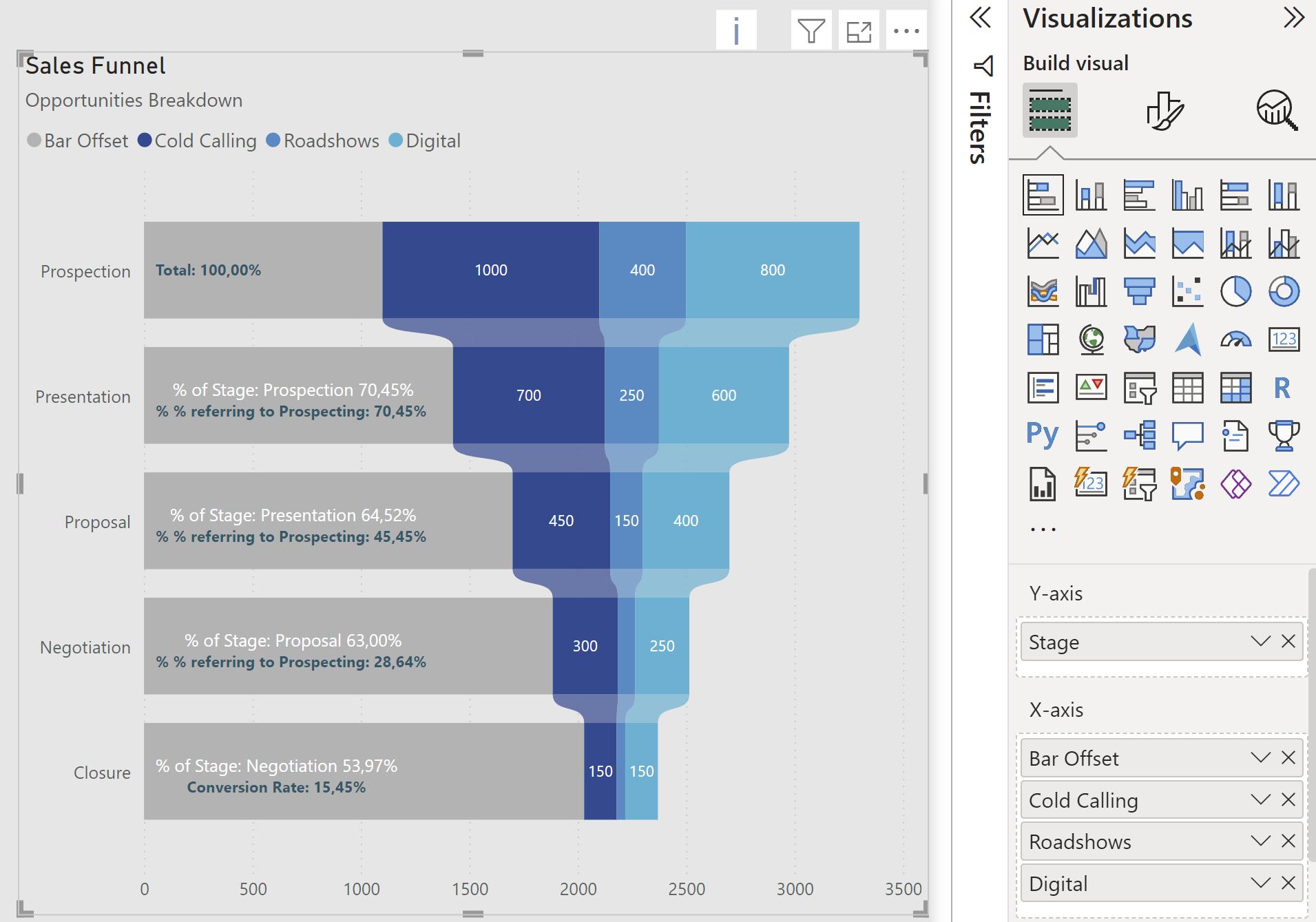
The formatting of the labels may be adjusted the same way as in the previous example. All we did here was remove the “detail” label for Cold Calling, Roadshows and Digital, and scale down the size of the numbers a bit to fit better.
That’s it for the Funnel chart; let us know if you have any other useful modifications for it.
Tune in next week for another Power BI blog. In the meantime, if you wish to catch up on past articles you can find all of our past Power BI blogs here.