
Power BI Blog: “How Copilot Arrived at This”
10 April 2025
Welcome back to this week’s edition of the Power BI blog series. This week, we look at improvements in how Copilot explains itself in Power BI.
Microsoft has responded to the feedback that users would like more transparency regarding how Copilot generates visual answers. Well, things are on the move. The previously-named ‘show reasoning’ section now called ‘How Copilot arrived at this’.
When receiving a visual answer from Copilot, you may expand this new section to assess what data (fields / measures) and filters were used to generate the answer. You can also click on the field to see more information like the aggregation or home table. This is especially helpful when there could be multiple fields with the same name, like having multiple Dates in your data, verifying Copilot picked the correct one.
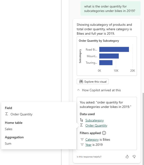
As a reminder, Copilot does not currently incorporate existing filters from the report when generating a visual answer. This list only contains filters that were used at the time of generating the answer.
This is a step towards increasing transparency in how Copilot understands and generates responses. More soon, we think.
In the meantime, please remember we offer training in Power BI which you can find out more about here. If you wish to catch up on past articles, you can find all of our past Power BI blogs here .