Power BI Blog: Marker Enhancements
26 December 2024
Welcome back to
this week’s edition of the Power BI blog series. This week, we look at how Microsoft is
revamping its rendering of
columns, bars, Ribbons, lines, Area charts and markers.
Revamping the rendering of columns, bars, Ribbons, lines, Area charts and markers is apparently a top priority for Microsoft. These elements form the foundation of their core visuals and will eventually impact other areas. By providing more control, report creators can enhance their storytelling and help users easily interpret data.
Recently, markers for Line charts, Scatter charts and various anomalies are improved. The revisions have introduced new options that offer greater customisation and flexibility.

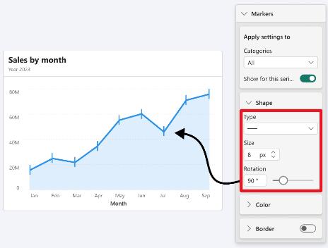
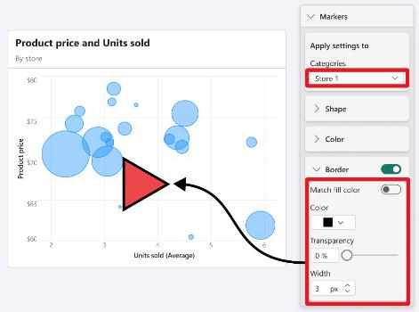
Markers for Line and Scatter charts may be adjusted in two ways:
- Categories: when the chart has no series, the dropdown menu displays categories. You can customise each data point’s marker based on the selected x-axis category
- Series: when the chart displays a legend, the dropdown menu displays series. You may customise the markers for the complete set of data points within the selected series.

You can hide or show markers for a specific data point category by toggling the ‘Show for this category’ option. Please note that the ‘Markers’ toggle has been moved to now being under ‘Show for all series’.
New format settings have been added to markers for Line charts, Scatter charts and various anomalies, including:
- Shape:Shape markers continue to offer control over their type and size. Additionally, ‘rotation’ is now available for all shape types, except for the circle shape. Rotating shapes enhance the variety of shape types at your disposal, which is particularly convenient when multiple lines require unique shapes

- Colour: changing the colour of markers has always been a convenient control. Now, you can also modify the ‘transparency’ of markers for a specific category, series or all markers

- Border (new): Borders for markers have been introduced, allowing you to add borders to a specific marker category, series or all markers. Additionally, you can fully customise the marker borders by adjusting their transparency and width.

That’s it for this week. In the meantime, please remember we offer training in Power BI which you can find out more about here. If you wish to catch up on past articles, you can find all of our past Power BI blogs here.

