
Power BI Blog: Multiple ToolTips in One Visual - Revisited
22 August 2024
This week, we revisit creating multiple ToolTips
for one visual. Since the Power BI
interface has been undergoing some transformations, we aim to provide a clear
route to access this functionality.
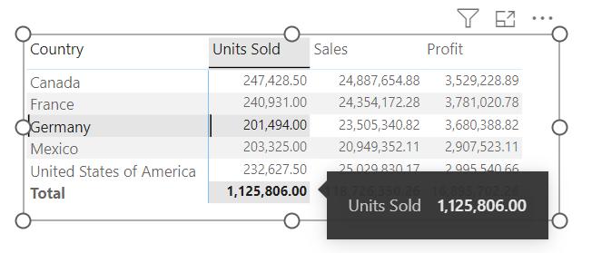
ToolTips are speech bubbles (screen tips) that appear when users hover over an element (with the mouse, rather than physically!).In Power BI, the default ToolTips are small text bubbles displaying the focused value in a visual.The following image shows this for our Matrix, which contains sales and profit data across different countries:
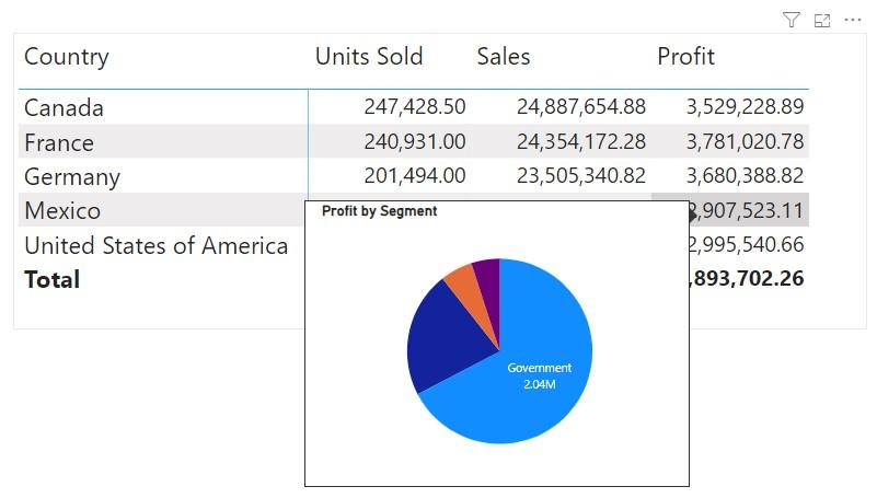
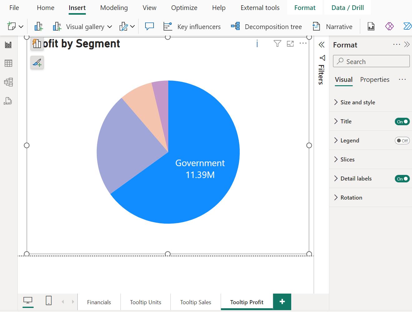
Taking that one step further, we may also design auxiliary visuals to use as ToolTips. We designed a Pie chart breaking down profits by different segments and used that as a ToolTip:
However, what’s not so flexible about Power BI ToolTips is that we can only use one [1] auxiliary visual as ToolTip for the main visual. Even when we hover over Sales or Units Sold, the same ToolTip visual will pop-up: the Profit by Segment Pie chart for the focused country. What if, we also want a breakdown of Sales when hovering over Sales, without creating another Matrix? What if we want yet another different visual for Units Sold?
Well, that’s the subject of this article. We will show you how to include different ToolTip visuals for different columns in one [1] main visual.
Custom ToolTip
Before including different visuals as ToolTips, let’s briefly walk through how to include one [1] visual as a custom ToolTip. Here consider the same Matrix with Units Sold, Sales and Profit across different countries.
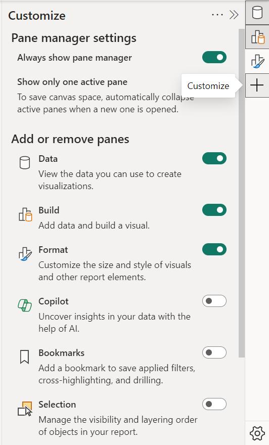
To make the Format tab easier to access, we have used the Customize functionality to add the Format tab to our list of tabs at in the right-hand panel:
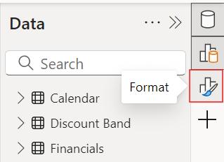
For this example, we begin by accessing the Format pane:
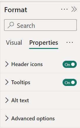
Then on the Properties tab, we choose ‘Tooltips’:
In a separate page which we call ‘Tooltip Profit’, we create the auxiliary Pie chart of total profit against segments.
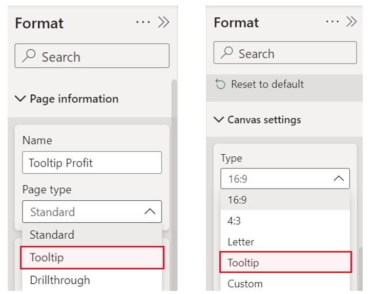
Then, we click out of the Pie chart visual to format the page, and from the Format pane we select ‘Page information’ and change ‘Page type’ to ‘Tooltip’. Also, in the Format pane, we access ‘Canvas settings’ and change the ‘Type’ to ‘Tooltip’.
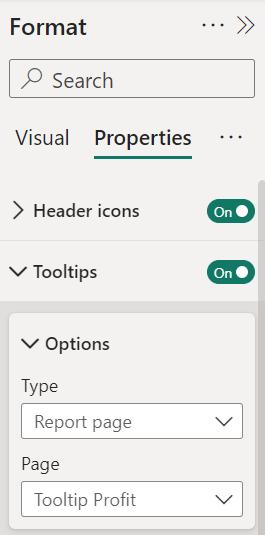
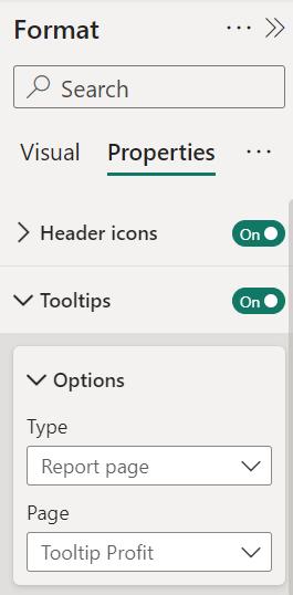
Now we can go back to the main matrix and click on the visual to specify the Pie chart as a custom ToolTip. We select the Format pane and then on the Properties tab, within Options in the Tooltips section, we set Type to ‘Report Page’ and then select the page ‘Tooltip Profit’.
This way, we have the Pie chart on page ‘Tooltip Profit’ as a custom ToolTip, as shown at the beginning.
Multiple ToolTips
Now, suppose we want to show a breakdown of Sales by Discount Band, and a breakdown of Units Sold by Product, when hovering over Sales and Product, respectively. How can we achieve that?
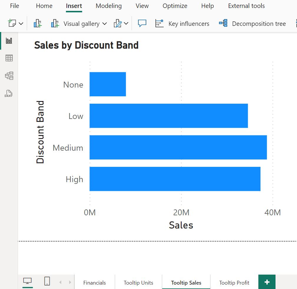
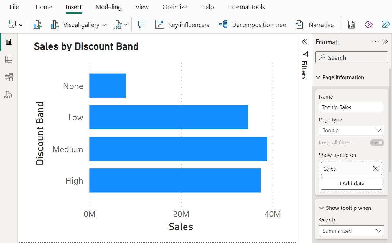
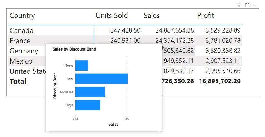
Let’s first create the auxiliary plots. Here, we create a Clustered Bar chart ‘Sales by Discount Band’ on a new page ‘Tooltip Sales’:
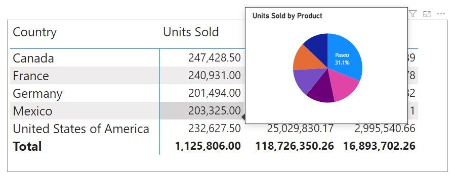
We also create Pie chart ‘Units Sold by Product’ on another new page ‘Tooltip Units’. Do note, we need to create these pages from scratch, not by duplicating from another page. Otherwise, we won’t be able to link ToolTip pages to the main visual correctly. For each of these new pages, we click out of the visual to format the page, and from the Format pane we select ‘Page information’ and change ‘Page type’ to ‘Tooltip’. Also, in the Format pane, we access ‘Canvas settings’ and change the ‘Type’ to ‘Tooltip’, just as we did for the ‘Tooltip Profit’ page earlier.
Earlier, on page ‘Financials’ for the matrix visual, accessed Format pane, selected the Properties pane, and the Tooltip Options section, set the Page to ‘Tooltip profit’:
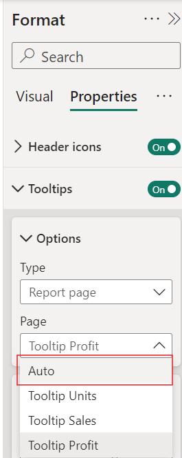
Now, since we wish to include multiple visuals as custom ToolTips, we need to select Auto instead of a specific page:
Then, on each of the pages containing the ToolTip visuals, we somewhere on the page, but not in the visual and access the Format pane. On the ‘Page information’ tab, in the ‘Show tooltip’ section, we select the column that should feature that ToolTip. For example, for the page ‘Tooltip Sales’ we select the field Sales:
Similarly, for the page ‘Tooltip Profit’we select the field Profit, and for the page ‘Tooltip Units’ we select the field Units Sold. We can now go back to our main visual and pop-up the different ToolTips by hovering over the appropriate columns:
That’s it for this week’s Power BI blog. Hope you’ve enjoyed our article, and please stay tuned for more thoughts and insights from http://www.sumproduct.com.