
Power BI Blog: Path Layer for Azure Maps
13 February 2025
Welcome back to this week’s edition of the Power BI blog series. This week, we look at Path layers in the Azure Map visual.
The Azure Map visual now contains something called the Path layer. This provides users with the ability to visualise geographic connections between multiple points. Whether you’re managing logistics, analysing network traffic or tracking asset shipment across the globe, this feature allows you to view your connections between multiple geographic points in an intuitive and interactive way.
The Path layer is useful for several key scenarios such as
- Network Analysis: for industries like telecommunications, the Path Layer enables you to map intricate network connections. It helps identify inefficiencies, monitor data flow(s) and strengthen critical infrastructure
- Flight Path Analysis: airlines can leverage the Path Layer to visualize and analyse flight routes, improving air traffic management. It helps identify new route opportunities and enhances the overall passenger experience by optimising existing routes.
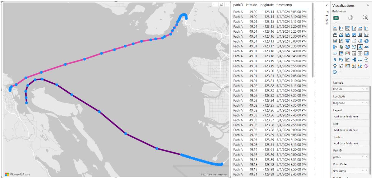
To get started, add the location for each point using either a geocoded location field, such as city names, or latitude and longitude. Then, differentiate between the paths by adding a field to the ‘Path ID’ field well and indicate the order of connection through the Point Order field well.
For example, you could create a map showing the path of two ships with the latitude and longitude of their positions for each point, a path field with a unique identifier for each ship, and a timestamp for each location to make sure the points are connected in the correct order.
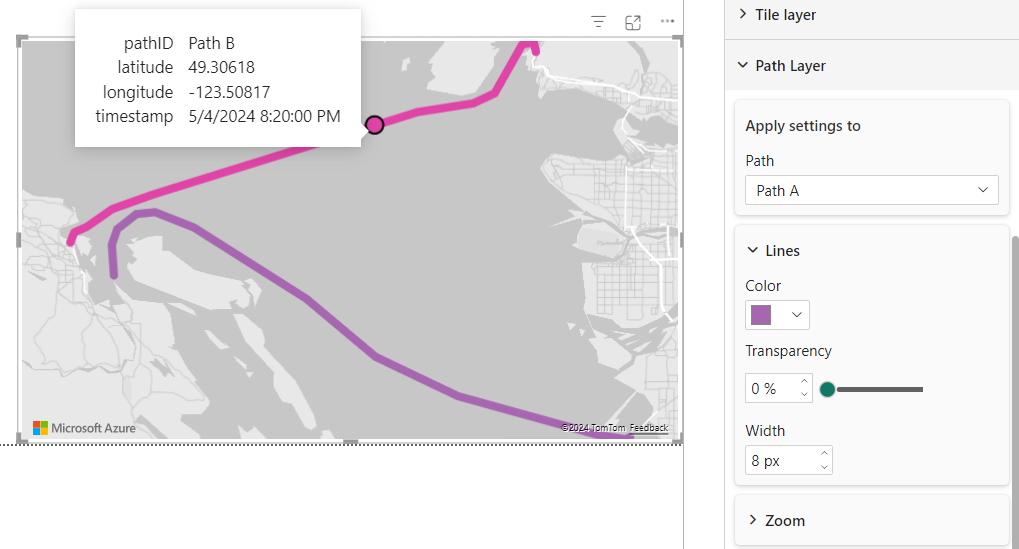
You can also format the visual by controlling the colour, transparency and width of the lines, and even turning off the bubble markers for each point. If you turn off the bubble layer, you’ll only see a bubble on hover showing you the closest point to your pointer location. Paths are interactive as well, so you’ll get tooltips on hover and be able to cross-highlight other visuals by clicking on points of the lines.
There are a couple of interesting behaviours to be aware of with this new layer. First, when using a drill hierarchy with the Path layer, the visual will automatically drill down to the lowest level and will not allow you to drill up, as points in the path would be aggregated at higher drill levels.
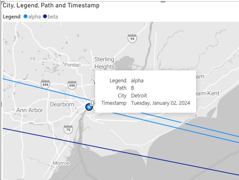
Next, if you have a location that’s part of multiple paths, the bubbles for that location show up on top of each other. If you want to click on the bubbles underneath, just hover on the line associated with its path and it will float to the top and be selectable. Lastly, you can further break down the paths by adding a legend, which will create unique lines for each legend value of a given path ID.
Currently, the Path layer operates mainly in conjunction with the bubble layer. Once you add a path to your map, you’ll see that the filled, cluster bubbles, heat map and 3D column layers are all disabled. Additionally, while you can use the Path layer in conjunction with reference layers, the reference layer will be static. It’s currently unsupported to mix data bound reference layers with the Path layer.
The Path layer is still actively rolling out to all regions. Depending upon what region your tenant is in, you might not see the Path layer in the Power BI Service immediately. Be sure to check the report after publishing, and if you don’t see the layer, it should be accessible very shortly.
In the meantime, please remember we offer training in Power BI which you can find out more about here. If you wish to catch up on past articles, you can find all of our past Power BI blogs here .