Power BI Blog: Analysing our Bins
19 November 2020
Welcome back to this week’s edition of the Power BI blog series. This week, we dive deep into bins and spout our usual rubbish.
Over the past few weeks, we have gone through our dataset and created categorical columns that grouped or binned our data. This week, we will take a closer look at our bins and see if we can retrieve and useful insights from them. As a quick recap, we created two numerically binned columns “SalesAmount (bin size)” and the “SalesAmount (num of bins)” columns.
The SalesAmount (bin size) column was created by defining a bin size of 50, whereas the SalesAmount (num of bins) was created by delineating a total of 10 bins for the entire dataset. To read more about how we created these bins you can read this blog.
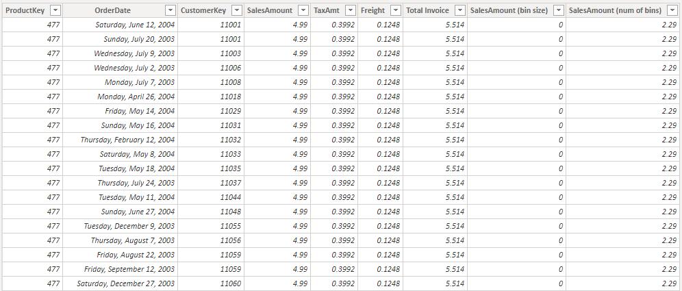
Moving on to our example, we have plotted the Total Sales fields against the SalesAmount (num of bins) column.
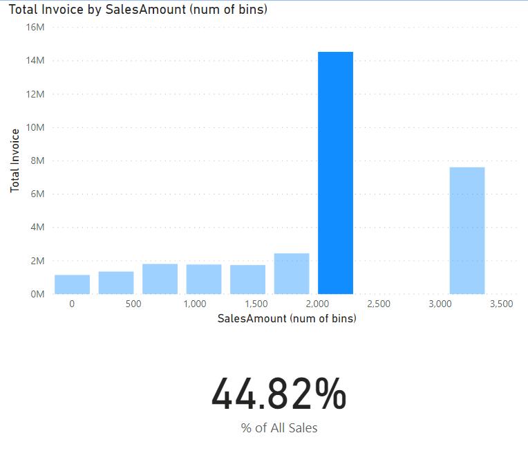
According to our bins, it looks like most of our business’s revenue comes from sales of items between $2,000 and c. $2,400. As it stands, this bin holds approximately 45% of all of our sales.
What if we created another card to count the total number of products that fall into this category?
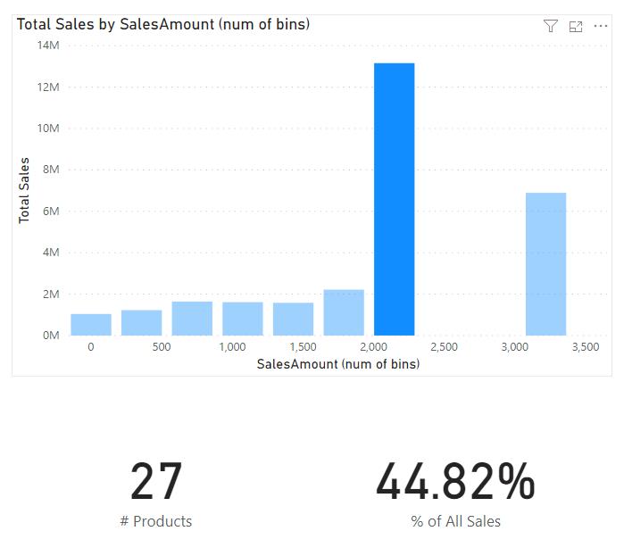
So, 27 of our products make up for nearly 50% of our sales: interesting. Let’s look at our other bin to see if we can find anything else.
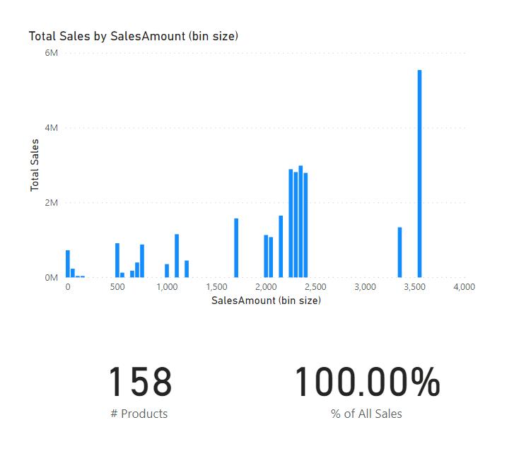
This field has more bins, and therefore paints a slightly different picture. It looks like the aggregated bin between $2,000 and $2,357 had grouped several popular products together. However, if we look to the right, 18.90% of our sales are comprised of just five (5) products.
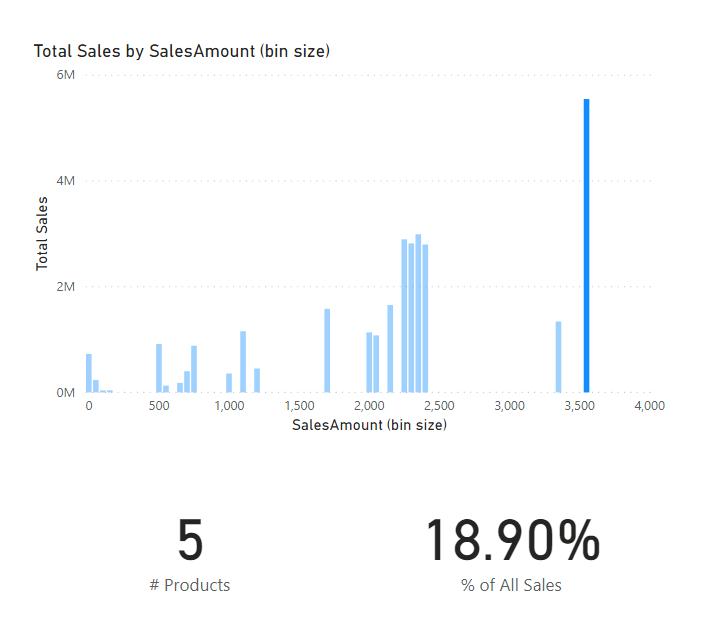
The key takeaway here is when creating bins, one should consider the bin size along with level of granularity when one is viewing the data.
That’s it for this week! Join us next week for more on Power BI.
In the meantime, please remember we offer training in Power BI which you can find out more about here. If you wish to catch up on past articles, you can find all of our past Power BI blogs here.

