
Power BI Blog: Power BI Blog: Building a Threshold Column Chart
27 June 2024
Welcome back to this week’s edition of the Power BI blog series. This week, we look at how to create a Threshold Column chart to highlight columns that rise above a set threshold.
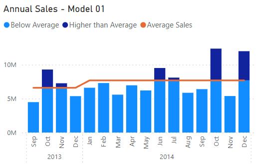
The goal of this kind of visual is to plot values on a normal Column chart but highlight the ones that rise above a certain threshold, in this case, the average. To make things difficult, we want to be able to adjust this for the averages of different years. There is no built-in option to achieve this in Power BI currently, which means we need to get a little bit creative.
Chart Data
We are looking at the [Sales] column in the financials table and will be constructing two measures as follows:
Total Sales = SUM(financials[Sales])
Average Sales
= IF([Total Sales], CALCULATE(AVERAGEX(dcalendar,
[TotalSales]),ALL(dcalendar),VALUES(dcalendar[Year])))
The Average Sales measure calculates the average sales of a dataset over a calendar year using the AVERAGEX function, which calculates the average on a record by record basis. Meanwhile, the Total Sales measure is just the total sales for a given period.
Next, we are going to create two more measures using those we just made.
Below Average = IF([Total Sales] >= [Average Sales] ,[Average Sales] ,[Total Sales])
Above Average
= IF([Total Sales] >= [Average
Sales],
[Total Sales] - [Average Sales] ,BLANK())
The Below Average measure here is comparing average sales and total sales and is taking the lower of the two. The Above Average measure returns the value of Total Sales above Average Sales, returning zero [0] if it is less. These measures split the Total Sales into two [2] segments based upon the Average Sales (or any other threshold you might want to use).
Building the Chart
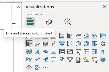
Now that the measures are set up, the next step is to build the chart. We will proceed to the Visualizations tab and create a Line and Stacked Column chart:
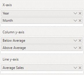
The x-axis will be Year and Month, while the column y-axis will be Below Average followed by Above Average. The line y-axis is just Average Sales and will function as our threshold.
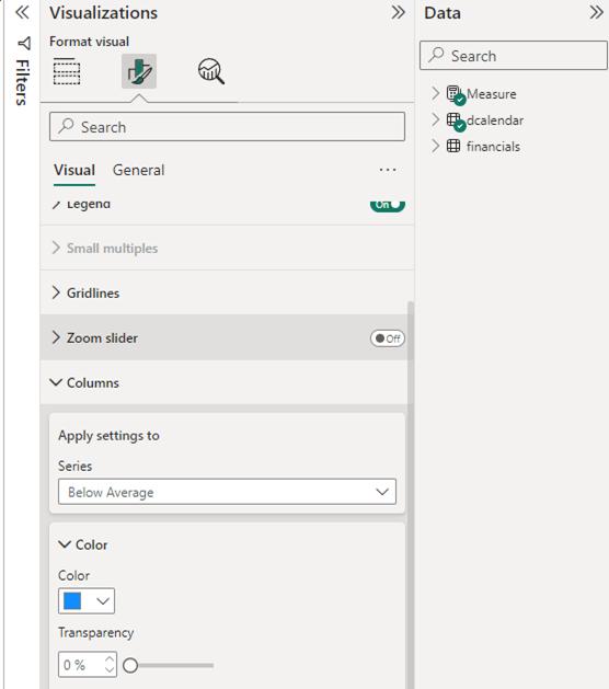
This should leave us with a threshold chart highlighting sales above the average for the given year. From here, we can change the colours and styles in ‘Format Visual’ to our liking to make it more appealing.

That’s it for this week’s Power BI blog. Next week, we will go through some interesting ways we can customise this visual. If you wish to catch up on past articles, you can find all of our past Power BI blogs here.