
Power BI Blog: Conference Planning Part 2
4 November 2021
Welcome back to this week’s edition of the Power BI blog series. This week, we finish reorganising some data from a table with a single column and create some visualisations.
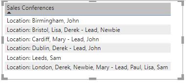
Last time, we started with a Table visualisation showing the salespeople that we have optimistically allocated to our upcoming conferences in a variety of UK cities.
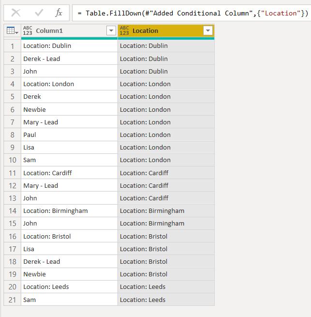
We accessed the Power Query Editor from the ‘Transform data’ option and we transformed our data until we had a column for salespeople and a Location column.
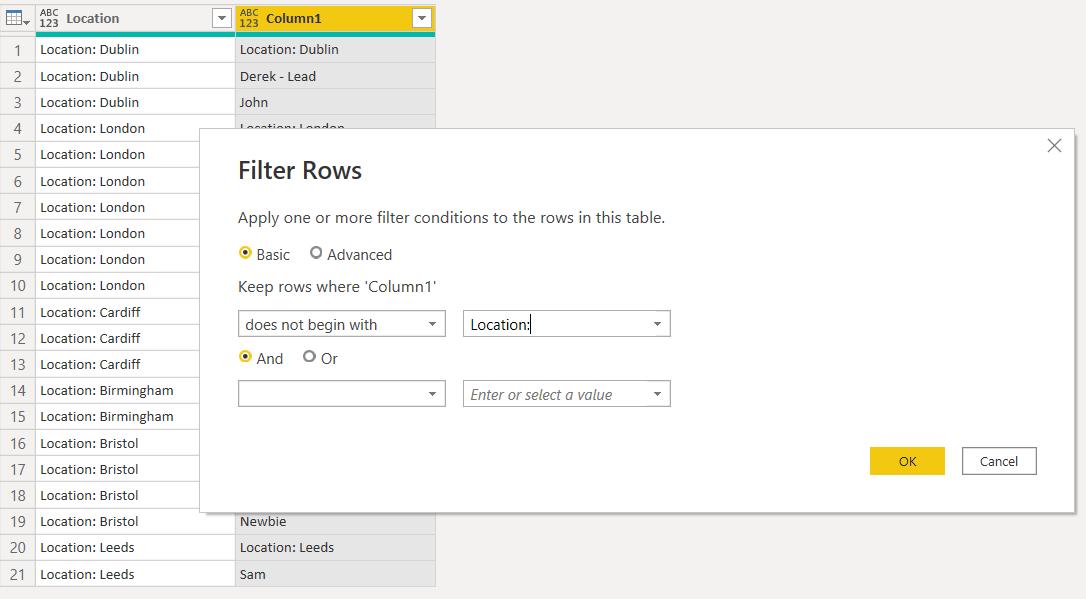
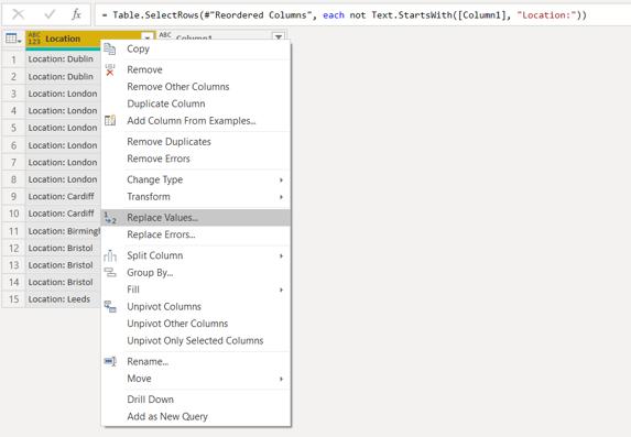
Next, we can re-order the columns by clicking and dragging, and then filter Column1 to remove anything than begins with ‘Location:’. This is available from the ‘Text Filters’ dropdown:
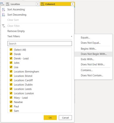
We specify the string to look for:
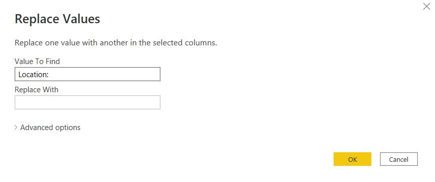
This gives us a list of locations and names. We no longer need the ‘Location:’ label so we can right-click and ‘Replace Values…’.
We can then remove ‘Location:’ from this column.
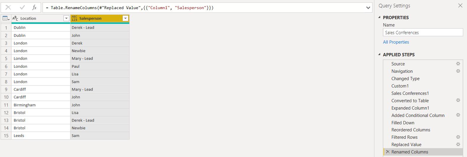
We may also rename Column1 to Salesperson, and the table is then ready to be loaded to Power BI Desktop.
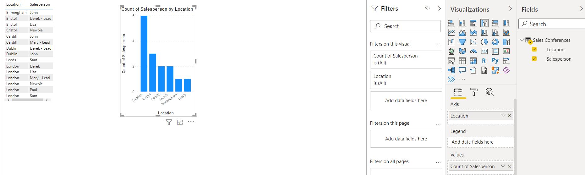
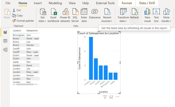
We drag the new columns to the table and create a simple chart with Location as the Axis and a count of Salesperson in the ‘Data Series’.
Finally, if the original data source changes as more salespeople have been added, we may refresh to see the changes on Power BI Desktop:
The changes are through: looks like Cardiff and Dublin will have fun!
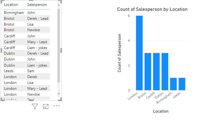
(Always good to see my jokes are appreciated – Ed.)
Check back next week for more Power BI tips and tricks!