Power BI Blog: June 2019 Update New Interface
20 June 2019
Welcome back to this week’s Power BI blog series! This week, we’re going to look at Power BI’s updated interface look.
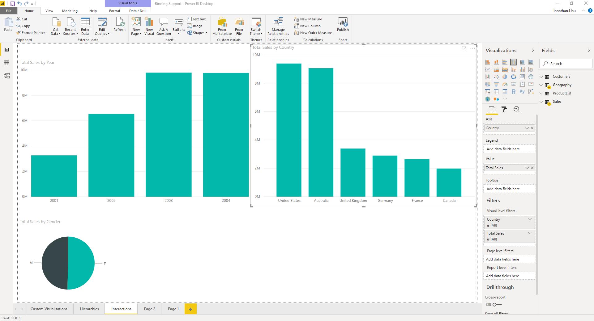
If you have not yet noticed, Power BI Desktop has been recently updated! Microsoft has updated Power BI’s interface to a lighter colour, with updated spacing, new icons and a more ‘modern’ feel.

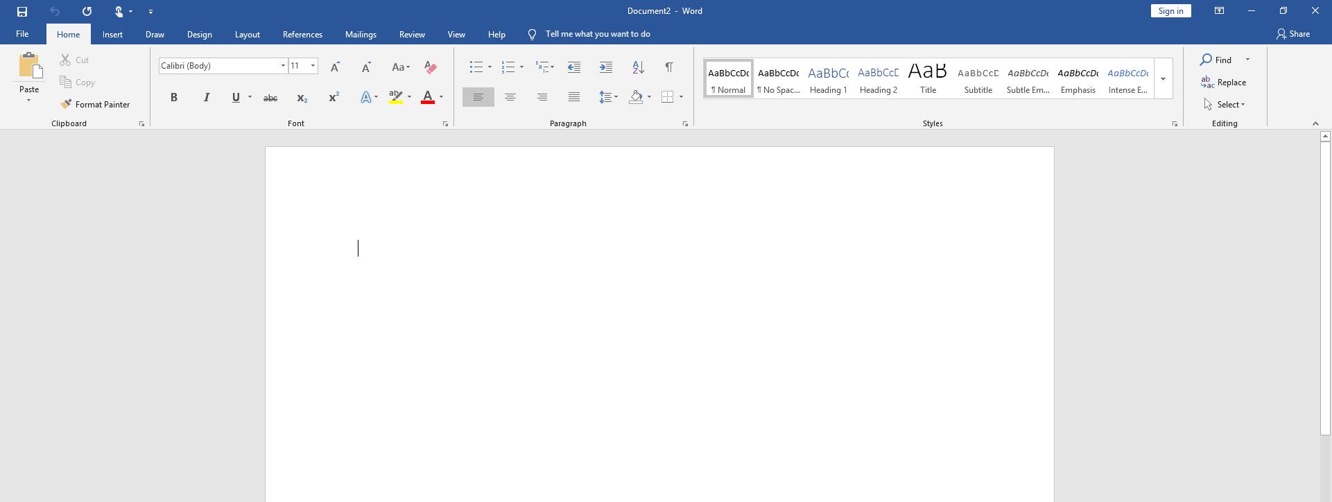
Power BI is now spotting the light grey theme which is more aligned with the default look of any Microsoft Office product. You can see the similarities with the screenshot taken from Word 2019 below:

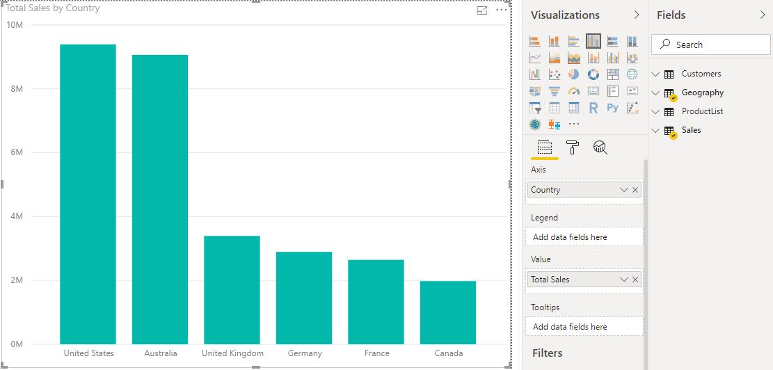
The new interface also has updated icons including the icons for fields being used in visualisations:

If you do not like the new theme, and you wanted the option to be able to switch between the lighter theme and the older theme. You can give Microsoft some feedback on their community forum page at https://community.powerbi.com. Some people who do not like the new lighter theme have already created a thread voicing their displeasure https://community.powerbi.com/t5/Issues/June-2019-Update-Light-Theme/idi-p/710732/page/2#comments. If you did like this change you can also give positive feedback through the community forum as well!
That’s it for this week, tune in next time when we cover more of the June 2019 updates!

