Power BI Blog: Bullet Charts
16 January 2020
Welcome back to this week’s Power BI blog series. This week, we are going to look at bullet charts.
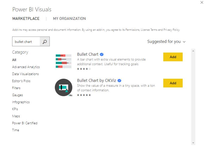
Say that we’ve finally got the monthly budget sales targets for the previous years and we want to plot our performance on a bullet chart. Well, this week, we are going to look at a custom visual called Bullet Chart 2.0.1 (correct at the time of writing). It may be found on the Microsoft Marketplace and downloaded for free:
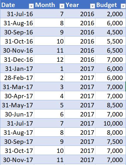
We can load the following monthly budget data into Power BI (this screenshot is not exhaustive):
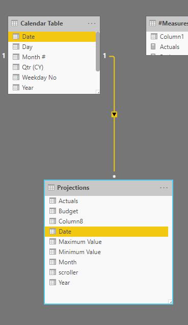
After loading the data into Power BI, assuming that this is a new table, we have to create a relationship with the current dataset:
The next step is to create a measure that will summarise the budget amounts:
Budget = Sum(Projections[Budget])
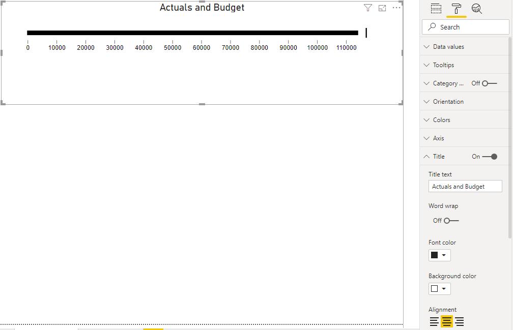
We can now drag the Budget and Actuals measures into the visualisation:

We then turned Category off and we centrally align the title:
The next thing we can do is insert colour coded zones through the Data Values section in the Format tab:
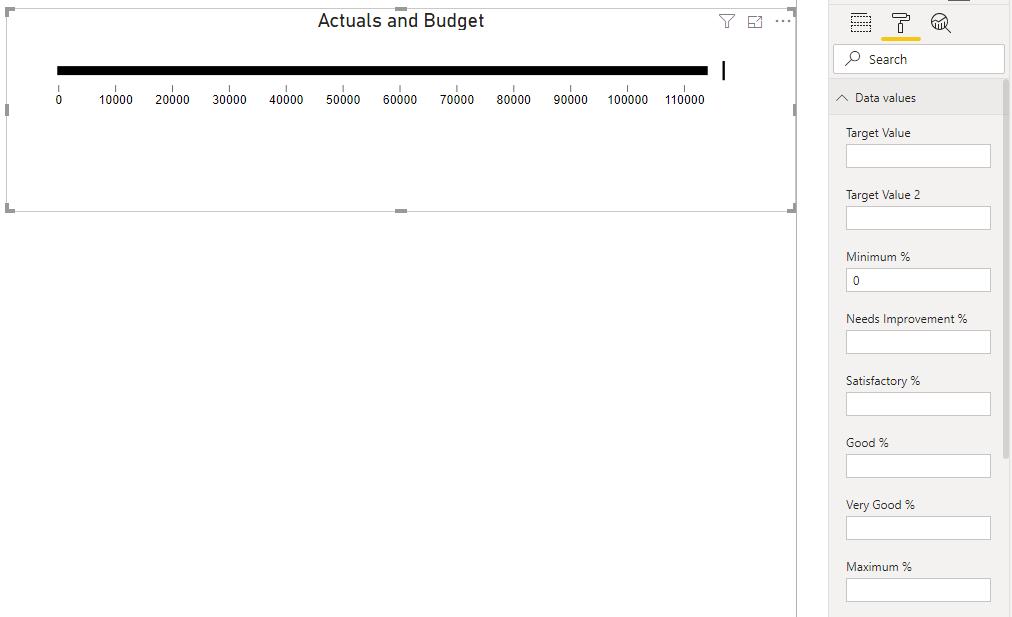
We have elected to put the following percentages to colour code the visualisation:
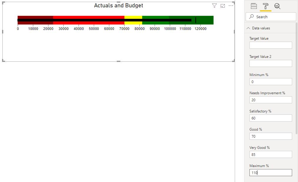
You should note that to have additional space at the right end of the bullet chart, we can add a percentage greater than 100 in the Maximum % area.
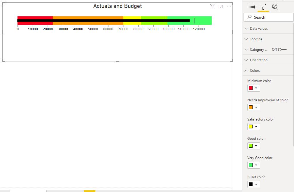
If the colour palette doesn’t agree with your palate, we can change the colours in the Colors area too:
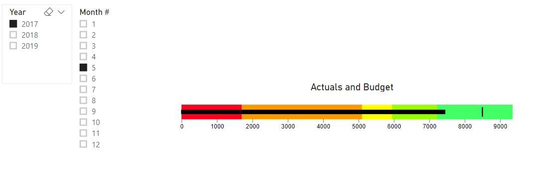
The bullet chart also responds to page slicers:
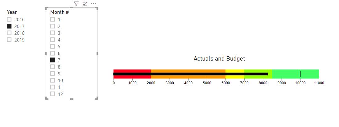
There you have it: how to create a simple bullet chart in Power BI.
That’s it for this week, come back next week for more Power BI!
In the meantime, please remember we offer training in Power BI which you can find out more about here. If you wish to catch up on past articles, you can find all of our past Power BI blogs here.

