Power BI Blog: Colour Formatting Tips – Conditional Formatting for Tables
3 October 2019
Welcome back to this week’s Power BI blog series. This week, we’ll continue to look at few more tips on colour formatting.
Over the past two weeks, I wrote about colour formatting in general and conditional formatting for column charts. As the final post in this ‘Colour Formatting Tips’ series, I will cover conditional formatting for tables.
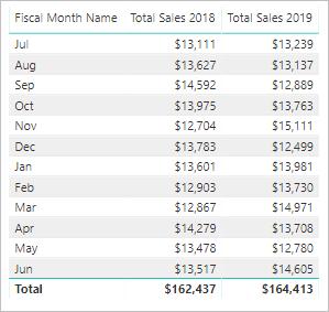
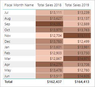
Let’s consider the following Power BI table:
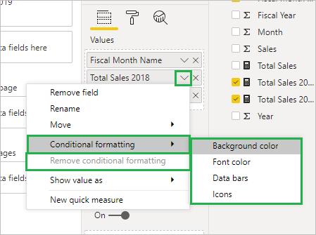
In the Visualization pane, under the Field list, if I click the down arrow beside each field, I can see the ‘Conditional formatting’ options. I can also see the ‘Remove conditional formatting’, which is not activated while I have no conditions now, but this can be used later if I want to revert to default.
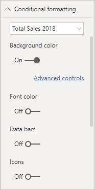
Alternatively, similar to what I did in the column chart, I can go to the Format tab and find the ‘Conditional formatting’ menu. This offers me the freedom to set up colours to background, font, adding data bars and icons. I need to choose which field I want to apply conditions to in the drop-down menu. For more detailed settings, I click the ‘Advanced controls’:
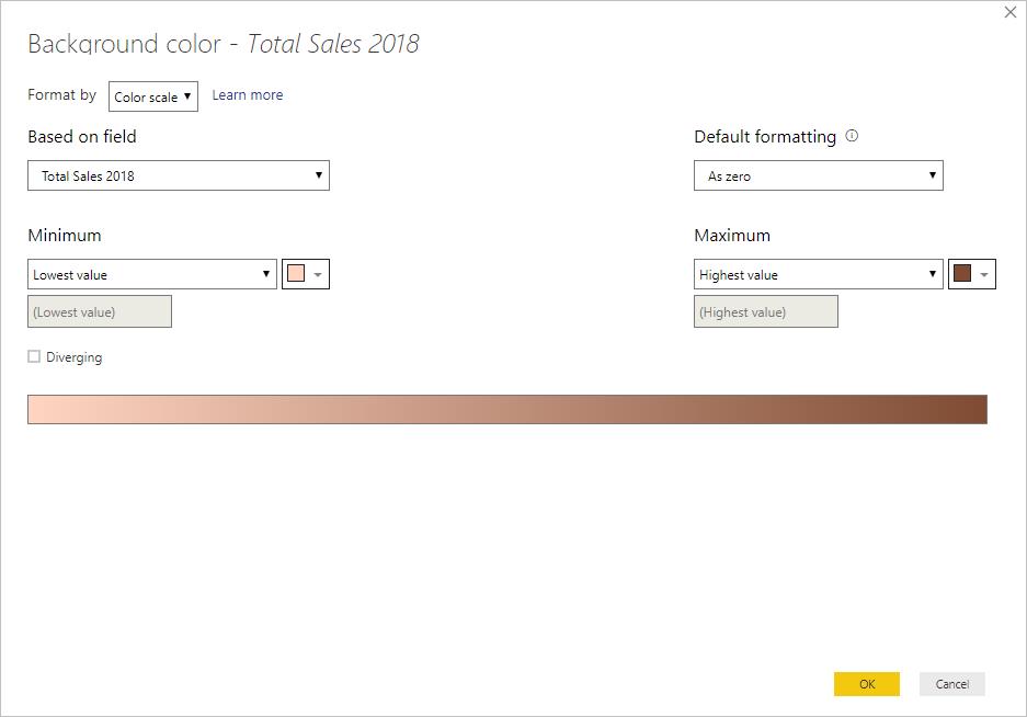
The pop-up dialog appears with the same setting as in one of the column charts:
Then, my table will now have data coloured:
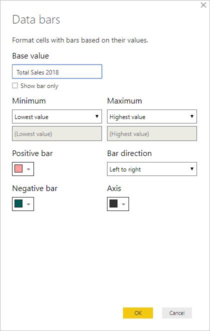
I can also add data bars to each table cell, by setting up ‘Data bars’ preference:
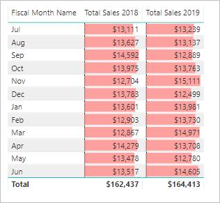
My table now shows data bars with lengths relative to the sales figure:
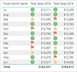
Moreover, I can set up icons next to each data label based on predetermined rules:
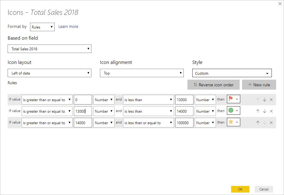
With icons, I can evaluate sales performance of various months in an instant:
Have fun painting colour! That’s it for this week, check back next week for more Power BI tips.
In the meantime, please remember we offer training in Power BI which you can find out more about >here. If you wish to catch up on past articles, you can find all of our past Power BI blogs here.

