Power BI Blog: Custom Visualizations; Funnel/Pyramid Chart Formatting
4 June 2020
Welcome back to this week’s edition of the Power BI blog series. This week, we take a look at formatting a custom visualisation, namely the Funnel Chart by xViz
Last week's blog concluded with a simple Funnel Chart that looked like this:
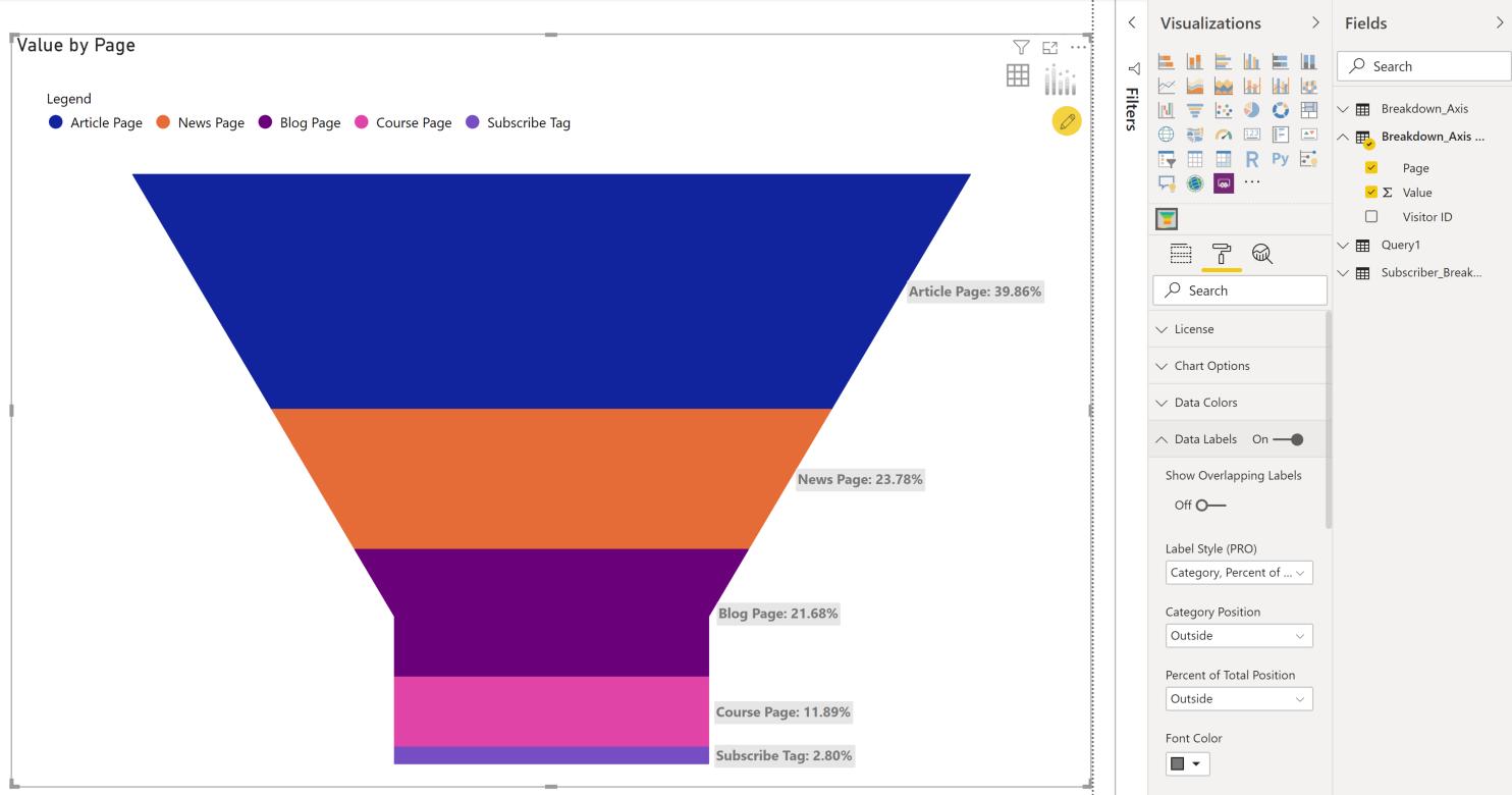
This week, we will try to better this chart with some formatting changes.
First of all, if we look closely at the numbers, only four of all our visitors from this dataset subscribed. However, the current Funnel shape visualisation visually makes it look like many more than four. The first step to amend this is to change the Funnel shape to a Pyramid.
To change the chart into a Pyramid, first click on the chart, then navigate to the Format tab under the Visualizations panel, then scroll to ‘Chart Options’ and select Pyramid from the dropdown menu in ‘Chart Type (PRO)’:
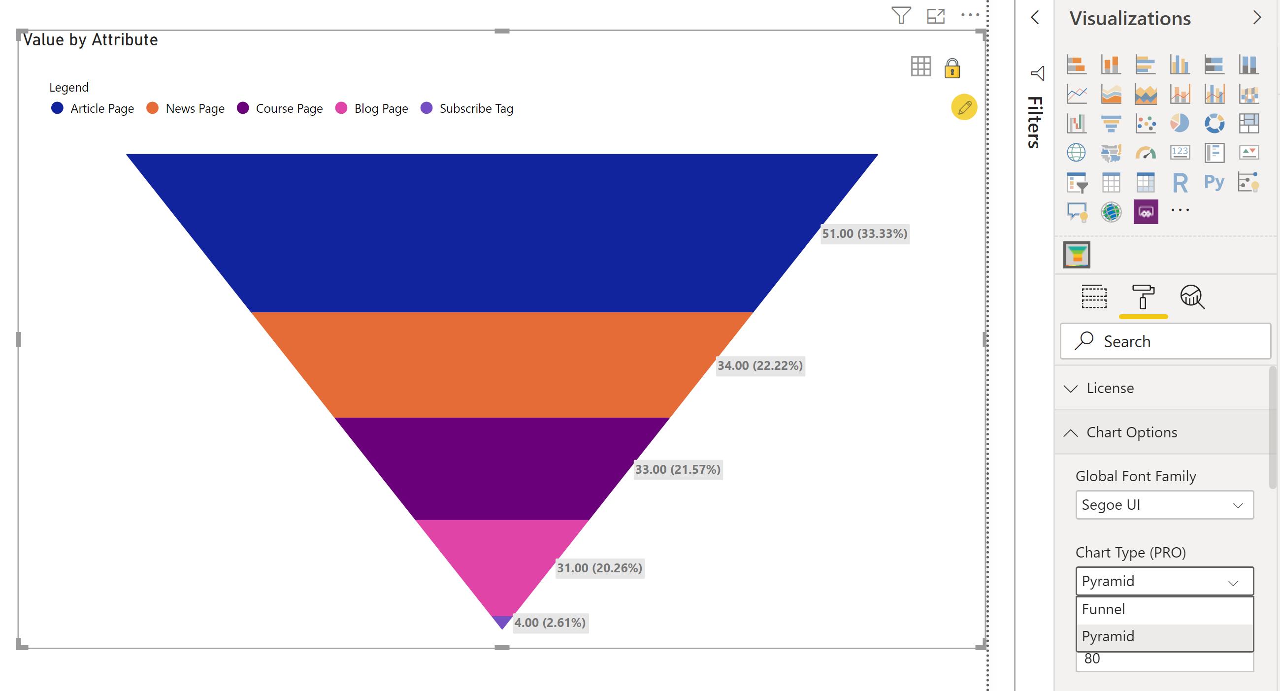
That looks much more reflective of the data. Now, if we want the pyramid to be flipped – with the chart selected and in the same format panel – navigate to the ‘Chart Orientation (PRO)’ option, then select Up.
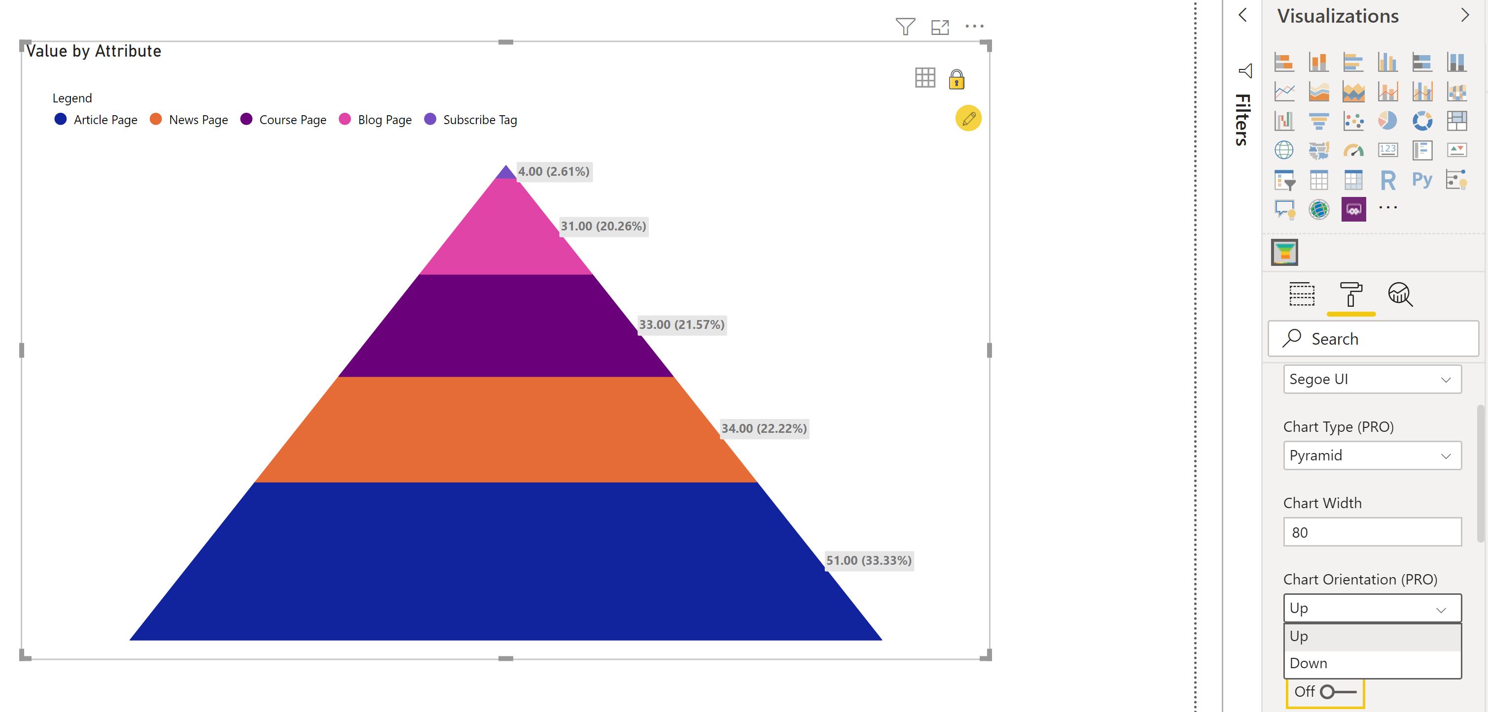
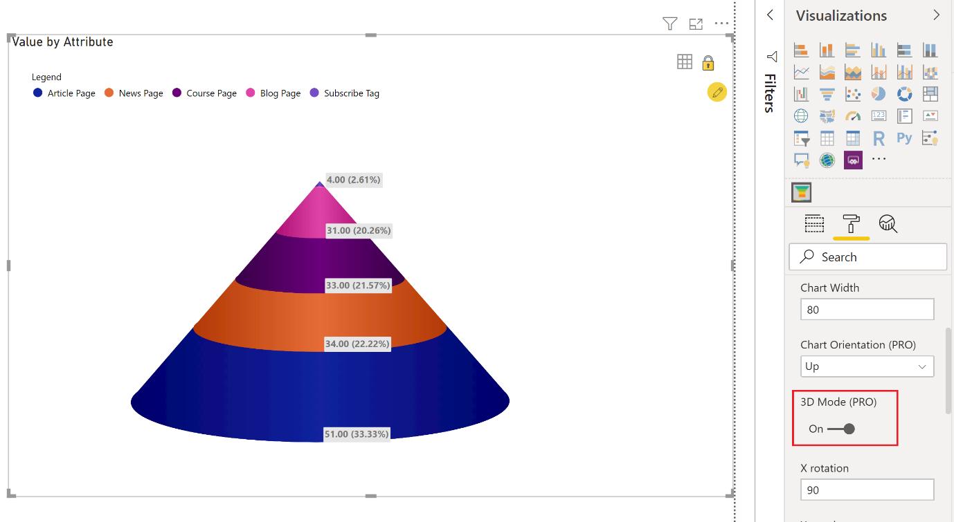
At this point in time, ‘3D Mode’ is only available when the Pyramid is oriented in the Up position. To enable ‘3D Mode’, simply toggle the On option for ‘3D Mode (PRO)’ (it can be found directly below the ‘Chart Orientation (PRO)’ option):
Let’s make some changes to the data labels to make it easier for the end user to read. With the visualisation selected, click on the Formatting tab and scroll down to the ‘Data Labels’ section. Here, we can increase the font size of the data labels, and apply a bit of transparency to the background, so it does not appear too harsh.
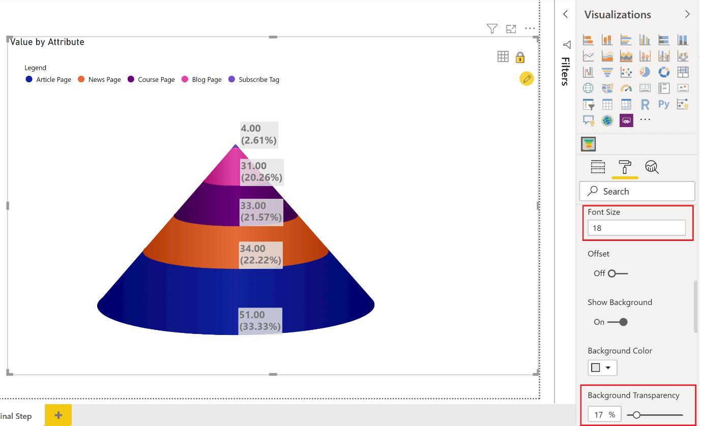
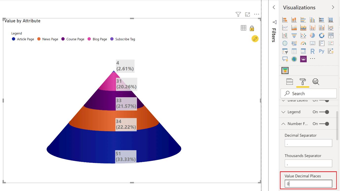
Almost there! Looking at our data points, the number formatting to two decimal places seem unnecessary. We can modify this in the ‘Number Formatting’ section.
There is one more detail that we should cover: the colour scheme. We may customise the colour scheme in the ‘Data Colors’ section:
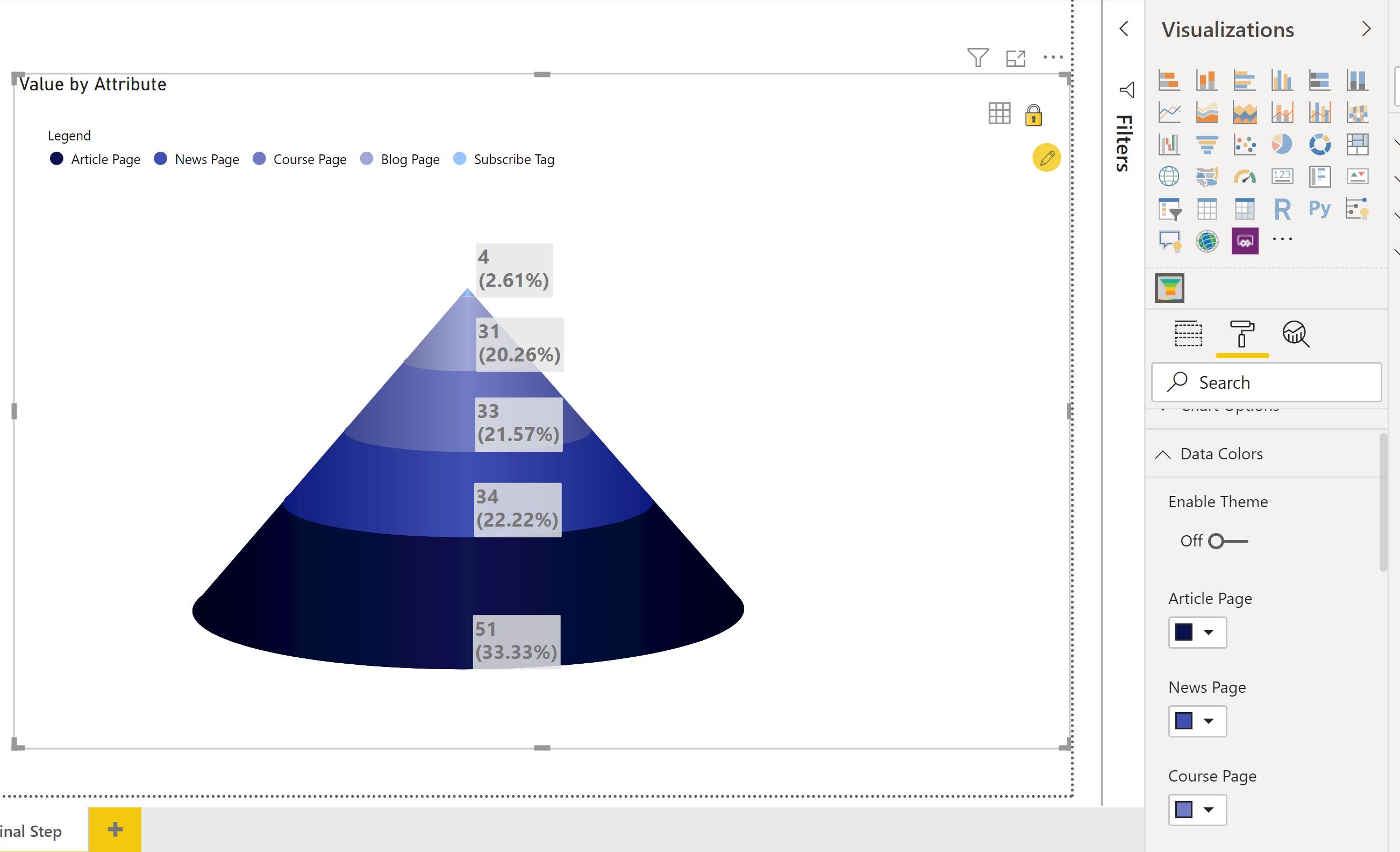
There we have it: how to make your Funnel / Pyramid visualisation a little flashier and more applicable to your business’s colour scheme.
That’s it for this week, come back next week for more on Power BI.
In the meantime, please remember we offer training in Power BI which you can find out more about here. If you wish to catch up on past articles, you can find all of our past Power BI blogs here.

