Power BI Blog: Mekko Chart
11 July 2019
Welcome back to this week’s Power BI blog series. Over this week and next, we are going to create a beautiful visual: the Mekko Chart.
Over the last two weeks, I talked about Waffle Chart and how it solves the problem of comparing small percentages which may be difficult with the common Pie Chart. I then came up with another question for myself: how would I be able to know and compare the actual value of multiple items when they appear to be similar in percentage terms? Now I have solved my problem.
Inspired by the iconic Marimekko design, Microsoft introduced the Mekko chart, which captures two dimensions in one chart, namely percentage and value. This allows you to identify the large segments as well as ones that are underrepresented with just the merest of glances.
Example of Marimekko designs would include the following:

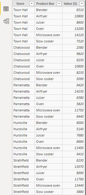
Here I have a list of partner stores around Sydney and their sales records of my company’s products, which have already been imported to Power BI. I wish to see them clearly in segments and patterns:
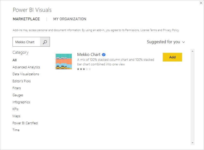
First of all, let’s import the Mekko Chart to Power BI by going to the Home tab’s ‘Custom Visual’ group, choose ‘From Marketplace’ and search for “Mekko Chart”:
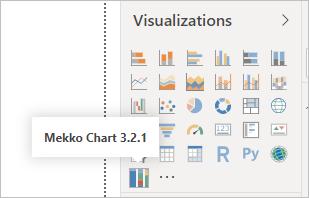
On the right-hand side, I will now see Mekko chart item:
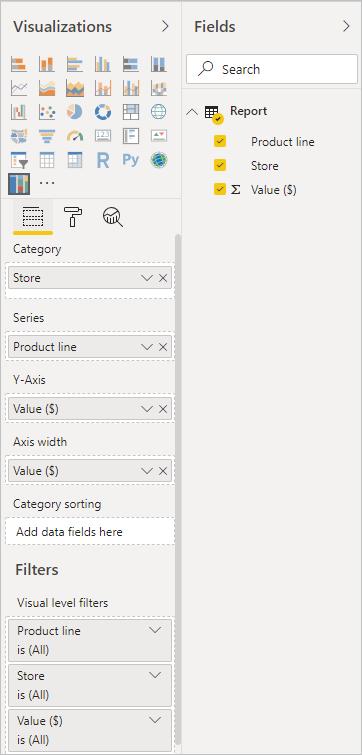
After selecting it, I drag Stores to ‘Category’ because I wish to compare on store basis, ‘Product line’ to ‘Series’ and ‘Value ($)’ to both the ‘Y-Axis’ and ‘Axis width’ categories as shown below:
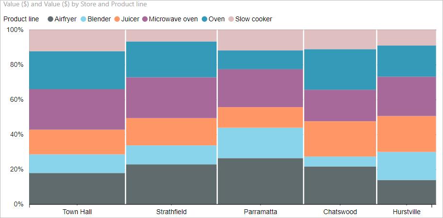
I will now have an initial visual like the one below. It’s straightforward to see the sales performance and popularity of products in each store compared to the others. I can quickly grasp an idea that Town Hall and Strathfield stores record the highest sales figures whilst Hurstville store makes the least, by comparing the width of the bars. Also, Airfryer products are more sought after in Parramatta stores than in any other stores, as the Parramatta store’s Airfryer block is the largest in height.
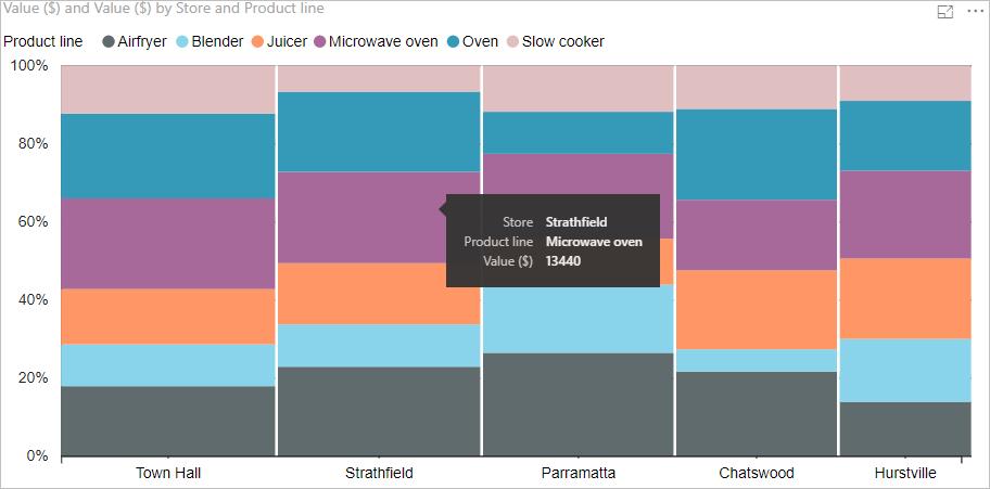
If I move my mouse over a block, I can see further details:
That’s it for this week, check back next week for the next blog in this Power BI series.

