
Power BI Blog: New Highlighting and Filtering Icons
11 April 2019
Welcome back to our Power BI blog series! Just a short one, this week, we thought we’d highlight a graphical change to the way interactions work with highlighting and filtering.
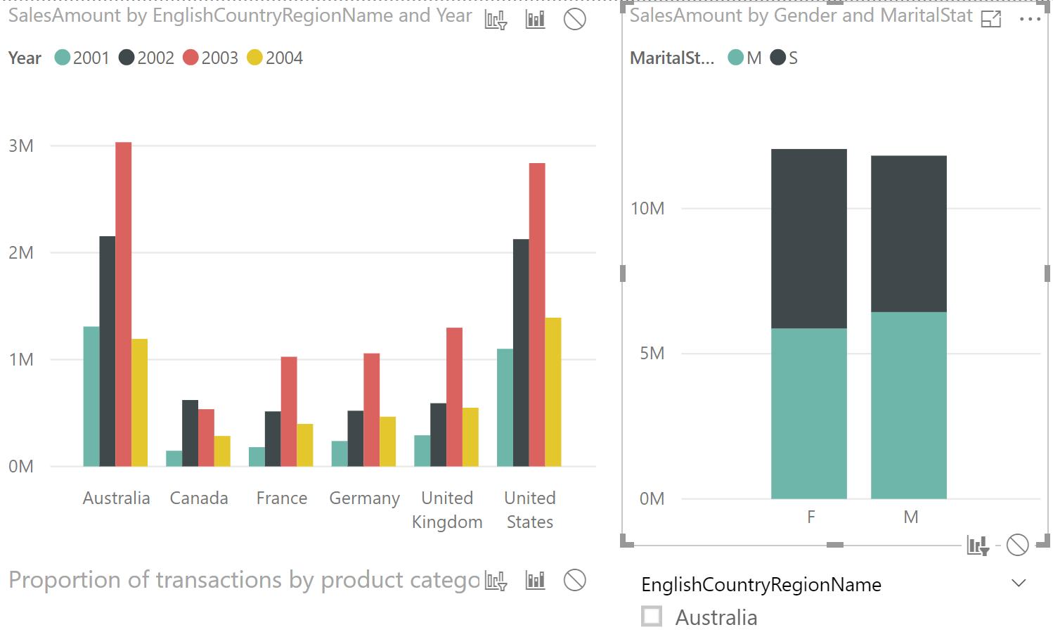
Do you see it there? Blink and you’d miss it – let us blow it up for you:

It appears that the global push to ban pie charts from Microsoft imagery has finally come down on Power BI, with the Highlight option now being represented by a column chart with a portion highlighted, which actually reflects what will happen to your charts 90% of the time. Previously, the icon was a pie chart:
… and the picture was not reflective at all of what you viewed on the page:
So hopefully, you won’t be confused when you’re searching for your filter and highlight interactions – they’re still where they used to be, but in a newer, nicer, more relevant form.