Power BI Blog: Text isn't Limiting! - Part 3
22 March 2018
Welcome back to Power BI Tips.
Last week we cleaned up our text file and have finished preparing it:

Let's make a line chart showing the population change trends. You can find this visual as the first in the second row in the "Visualizations" pane.
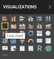
Click on Date and Population Change in the “Fields” pane and see how the visual looks:
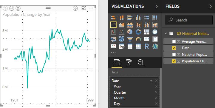
Looking good.
But our visualisation is quite small with the data points in the line chart squashed together. Resizing the visual wider, we can enlarge the plot area. Notice that on the visualisation there are darker grey sections on the boundary. They are our points to drag and expand.
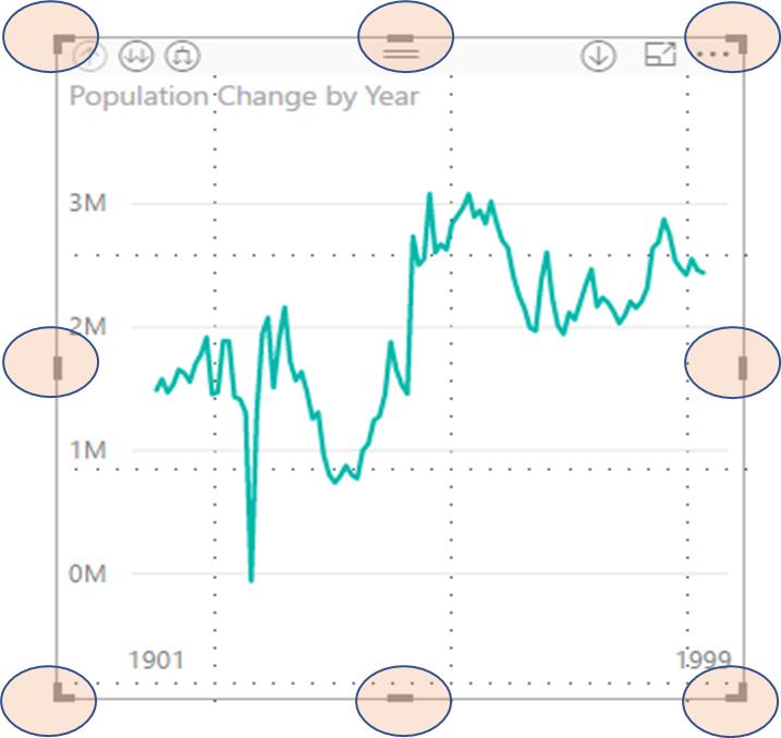
Click on the any of the dark grey sections and drag to resize to your liking:
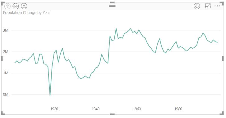
Since the chart has widened, the axis by Year now shows more labels to give a better idea of the time scale.
What if we wanted to leave the chart the size that it is, but have a closer look? Then we can switch to Focus mode.
On the top-right corner of the visualisation, there is a square icon to put it into focus mode.
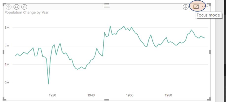
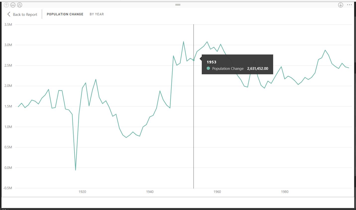
This takes a single visualisation and projects it into full screen mode, allowing us to look closer at each of the points. In any visualisation, when the mouse is moved to hover over a data point, a tool tip appears to show the value at that point.
In focus mode, the increased size makes it easier to pick a specific data point to look at.
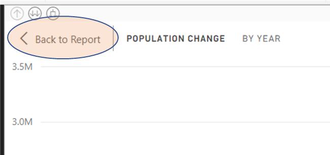
To return to our original report workspace, click Back to Report on the top left corner:
Easily done! Next week, we’ll start playing with some of the data using Power Pivot functionality and adjust our visualisations.
Tune in next time for more Power Bi Tips!

