
Power BI Blog: The Duo Chart – Part 1
30 May 2024
Welcome back to our Power BI blogs. This time, we will introduce to you the Duo chart, a custom visual that puts two types of charts side by side. Over a two-week series we will go through how to build such charts with an intriguing example.
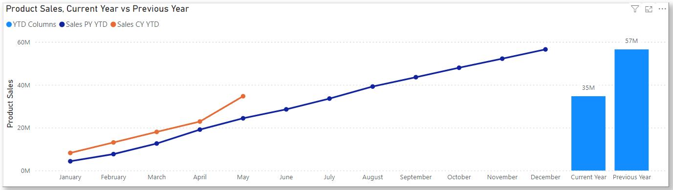
In a single visualisation, the chart below plots the year-to-date product sales against its previous-year counterpart (the lines) and also their year-end totals (the columns). In this article, we will explain how to build Duo charts like this and will go through detailed steps for building this particular example.
Construct the Axis
This is a rather manual step in building the Duo chart.
Power BI offers built-in combo visuals such as the Line and Stacked Column chart, but the data series all have their x-axes and y-axes consistent, e.g. dates or categories along the x-axis and values on the y-axis in the Line and Stacked Column chart. That’s very much intuitive, but what we are trying to build breaks that structure, insofar we are breaking the x-axis into two [2] sub-x-axes.
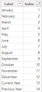
Therefore, what we will use as x-axis for the above is a table concatenating two [2] x-axes. Consider the following table expression:
XAxis =
VAR Months = ALL(Calendar[Month Name], Calendar[Month])
VAR SideTable =
DATATABLE("Label", STRING, "Index", INTEGER, {{"Current Year", 13}, {"Previous Year", 14}})
RETURN UNION(SideTable, Months)
We listed the 12 calendar months and also two [2] text labels, “Current Year” and “Previous Year”. Then, we concatenated them via the UNION function. The resulting table looks like this:
Albeit a manual step, it also gives us the freedom to break the axis into as many parts as we want, i.e. we can build a Trio chart or even a Quartet chart.
Finally, we need to create a relationship to our Calendar. Specifically, it’s a one-to-many relationship from XAxis[Index] to Calendar[Month].
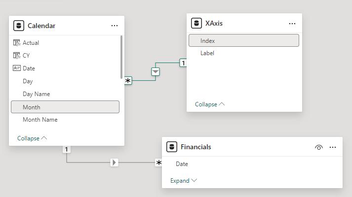
Having done this, we are treating each calendar month as unique, regardless of the year. That means the visual is only useful for comparing years against each other, and the measures shouldn’t be defined across multiple years. Later, we will construct flags and apply filters for date control.
The Columns
To plot the two [2] columns at the right-hand side, we wrote the following measure:
03 SideColumns =
SWITCH(SELECTEDVALUE(XAxis[Index]),
13, CALCULATE([00 Sales YTD], REMOVEFILTERS(XAxis)),
14, CALCULATE([02 Sales PY YTD], REMOVEFILTERS(XAxis)))
The two [2] chart measures 00 Sales YTD and 02 Sales PY YTD calculate the year-to-date sales for the current year and the previous year, and we use the REMOVEFILTERS function here to remove date-context and obtain their year-end values. We will go through the chart measures in details later.
The DAX function SWITCH works as a conditional statement. It has the following syntax:
SWITCH(expression, value, result[, value, result]…[, else])
The function evaluates an expression against a list of values and returns one of the result expressions. It has the following arguments:
- expression: this is required, and it can be any DAX expression that returns a single scalar value where the expression is to be evaluated multiple times (for each row / context)
- value: the first of these are required and it needs to be a constant value to be matched with the results of expression
- result: the first of these is required and it can be any scalar expression to be evaluated if the results of expression match the corresponding value
- else: this is optional, it can be any scalar expression to be evaluated if the result of expression doesn't match any of the value arguments and if left unspecified it returns BLANK.
Here, for the chart measure 03 SideColumns, we use the SWITCH function and the value arguments 13 and 14 to match against indices of the axis we constructed. We are applying the SELECTEDVALUE function to get the distinct values of XAxis[Index] when its context has been filtered down to one [1] value only.
By doing this, when being set as the column y-axis, the measure 03 SideColumns matches conditions 13 and 14 against distinct values of the x-axis, and at the 13th and 14th positions, returns total sales of the current year and the previous year. Thus, we are putting the two [2] sales measures at the right end of our axis and leaving 12 empty spots for the 12 calendar months.
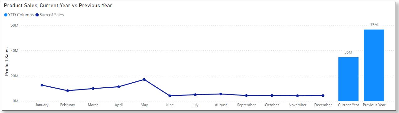
Using Sales as a placeholder, the visual looks like the following now:
That’s it for this week. Next week we will go through the other chart measures and steps to complete the Duo chart. Please stay tuned and don’t miss out on more thoughts and insights from http://www.sumproduct.com.