
Power BI Blog: The Duo Chart – Part 2
6 June 2024
Welcome back to our Power BI blogs. Here, we continue discussing the Duo chart, a custom visual that puts two types of charts side by side. Over a two-week series we will go through how to build such charts with an intriguing example.
The Duo chart is a custom visualisation that puts two types of charts side by side. The following example plots the year-to-date product sales against its previous-year counterpart (the lines) and also their year-end totals (the columns). Last week, we walked through building the x-axis and the Column chart measure. This week, we will go through the other measures and complete the chart.
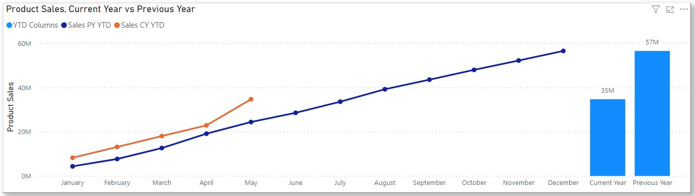
Chart Measures
First, we add a calculated column Actual as a flag in the Calendar Table:
Actual = [Date] <= MAX(Financials[Date])
We built our Calendar Table to have complete years covering all sales data in the Table Financials and this flag Actual returns a FALSE value for any date after the latest sale in Financials. That means we can use it to stop our visual at the latest sale, instead of plotting a flat line for running summations until year-end. That also brings us to the first chart measure, 00 Sales YTD:
00 Sales YTD = CALCULATE(TOTALYTD(SUM(Financials[Sales]), Calendar[Date]), Calendar[Actual] = TRUE())
Here we use the function TOTALYTD on Financials[Sales] along dates in Calendar to calculate the year-to-date sales, where we’ve applied the filter Calendar[Actual] = TRUE() to only calculate for dates before the last sales. Then, we create a measure for previous-year figures using the function SAMEPERIODLASTYEAR:
01 Sales PY = CALCULATE(SUM(Financials[Sales]), SAMEPERIODLASTYEAR(Calendar[Date]))
on which we can build a measure for previous year’s year-to-date sales:
02 Sales PY YTD = CALCULATE(TOTALYTD([01 Sales PY], Calendar[Date]))
In last week’s blog, we created the axis labels in a Table XAxis and a measure for the right-hand-side total columns 03 SideColumns. Now, we are ready to build the Duo chart.
Building the Chart
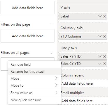
We create a Line and Stacked Column chart and select the x-axis we built, XAxis[Label]. Then, we select the current-year and previous-year YTD sales, 00 Sales YTD and 02 Sales PY YTD, as the line y-axes, and the year-end totals, 03 SideColumns, as the column y-axis. We also rename them for the visual.
Notice that we need to select a year so we can specify what is the current year and what is the previous year and to make the calendar months on our x-axis unique. To do this, we can use a Slicer on Calendar[Year].
The above also completes the Duo chart.
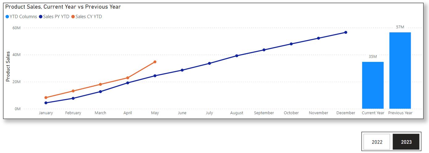
We would like to discuss an alternative approach for selecting a year than using the Slicer.
When we have more years of data, the above design with a Slicer is good for selecting one [1] year to compare against the previous. However, for particular cases where we only care about the ongoing year and want to compare against the last year, or when we only have two [2] years of data, like the above, the Slicer will be superfluous. However, we still need to select a year. Our approach is to use the Filters pane with a flag:
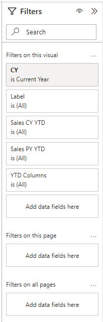
We added a calculated column CY to the Calendar Table:
CY = IF(year(max(Financials[Date])) = [Year], "Current Year", "")
This way, the column will display text “Current Year” if the corresponding date-row belongs to the year of the latest sale. Then, we may add it to the Filters pane and filter for the text value “Current Year”.
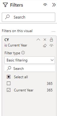
By doing this, we do not need to use a Slicer but still have a single-year context for the visual.
That’s all we want to share with you on the Duo chart. Please stay tuned for more thoughts and insights from http://www.sumproduct.com.