Power BI Blog: Visual Container Improvements
25 May 2023
Welcome back to this week’s edition of the Power BI blog series. This week, we look at useful additions to help you customise your visuals’ containers.
Just recently, Power BI has introduced four key features to help you customise your visuals’ containers. Thought we’d take a look…
Subtitle
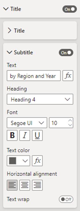
You can now turn on a subtitle that can be used to add extra context to your visuals. You’ll find the new ‘Subtitle’ toggle in the ‘Title’ settings card of the Formatting pane.
Divider
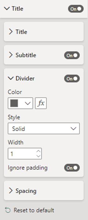
To visually separate the visual header from its contents you can add a divider line. You can find the ‘Divider’ option in the ‘Title’ settings card of the Formatting pane, below the new ‘Subtitle’.
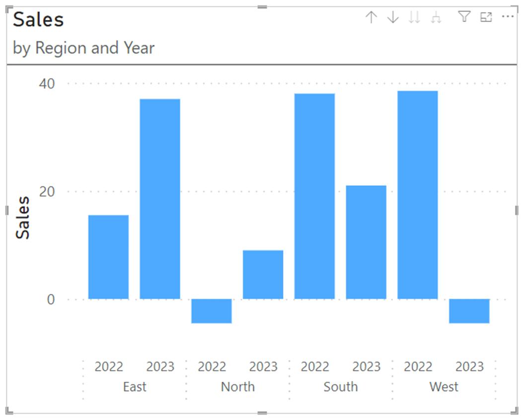
Here’s an example visual container with Subtitle and Divider both switched on:
Spacing
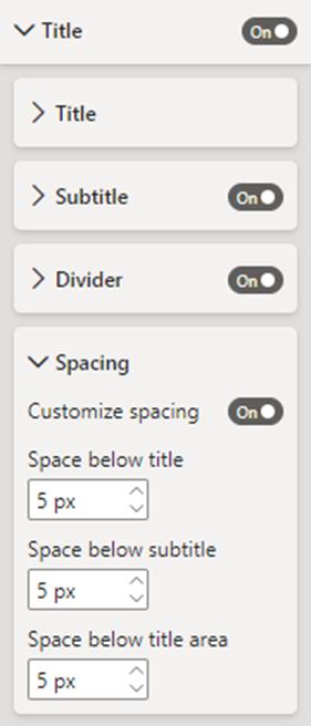
In addition to the Subtitle and Divider on your visual container, you can control the space below each component too. You’ll find the ‘Spacing’ setting at the bottom of the ‘Title’ settings card of the Formatting pane.
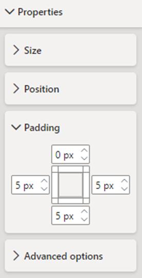
Padding
You can now control the container’s margin to create a negative space making the visuals look more professional and appealing. You’ll find this new option in the Properties card of the Formatting pane.
In the meantime, please remember we offer training in Power BI which you can find out more about here. If you wish to catch up on past articles, you can find all of our past Power BI blogs here.

