Power BI Anomaly Detection in Preview
16 November 2020
We know we have done it before with Smart narratives, but we think we have found another newsworthy item in this month’s Power BI updates. Not sure if doing this twice means it’s an anomaly though…
Anomaly detection has come to this month’s release of Power BI updates. ‘Anomaly detection’ helps you enhance line charts by automatically detecting anomalies in your time series data. It also provides explanations for the anomalies to help with root cause analysis. With just a couple of clicks you can easily find insights without slicing and dicing the data.
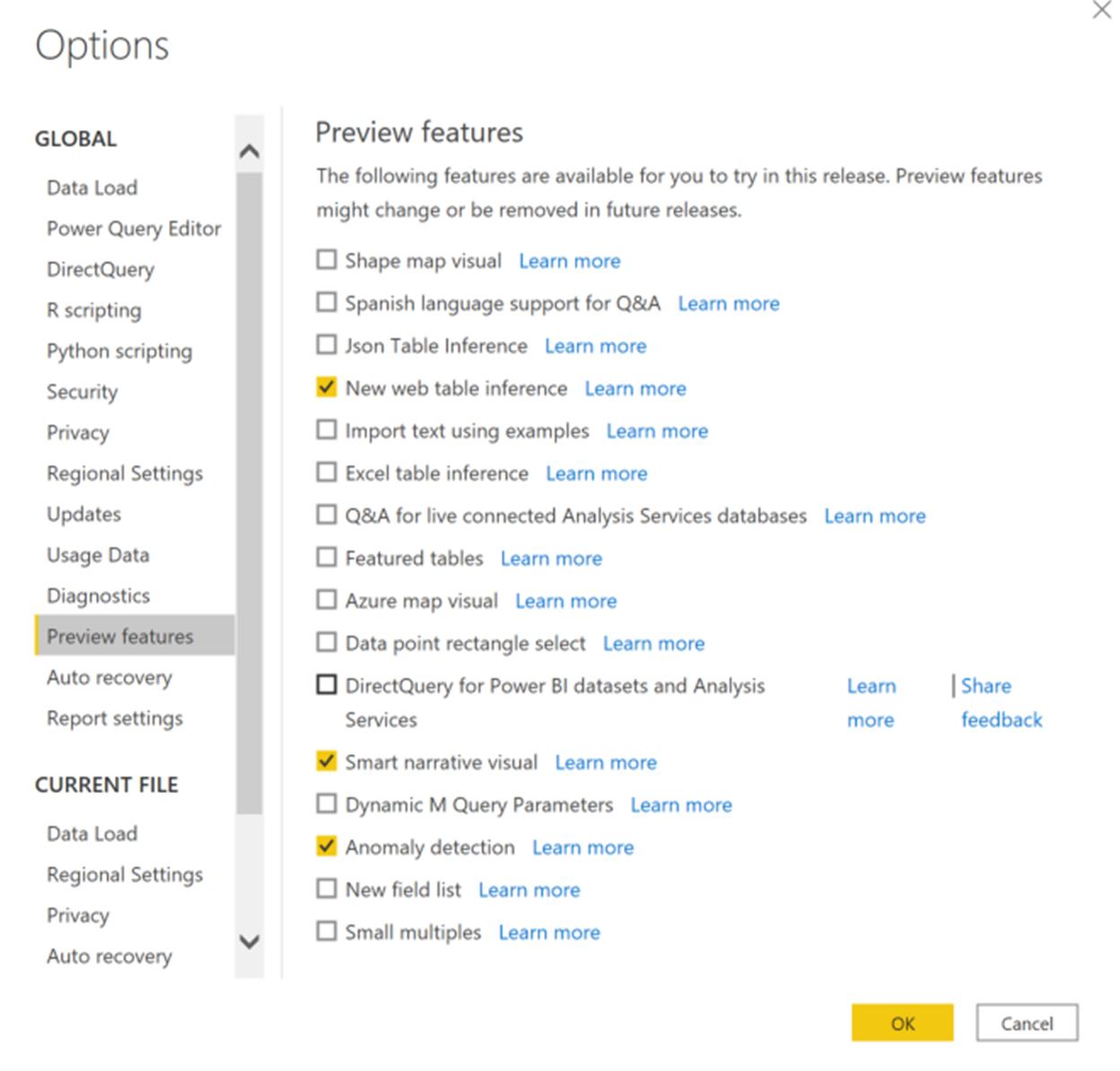
Since this feature is in Preview, you will first need to turn on the Power BI Desktop feature switch by going to File -> Options and Settings -> Options -> Preview features and make sure ‘Anomaly detection’ is turned on:

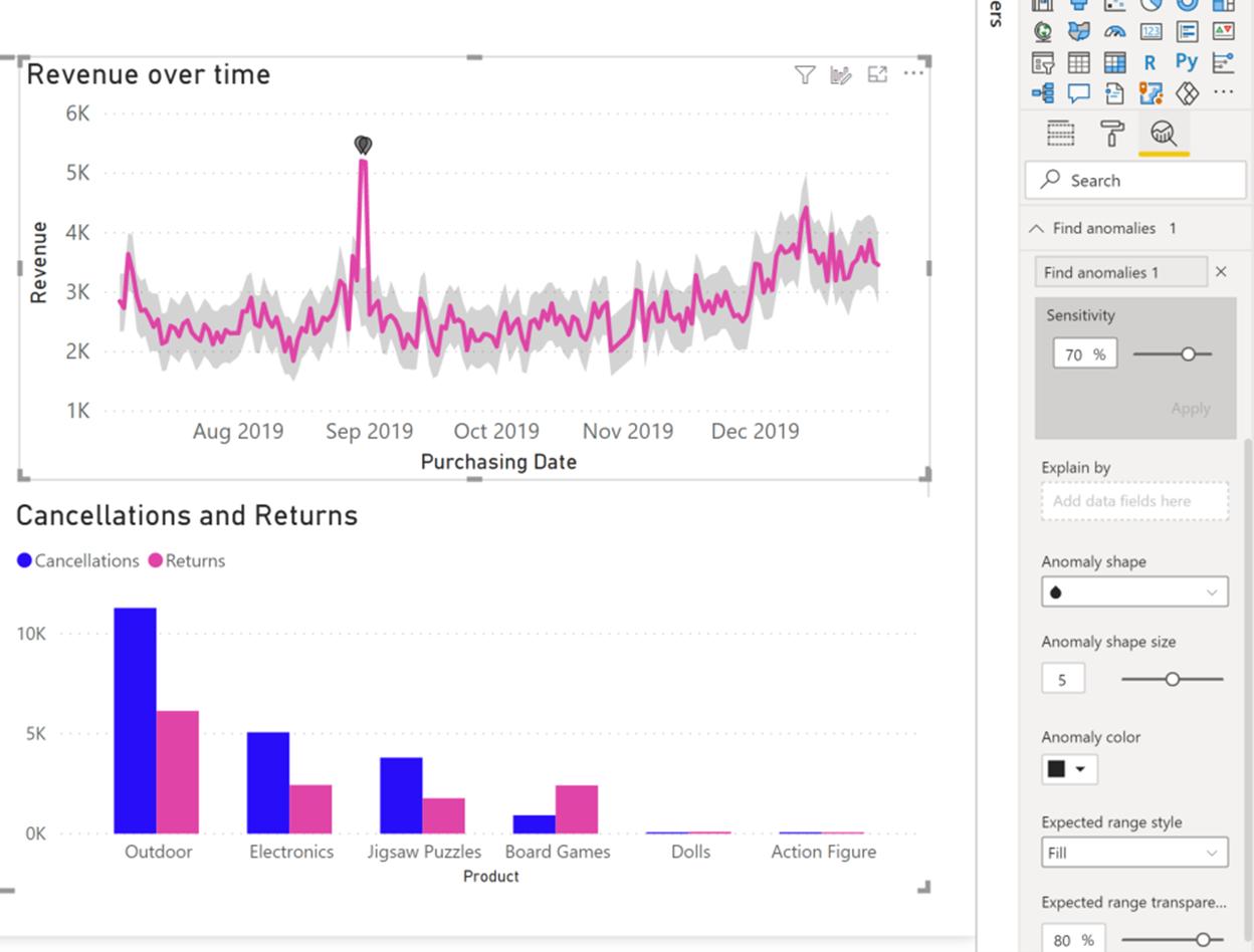
Once you enable ‘Anomaly detection on a chart’ by adding ‘Find Anomalies’ from the ‘Analytics’ pane, it gets automatically enriched with the anomalies and expected range of values.

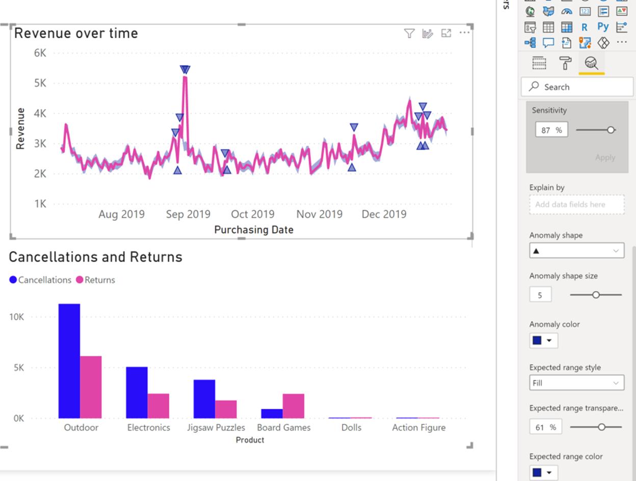
This experience is highly customisable, whereby you may configure the sensitivity of the algorithm, shape, size, colour of the anomaly, and the colour, style and / or transparency of the expected range.

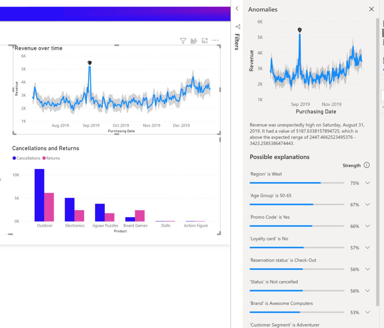
Once you select the anomaly, Power BI runs an analysis across the fields in your data model to figure out possible explanations. The Anomalies pane provides a natural language explanation of the anomaly and associated factors sorted by their explanatory strength.

You can control the fields that are used for analysis by dragging fields into the ‘Explain by’ field well. Clicking on an explanation opens the card where you can see more details of the explanation. You can also add the explanation visual to the report.
Report consumers can view anomalies and explanations after the creator publishes the report to the Power BI Service.
Once this comes out of Preview, we’ll write up a full example in our Power BI series. Watch this space!

