Power BI Service Gets Fresh
25 July 2019
Today sees a public Preview of the ‘new look’ for Power BI Service. Microsoft has announced they are refreshing the user interface “…to provide a modern experience that’s simpler and builds on customers’ familiarity with Microsoft products…”. Let's hope it's not like Access then (just joking!). This, apparently, is just the start, and we understand there is more to come.
The new look starts rolling out this week, with everyone able to access it by the end of July (US time).
The main changes so far include:
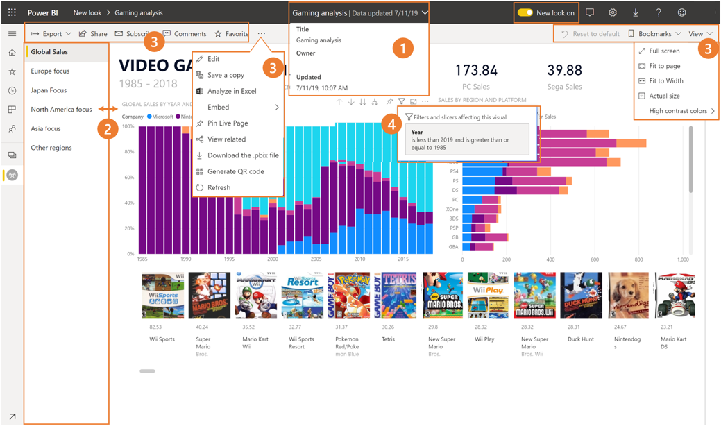
- Metadata: more details will be available such as last refresh date and contact information
- Vertical navigation: report pages will now be more prominent, building on customers’ familiarity with navigation in Word and PowerPoint
- Simplified action bar: there’s a new, updated action bar designed to surface the most relevant commands, making it easier to export, subscribe, collaborate with others and delve deeper through filters / bookmarks
- New filters experience: there’s a new filter ‘experience’ including the pop-up filter list, with an updated Filters pane available by default for all reports with the new look
- New colours and icons: Power BI Service has switched to a lighter colour theme and updated icons
- Feature parity: no functionality has been removed, but there are now additional commands such as edit, save a copy etc. to be found by expanding the ‘…’ menu in the action bar
- Consistent experience: the dashboards will be getting the new look too.
If you want to find out more, check out Microsoft’s blog here, or subscribe to our newsletter [at the foot of any SumProduct webpage (if you haven’t already) where we will keep you up to date with both skills and all this is new in Excel, financial modelling and Power BI.


